Design submitted by Peter from the UK.
Peter says: “I have recently done a couple of designs that looked a little like an eye which made me think more about Irises.
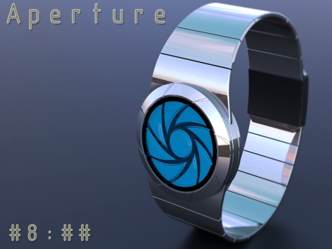
This design is very much inspired by a camera iris or shutter, which works in a similar way to the iris of a human eye but is much simpler. I found that the iris/shutter look not only looked dynamic but also lent itself to some unusual looking digits, “Aperture” was born.
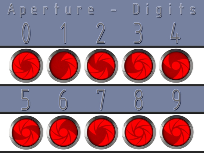
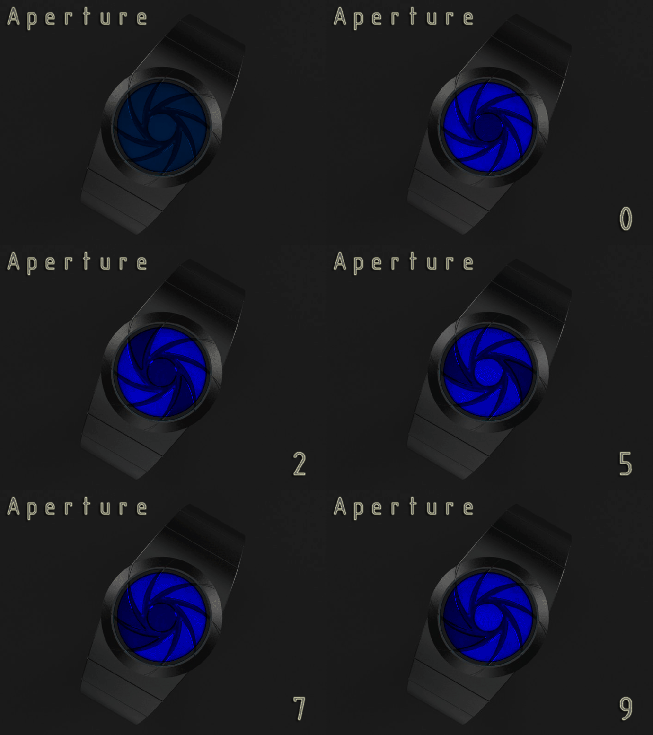
The time or date is displayed in a phased digital style, each number is shown in sequence to make up the time. The digits are created by the iris shaped segments (this could be either backlit LCD or LED).
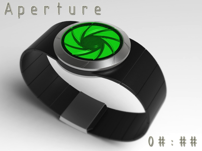
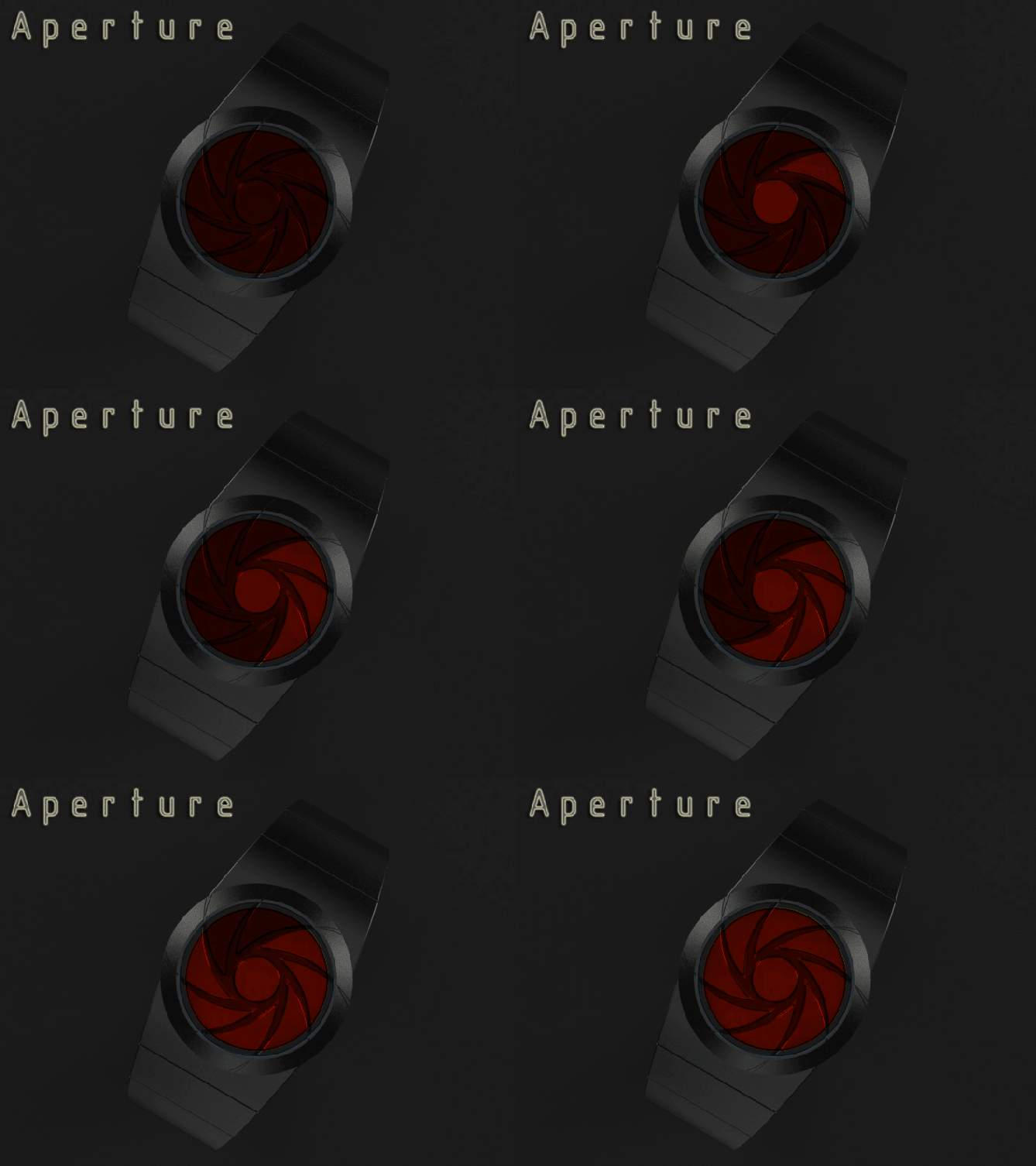
When the time is not being told the display could be animated or show the seconds constantly ticking away (LCD always on).
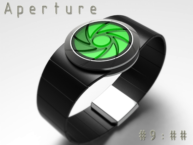
The iconic iris/shutter shape combined with an embossed lens gives the watch an unusual but dynamic look. This may appeal to those who like naturally inspired designs or techies alike.
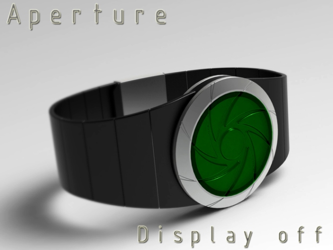
This design may be a perfect gift for those with interest in photography for example.
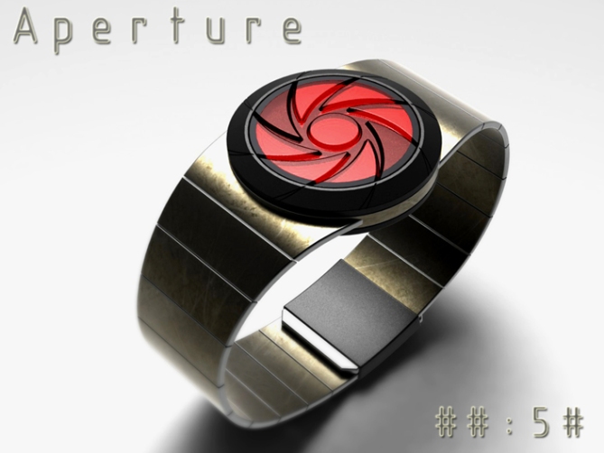
The constantly animated display should also appeal to those with a playful disposition. Continue down the page to see these.
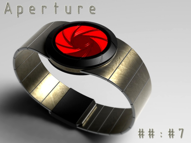
This design stands out due to its Iris/shutter ispired display, 3D looking lens and unusual digits.
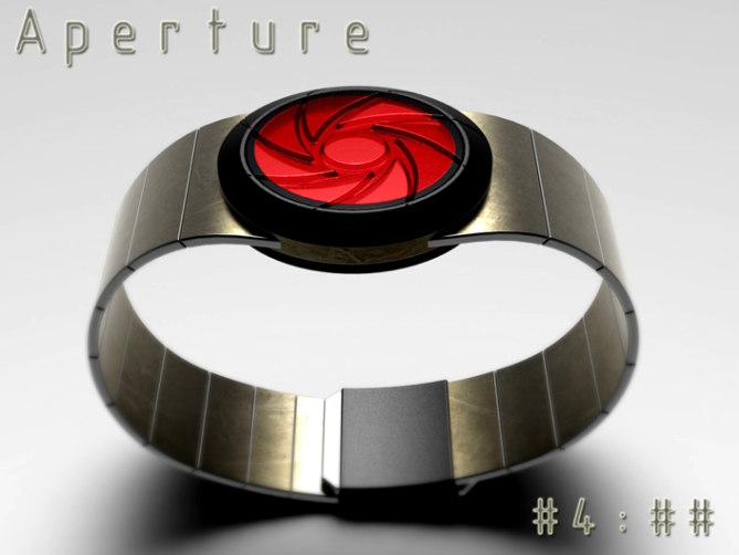
The case and strap are subtle enough for the majority and the face is interesting enough for the hardcore Tokyoflash fans.”



Cheers TF for adding this design to the blog! 😀
LikeLike
Ow yeah! Really cool Pete. Nice theme, nicely translated into a watch. I like it all, especially how the lines continue into the case ring thingy. Maybe the segments could be divided so an opening/closing animation can be performed… 5*/YES!
LikeLike
Yeah nice idea, the triangular segments could consist of several inside each other going from small to large which wolud give the impression of the iris closing or opening. It would make the LCD more dense but would still be easily done I would have thought. Cheers for the great feedback sir! 😀
LikeLike
Ow yeah, and there could be this little animation when the numbers change. That would look like shooting a photo.
LikeLike
If they are nested, you could have all four numbers on at once, like the spider watch. I prefer a watch with an always-on display that I don’t have to wait for.
Amazing design, really cool-looking. I’d buy one.
LikeLike
If the segments were divided like I mentioned to Sam above that might well allow for “nested” or “stacked” numbers like Spider, as well as Sam’s suggested animations. It would be nice to have a couple of time telling methods for sure! Would make the design accessible to more people. Cheers for the feedback and the support Darin! 😀
LikeLike
Good looking concept you have there Pete!
Nice novel way of using the iris shape to make digits, which look dead funky by the way…=) Technically it looks good and simple, shouldn’t be at all difficult to manufacture. The sequential digit thing is not really my thing though, but I’d still like to see this get made. Good luck!
LikeLike
No problem Anders, I knew the phased digits isnt for everyone but it does make for a clean and simple display. Maybe with a little TF magic it might just tempt you to the dark side! 😉 Cheers for the feedback sir! 😀
LikeLike
Hi Pete, with a sequential display must be focused to play, so a little learning before arriving on time.
I love the look, the idea of a fixed and mobile opturateur by posting, all this to get to 5 stars and Yes.
Congratulations for George!
LikeLike
Cheers Patrick, Im glad you likey. Is that George the Ant or the new Prince? 😀
LikeLike
Ah ah ah, yes, they have the same name, ah ah ah
I had forgotten the ant, I was thinking more of the future King.
LikeLike
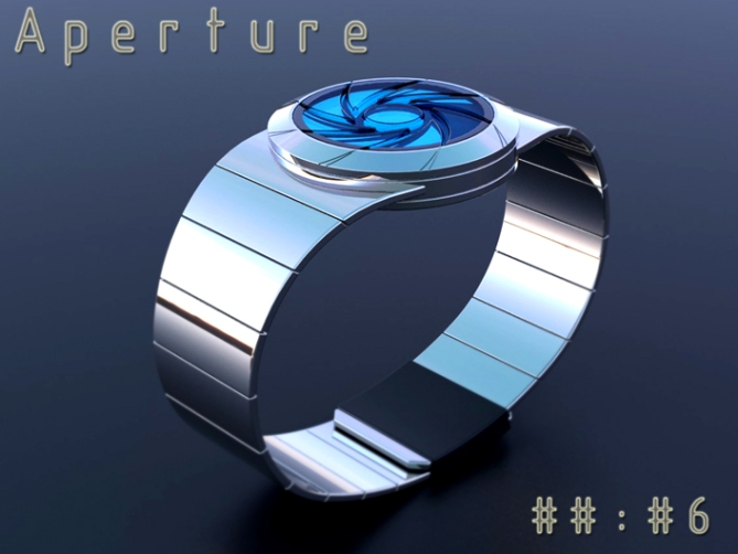
Love the silver and blue one!
LikeLike
Can’t say fairer than that. I will keep some gift wrap to one side for you! 😉 Cheers
LikeLike
One of your best, Pete. It looks great even when the display is off. When I was young, camera lens shutters, and how how they work, fascinated me – this watch appearance brings that all back. Opening / closing animation sounds great, unless it spoils the simplicity of the design. 5*/Y doesn’t seem enough for this one!
LikeLike
Most kind sir! The consensus would be less complimentary, I thank you for the support sir! Hopefully the majority will see what you see eventually! Cheers! 😀
LikeLike
I like this one Pete! On the whole, the numbers look great and also work really well. Maybe you could add just one more segment to the top right of the 4 and also add the central dot to the 2 and make it look more like a 2 (if possible)? Anyway, 5Y 🙂
LikeLike
Cheers for the feedback Mushy! The 2 is the most compromised number, but in adding the dot it’s looks ver similar to the 5 which is why I didn’t. It might well be that it would work better with more segments. The higher the number the higher the resolution really. But it’s getting the balance between easily recognisable numbers and retaining the iris look. I’m glad you likey sir! Cheers! 😀
LikeLike
I disliked this until I clicked on it and realized it was digits. the digits are very cool. the 3 and the 9 are very similar, but I still think easy enough to learn how to distinguish. as you mentioned, the 2 is a little tricky, but still recognizable. i’m not crazy about the fact that you have to wait to see the progression of digits. obviously it’s preferable for all digits to be shown at once, but there’s really no way around that for this design. the look is very cool. I love the embossed lens. 5* from me. 🙂
LikeLike
Thanks Heather, I’m glad you gave the design a chance to win you over a little. I think there is scope for improvement with the digits, I didn’t really play around with the number of segments. So I think that adding a couple more might help a little. Yeah the phase thing is unavoidable really. Hopefully it’s not a deal breaker! 😉
LikeLike
I agree with Heather…
Great job as usual. Good luck master Pete
For the effort you deserve 5/Y_ 🙂
LikeLike
Thanks a lot Jose, cheers for the support and the vote sir! 😀
LikeLike
I like the overall look & specially the lens. The constant animation is nice. But I hate multiphase watches. It would be nice(r) if each phase had it’s own color ( red > green > blue > white, or any other combo )
LikeLike
Hi Makko, the phase colour suggestion is a nice one. It would help the user keep track on where they are in the time telling sequence. Cheers for the feedback sir! 😀
LikeLike
Time is running out for this one too! Cheers to everyone who supported this design and TF for adding it here to the blogiest of blogs!
Cheers guys,
Pete from GB
LikeLike