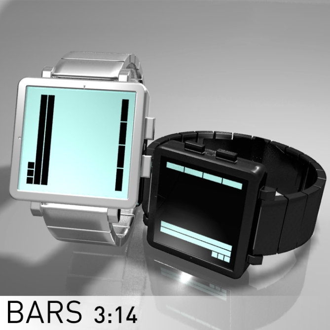
Design submitted by Laszlo from Hungary.
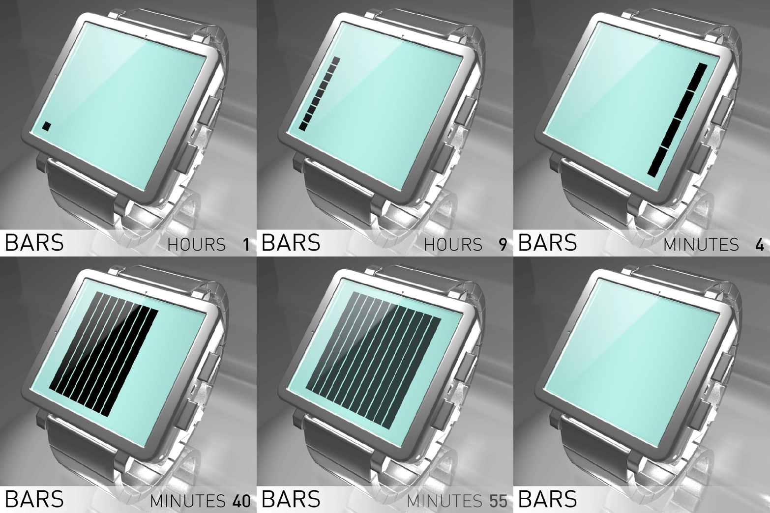
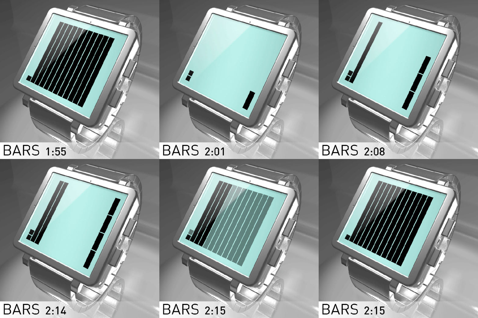
Laszlo says: “I’ve tried create a watch with large easy to read display. It’s the Bars. This is a 12-11-4 reading system (12 squares is the 12 hours, 11 squares is the 5 minutes groups and 4 squares is the single minutes), always on LCD watch concept.
Two little engraved dots on the case helps to easy reading (one on 6 hours and one on the 30 minutes positions).”


Another great design, Laszlo. Only thing I’d change, to enable quicker reading, is to add more dots on the case: if you also had dots for hours 3 and 9 along with minutes 15 and 45, that would do it.
LikeLike
Thank you Nev.
LikeLike
I like it but my only issue is that at some times of day the day could look very empty. If the lens had stripes in it that related to the bars it would look more interesting at those times. Support worthy concept! 5* 😀
LikeLike
Thank you Master Pete.
LikeLike
Oh, looks like a classic Laszlo design 🙂 This concept can compete with other bar concepts but I’m not sure if it’s better. It’s up to TF. I like the minimalistic look of these little blocks spread on the display. Everything that looks like a little minimalistic artwork has my support!
LikeLike
😉
LikeLike
A classic Laszlo’s design.
I really like the concept
Great job as usual. Good luck master Laszlo
5/Y_ 🙂
LikeLike
Thanks José.
LikeLike
I prefer the negative display with black band/case. The display idea is similar to a model I sent in march (it wasn’t feature here so it’s a case of GMTA) I like the way the hours are shown, even if it should have more markers. I wish I would have used full height bars for the 10 minutes blocks.
LikeLike