Design submitted by Peter from the UK.
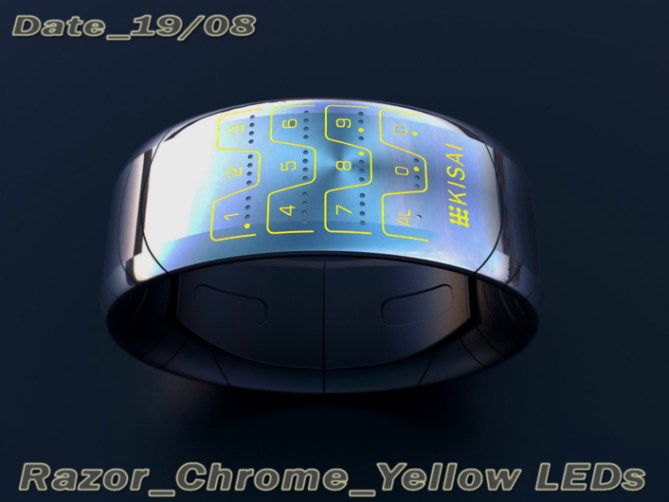
Peter says: A few years ago before the advent of the modern smart phone, mobile phones were far more varied and styled. They weren’t dominated by a huge screen so had to be sleek and interesting in their own right. My favourite phone of this era was the Motorola Razr, it was a sleek thin clam shell style phone with two separate screens and a super sexy metallic key pad. The key pad looked uber futuristic (at the time) with its metallic finish, illuminated numbers and dividing lines and tactile feel. This is what inspired my “Razor” watch.

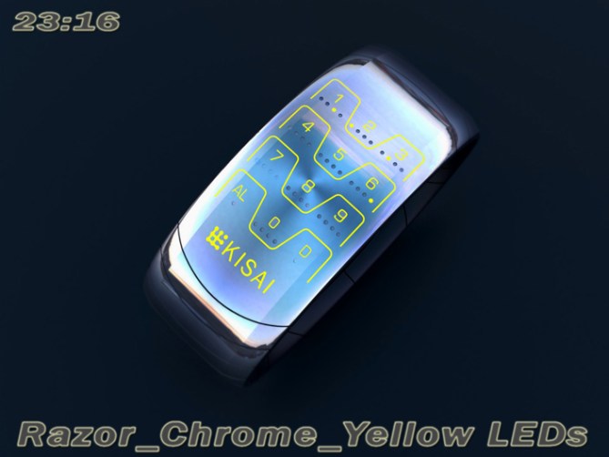
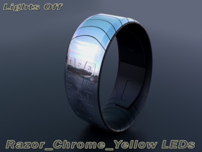
The time is very simply described by the key pad inspired LED display. Which consists of the numbers 0-9 arranged in a similar layout to the phone’s (as well as any other required icon (alarm, date etc). The numbers are separated by similar dividing lines and all look like they are etched into the body of the watch. They are illuminated in a similar manner to the key pad too. Each number or icon is accompanied by small LEDs (x1 LED for an icon and x4 for a number). These LEDs highlight the said numbers or icons displaying the time. (this could also be done by segmenting the dividing lines if a less cluttered look was desired, different coloured LEDs could also be used to show the order)


The order of the illuminated LEDs describes the order of the numbers, i.e. if the first of the 4 LEDs is illuminated then that number is the first of the 4 numbers that describes the time/date/alarm in a 24hr format.
This design is sleek and simple in its form and easy in its time telling. This combination should give it mass appeal. The inspiration used for this design may help the watch appeal to people who miss the good old days of gadgets and gizmos where design dominated rather than screen size or spec.
This design should stand out due to its familiar but modern look, sleek unisex shape and size and intuitive time telling.


How do we know when it’s hours and minutes?
LikeLike
If you read the explanation above, you will have the answer to your question.
LikeLike
Thanks Patrick, I did write a bit of a novel up there! lol
LikeLike
There are four dots per number, the illuminated led shows the order. Ie if the third led is illuminated that number is the third number of the time in a 24hr format (first number of the minutes) hope this helps. 😉
LikeLike
Dude, seriously. I read, but I didn’t get it until read again and pay attention at the dots of each image. Now I understand and: Design approved 😉
LikeLike
Haha no worries. I’m the same with other people’s designs! lol
Cheers for the second look and the approval sir! 😀
LikeLike
@Geek.
Look at the tiny led lights under the numbers. Every led is a hour/minute indication. Led 1 is the first hour like 2-:– led 2 is the second hour like -2:–
Etc etc
LikeLike
Cheers for the explaination Nutty! 😀
LikeLike
The display is very similar to this: http://zoomwap.blogspot.hu/2011/01/nokia-transparent-phone-concept.html
LikeLike
Yeah it does look similar, it’s a classic layout which hopfully will allow it to be initiative for many people. Cheers 😀
LikeLike
I never really liked the Motorola Razr phone, but as a watch face, it looks great!
It doesn’t look cluttered, but I think the segmented dividing lines alternative you mention would be interesting to see.
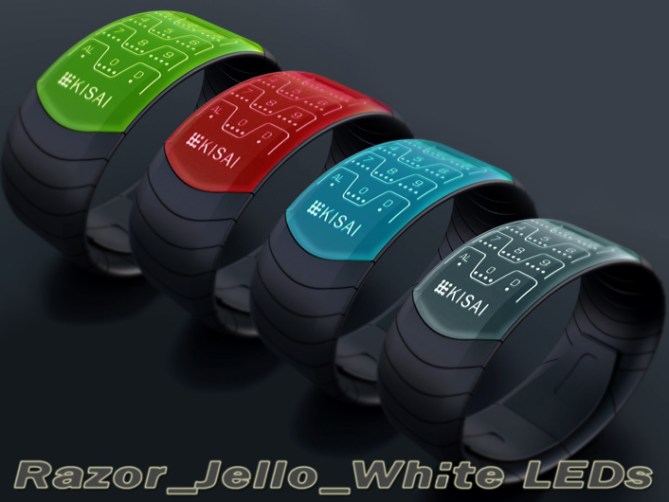
I want the graphite green version, not just because it is least like Razr colours, but that combination looks great together. 5*/Y
LikeLike
Yeah I was tempted to do both variants but decided it might confuse more people. lol
If I get five mins I will link a segmented dividing line version here! Cheers for the support and feedback sir! 😀
LikeLike
I like this system of reading and if this design is too similar to some existing thing, it will just tweak the look.
Another good work of Pete (it is really strong!)
5 * / Yes.
LikeLike
I don’t think that the display layout could be owned as it is classic and common to many products. I think in this context it shouldn’t cause any issues. But like you say it can be made to look different very easily. Cheers for the support sir! 😀
LikeLike
Cheers TF for adding this design to the blog! 😀
LikeLike
Excellent work Pete extremely cool concept. A Technological yet ergonomic design.
LikeLike
Thanks a lot Andrew, very kind sir! 😀
LikeLike
very cool and easy to read. You know i like the old razor phone
LikeLike
Cheers Gordon, yeah I tried to make sure there was minimal similarities (minus the inspiration of course) cheers 😀
LikeLike
nope, this is all you my friend, but i gotta say i did consider what a mash up would look like
LikeLike
I was a big fan of the Razr back then. No other phone reached it in terms of epicness. I’d get me a watch looking like this for sure. I’m just not sure if TF would go this way because of the similarity. It’s a cool fandom gadget. Time reading works fine within the given theme. Well good luck and thanks for sharing 😀
LikeLike
Thanks Sam, yeah that phone was epic! Still looks great today. I’m sure if TF were concerned with the similarities it would be easy to change the styling so it looks more unique. I think the layout would stay the same but with a change to dividing lines it could look very different. Also if the time telling LEDs were part of the dividing lines it could look very different but still keep the basic concept. I would love to know TFs opinion on if its to similar etc. cheers for the support and the feedback sir! 😀
LikeLike
It looks cool Pete. 5Y
LikeLike
Sorry Mushy, didn’t spot you comment till just now. Thanks for liking the look and the comment sir! 😀
LikeLike
In a word; cool. =) Glad to see I’m not the only one who finds smartphones dull as dust… I wasn’t a huge fan of the Razr, though, Motorola’s phones seemed to be marketing over function to me, but then I did work for SonyEricsson for a little while…=)
But never mind that, I should be talking about this watch. It looks very good, suits my taste very well and it seems to be just the right side of difficult to read. It would reach almost stratospheric levels of cool if it were a smartwatch and the numbers doubled as buttons, but then it’d need some sort of display as well. Perfectly do-able, I think, but might mean a bit of a redesign. Still, I think it’d be worth it. Best of luck sir! =)
LikeLike
Hi Anders, yeah a bit of a conflict of interests there! lol
Yeah it could be developed into a smart-watch easily without destroying the looks. I tried to avoid the numbers being buttons as this would have been closer to one of Sam’s designs. But if they were touch sensitive that would be ideal or soft keys like the phone keypad that inspired it. Adding a subtle display would be the trickiest bit like you say. It would be easy on the chrome finish as the display could have a chrome tint so would be virtually invisible when off. Something to think about that is for sure! 😉 cheers for the feedback sir! 😀
LikeLike
More than a watch, a Jewelry 😉
LikeLike
Thanks a lot Alain, I like the way you see the concept! 😀
LikeLike
Love everything about this watch except the name. Love the different colours! 5y
LikeLike
Cheers DZ! Glad you likey! The name isn’t a significant detail. I’m sure if TF decided to take this concept further they may well want to give it a new name anyways. Any suggestions? Cheers for the vote sir! 😀
LikeLike
How about “Bandwidth”?
LikeLike
Interesting, the dividing lines do look like some kind of radio wave or something. Maybe “frequency” would work too? 😉
LikeLike
MKII Version with simplified dividing lines, indicators in the dividing lines and strap segmentation that matches the shape of the dividing lines:
LikeLike
a little silver fun too!:
https://www.facebook.com/#!/pages/PF-Design/159423137472755
LikeLike
https://www.facebook.com/#!/photo.php?fbid=487872991294433&set=a.487690507979348.1073741847.159423137472755&type=1&theater
LikeLike
I love the look, especially the steel ones. But I don’t love the time telling. It’s just not my cup of tea. 5* for looking awesome, though.
LikeLike
I’ll take awesome looking any day (in all contexts! lol) Cheers for the feedback and the vote Heather! 😀
LikeLike
Love this simple and sleek design. I would probably buy multiple colors!
LikeLike
Great comment Andre! In glad you likey sir! I hope you get the chance to collect them all one day! 😉
LikeLike
if you make the white LED always ON on the jello version, i will definitely buy this 5*
LikeLike
A fine choice sir! 😉 Fingers crossed TF choose to develop this one. Cheers for liking and supporting! 😀
LikeLike
By seeing it it instantaneously reminded me of cellphone keypads with a futuristic twist. The Motorola Razr had a nice one.
I like the time-telling method. Always on with a wire(less) charger would be nice. I would buy.
LikeLike
Cool comment Makko, yeah wire-less charging would be sweet! Cheers for the feedback and the support sir! 😀
LikeLike
I really like the concept
Great job as usual. Good luck Pete
5/Y_:)
LikeLike
Great comment and support as usual! cheers Jose! 😀
LikeLike
This post also ends very soon. Thanks to everyone who supported this design and TF for adding it here.
Thanks everyone!
Pete from the UK 😀
LikeLike