Design submitted by Peter from the UK.
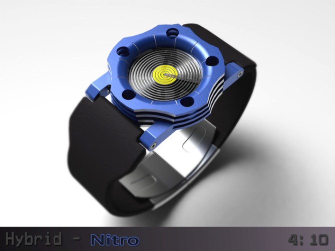
Peter says: As regular blog visitors will know I’m a bit of a petrol-head (gear-head) and like the industrial engineered look. This design takes its visual inspiration from RC car nitro engines. The time telling method is a variation of a previous design “Hybrid” hence the name “Hybrid – Nitro”

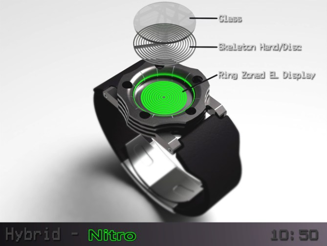
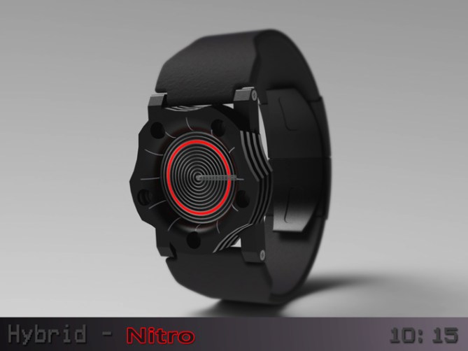
The time telling method uses a combination of an analogue movement used in conjunction with a segmented EL display that is seperated into rings. The minutes are described by the analogue disc that is essentially a skeleton seperated into 12 rings. A bar running through the disc points towards the minutes, whilst the rings frame the segments of the EL display that describe the hours. The exterior of this design would ideally be made from machined and anodised aluminium for that billet bespoke look.


The exterior of this particular design is very industrial and makes a real statement. This watch will mostly appeal to guys who like large watches with mechanical or engineered looks. This is a narrow market but would play into the limited edition ethos.
The brutal looks combined with intuative time telling sets this design apart from others. The machined exterior combined with anodised finish will give the design an engineered feel that makes this design a statement piece.


oh my gosh! why is the heat sink thing symmetrical along the band axis? it would look so much better if it was symmetrical along the axis of the forearm.
LikeLike
Hi inkybait,
I did try it with the machined areas in both axis and with three, four and five cut outs. This layout was just the one I preferred, it’s a subjective thing. There is no reason it couldn’t be different. Cheers for the feedback! 😀
LikeLike
It looks great, Pete.
The rings are hard to read, though, in either form. Could you add something to help this? Different thickness for some (3, 6, 9, 12) or gaps (between 3/4, 6,7, 9/10) – either would help, but would probably spoil the appearance. Different colours for some, would also work, but again might not look so good.
In the hope that something can be done to ease the reading of the hours, it has my vote. 5*/Y
LikeLike
Hi Nev,
You make a fair point and some good suggestions. I imagine the diameter of the watch would ultimately dictate what is possible. The hand part does have numbers cut out to highlight. These could be made more obvious, the different thicknesses would be nice. Different colours would be cool, I don’t know how easy that would be to do. Maybe the rings could be divided into the appropriate number of areas too. Plenty of scope for development here. Cheers for the support and feedback sir! 😀
LikeLike
All that is original likes me, then for me, Pete still broke with monotony and in a masterly way!
5 + * and yes, of course!
LikeLike
Thanks Patrick! Yeah I do like to try to be different. Doesn’t always work tho! lol cheers for the support! 😀
LikeLike
Thanks TF for adding this design to the blog! 😀
LikeLike
nice look, totaly reminds me of those little rc motors. Very industrial, i like
LikeLike
Thank you sir, I forget that you to have a liking for the industrial look. I thanky 😀
LikeLike
It looks nice Pete. Green and silver one for me. 5Y 😉
LikeLike
Thanks a lot Mushy! Glad you likey sir! Cheers 😀
LikeLike
Hm, interesting…=) I too have an eye for those engines, and I think it works remarkably well as a watch (to my surprise, to be honest)… Nice touch with the screw heads.
That said, I would prefer the time telling to be more ‘mechanical’, if you see what I mean. Maybe it’s just my taste, but I feel it would bring the form and function closer together. Very good work in any case, and certainly support-worthy. Good luck mate! =)
LikeLike
I see you what you mean. Your time telling method from your design which involved an arm being pushed in and out like a piston highlighting metallic rings would have really suited this case. Would have made a nice coop in retrospect! Thanks for the feedback 😉
LikeLike
I like the way the time is told. So. Cool. Man. But the look of the watch… Not my taste at all. I do see the intention of an industrial appeal but nahhh 🙂 Good luck anyway and thumbs up for the time telling!
LikeLike
Yeah the time telling could be used in a different case, I just tried to be different for this example. I did contemplate a sleeker case for this time telling but im a stickler for industrial stuff. Also after submission I realised that a screen printed transparent disc would work easily as well as the skeleton disc. Food for thought concept wise hopefully. Cheers sir! 😀
LikeLike
I like the design of this watch, and I belief you can do better time telling than this. I have an idea, but its yours. Love you Pete!
LikeLike
Cheers Firdaus. I have a few variations of this time telling. I think that a variation or evolution of this time telling will have merit. It is simple and intuitive, just needs to clearer and some how more exciting. If you want to share your idea feel free to private msg me. Talk to you soon 😉
LikeLike
I like the overall look, & specially the minute hand. My fav was the gray case/black band until I saw the last pic. Jaw dropping!
I like the time-telling method. I would buy, depending on the size.
LikeLike
You did a few watches with that method & it remind me of a old design I sent in December 2012, which was never published. ( https://www.facebook.com/media/set/?set=a.463446450378457.107733.316409365082167&type=3 )
LikeLike
Just a suggestion master it would be possible order to facilitate the count of hours to do some thicker lines (every three hours for example) …
Great job as usual. Good luck master Pete
5/Y_ 🙂
LikeLike
Yeah thats a fair point and a good suggestion. They could also be different colours to help with the reading. Cheers for the suggestion, feedback and support sir! 😀
LikeLike
This one ends very soon so just wanted to say a quick thank you to everyone who voted, commented and shared this design. Big thanks to TF for adding it to the blog!
Cheers everyone!
Pete from the UK 😀
LikeLike