Design submitted by Matt from Canada.
Matt says: One day I saw a Tian Harlan’s Chromachron (which date from early 1970’s). The dial is divided in 12 colors which are almost blocked by a smaller disk with a 1/12 portion cut out. The disk rotates and shows an approximated time because the bezel has no markers.

I made a lot of modifications:
– I’ve blocked the cut out piece at 12 o’clock and gave it a shorter rectangle shape.
– I’ve chosen to use a LCD screen instead of a turning wheel.
– I’ve added the missing minute and second, while using the outer ring for the hour.
– I’ve added another cut out for the month and date.
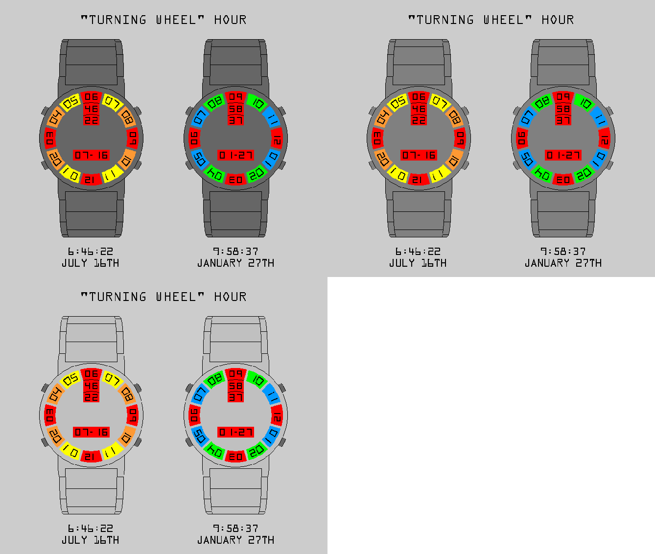
– The case is in polished metal and have 13 cut-out holes filled with a plastic “crystal”, which is tinted or clear.

To tell the time, you simply have to use the column at 12 o’clock. The number at the top is the hour. The number in the middle is the minute. The number at the bottom is the second.
There’s a date window between the 8 and 4 o’clock: Month at the left and date at the right.
I made 6 type of display:
– “Retrograde turning wheel” under a 3 colors tinted crystal.
– “Retrograde turning wheel” under a 12 colors tinted crystal.
– “Retrograde turning wheel” under a clear crystal.
– Note: the hour numbers can go clockwise or counter clockwise.
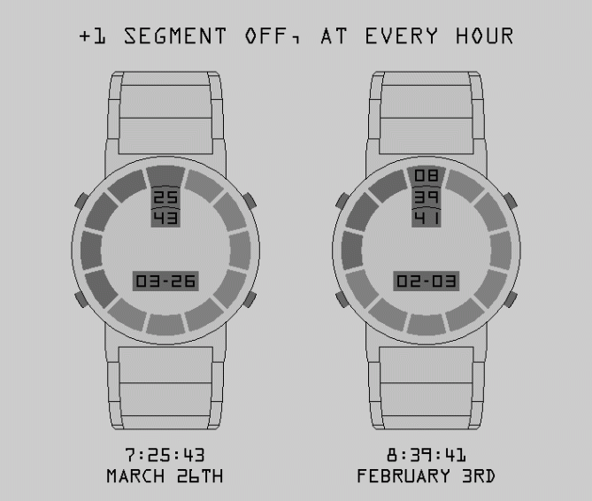
– Multiple segments off, with or without the hour digits.
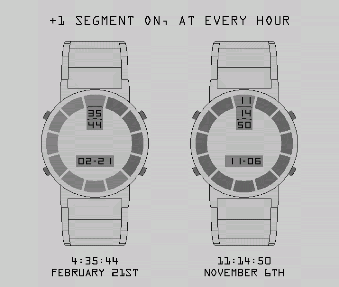
– Multiple segments on, with or without the hour digits.
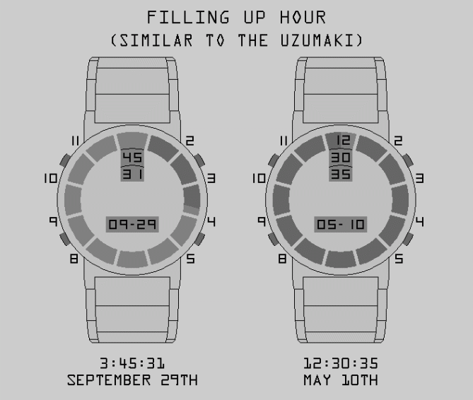
– “Filling-up” hour, comparable to the “Uzumaki”, with or without the hour digits.

People who like retrograde movement and turning wheel are the target market. It can also be good for people who like the 12 colors system but find it too hard to remember which color equal which hour.
Using a covered LCD screen to imitate a turning wheel and having the time in a column at the 12 o’clock position make it stand out.


Hi Matt, this is a good idea and it is easy to read.
There is work in your representation and it would be nice to have a few comments of my buddies of Blog.
For me, this is 5 * and Yes to your thinking and your work.
LikeLike
I was born in 70 so I am very suprised that to this day I’ve never seen someone wearing a Chromachron before. I think those are pretty damn cool for the time. With that said, I think your design would be more in the Chromachron spirit if the hour/minute/second occupied a singular wedge shape that cuts down to the center as the original did (since it’s basically wasted space here).
LikeLike
Do you mean having a bigger rectangle? BTW, the 2 black lines between the digits are on the LCD screen. They are there to imitate turning wheels, but could be removed.
Another possibility would be to have the name engraved, or written, at the center. But, I prefer a fully polished look. ( or having weekday on top of the month-day )
Thank you for taking the time to share idea.
LikeLike
The month-day window could be higher.
LikeLike
I’ve made my design with a 45mm case. Based on that, the “wasted space” between the seconds and the month-date is ~ 10.5 mm.
LikeLike
Looks very detailed and would always look interesting. I think I would prefer a mono-chrome one with a turned steel looking face. Very classic looking. 5/Y best of luck sir! 😀
LikeLike
Do you mean something like this : http://www.decotonesurfaces.com/images/products/detail/ENGINE_TURN_BACK_SPLASH.jpg
That would be nice. A “vinyl spiral” look would also be nice.
LikeLike
I really like the concept
My support. Good luck Matt
5/Y_ 🙂
LikeLike