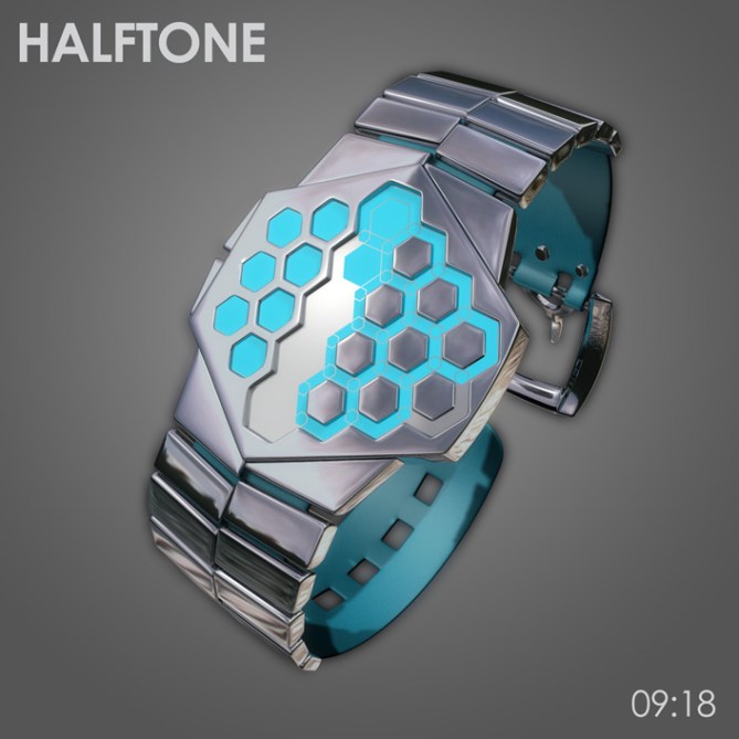
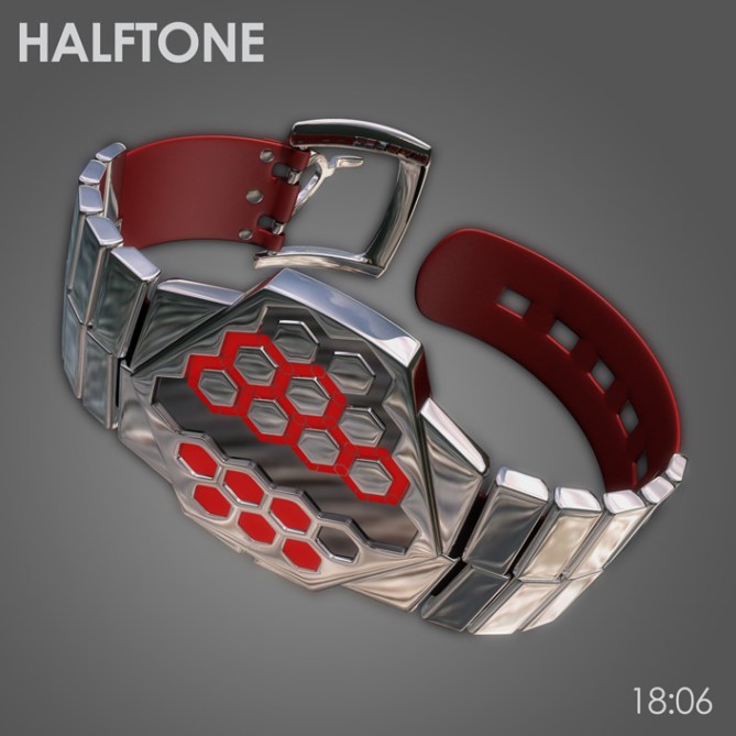
Design submitted by Anders from Sweden.
Anders says: Being an illustrator, I’m familiar with raster patterns. I realized this could be used in a watch display. Taking my design cue from halftone rasters used in graphic novels and design, as well as on the edges of some car and train windows, I came up with this hexagonal display.

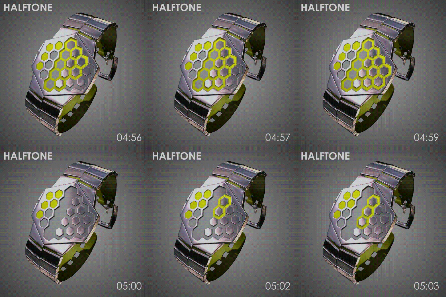
The display is a 12-5-9 format, with the solid hexagons on one side and the middle denoting hours, the rings around the rightmost hour markers denoting 5-minute groups and the hexagonal rings on the other side denoting single minutes. The display is mirror LCD and as such, always on.

To give the concept a unique feel, I decided on a combination of leather strap and metal link for these images. The links are simply clamped onto the leather for ease of adjustment. The skewed links in combination with the angular display elements gives an elegant, almost austere look.

The angular styling and half-link strap gives it a masculine look, so the main audience is most likely men who wish to make a stylish statement by their choice of watch. A circular variant is possible, and may be more unisex. Material choices are many; chrome, gunmetal, acetate, even wood.


I love the look! I’m getting the minutes, but can’t figure out the hours. It looks like you said the hours are the hexagons on the left, AND the middle, but when I look at the examples, it seems the middle line is the first digit of the minutes.
I would definitely buy this though; I’m sure once I figure out how to read it, I’ll be able to glance at it and quickly know the time. I have the Kisai X currently. This would be the 2nd I would buy, if it gets made.
LikeLike
Thanks for the comment Alan!
It might have been clearer if I’d made a diagram, since it is a bit tricky to explain in text… All the hour markers are same size, solid hexagons. In the middle row each hour marker is surrounded by a 10-minute marker (of which there are five), and to the right of these are the single minute markers. The 10-minute markers and single minute markers are all identical. In the animation you can see all the 10-minute markers lit while the time is 04:50-something. The unlit hexagons inside the 10-minute markers are the last five hour markers. Hope that helps! If not give us a shout and I’ll try again. =)
Glad to hear that you’re a prospective buyer, I certainly hope you’ll get the chance to wear one! =)
LikeLike
It took me a few moments to understand the hours and five minute hexes in the middle of the display. I think it’s initially confusing as they blend into the single minutes. I think I would have been tempted to have a divider between the middle row and the single minutes. I know this would dilute the theme ever so slightly because you loose the transition between the two styles of hex a little but would make time reading easier. That’s the only niggle I have with the concept! 5/Y best of luck sir! 😀
LikeLike
I see what you mean, but I think it’s mostly a matter of habit. I tried a couple of different looks for the display, but this was the prettiest I could come up with…=)
It might be possible to differentiate them by colours, although that’d spoil the effect a bit too. Different shades or intensities of the same colour perhaps?
LikeLike
Its not really an issue to be honest. If you did what I suggested you would probably loose the continuity. The single minute hexes overlap each other so if you seperated the hour/5min hexes from them there would be three seperate zones which would probably spoil the nice effect that you have going on there.
Maybe if the hour hexes in the center had a visible border when not activated it would be clearer. Maybe just printed on the inside of the glass (which in itself links back to the theme) So you always see the 5 hour hexes even at 12 o’clock etc.
Anyway thats enough of me trying to teach my grandmother how to suck eggs! lol
LikeLike
Hi Anders, this is a beautiful work, I like the shape of the dial. I understand the point of Pete, but personally it does not bother me too much.
5 ° / Yes, nice work.
LikeLike
Thanks a lot Patrick! Glad you like it! =)
LikeLike
Thanks TF for putting this one up!
LikeLike
Hi, Anders! I like what you did with the recessed middle, all recessed then protruding hexes to differentiate. I’m not loving the staggered look of the band, as I don’t think it looks deliberate. I think it needs to mirror the symmetry you have going with the case, or pronounce the stagger of the band links. Beautiful renderings!
LikeLike
Thanks xian, glad you like it! I see what you mean about the strap. I was going for something subtle, but agree with you that it doesn’t quite work and needs to be either more pronounced or not at all. Thanks for the support! =)
LikeLike
This is a beautiful LCD display. It is a advanced technology in the watch.
LikeLike
Looks really cool Anders! 🙂
LikeLike
Is it just for left-handers? 🙂 Also, I’d prefer the strap to be all metal or the leather to be faux.
LikeLike
Cheers mushy! =)
Ah, you spotted that little detail? =)
I happen to be a lefty, so most of my designs tend to come out that way, but it’s not deliberate. This particular one is symmetrical, so could just be turned upside down (assuming the strap is symmetrical as well, of course).
Everyone’s got their own taste in straps, so I just try to make something that fits the rest of the design, and leave it up to TF to sort it out if they decide to pick it up. This’d work with either a link strap or leather (or one of the alternatives…) so could be offered in two versions. Hopefully…=)
LikeLike
hehe No worries Anders. I really just mentioned it cos I’m a veggie. 🙂
LikeLike
I like the watch and the combination strap – it all works for me. I quickly understood how to read the hours and minutes. Definitely 5*/Y.
However, I only see how to read this as a 12 hour watch, not 24 hour. For example, the black/green one (which I definitely want), I see as 04:42 – what makes this 16:42?
LikeLike
Thanks for the support Nev! Happy to hear the display didn’t cause you any problems.=)
You’re right, it’s a 12-hour display. The 16:42 comes from my tendency to want to have all ten digits represented in the sample times. For a display like this it’s not strictly necessary, but it’s become a reflex for me…=) I suppose am/pm could be differentiated by having a two-tone backlight, and switching between red for am and blue for pm (or something like that). The display is really too streamlined to add an LCD segment for it…
LikeLike
Hmmm the cyan one is for me 😀 I like the asymmetry mixed with the nicely placed hexagons. The display looks stylish, diversified (with these different way you handle the hexagon geometry) cryptic but easy. It’s just a bit confusing that the hours 8-12 don’t look like the hours 1-7. But I see, this area is a mix of the left and right area. It’s fine 🙂 I really like the colored LCD on chrome ❤ The way you handle the straps is interesting, starting segmented, ending softy. I'd wear it I think 🙂 Oh the black and white one looks cool too. Anders, this is a pretty good job. Good luck sir!!
LikeLike
Hehe, I hope you’ll get it! =)
Thanks for the good critique Sam, always nice when someone you respect likes your work! (which goes for the other commenters/contributors as well, I have to say).
Yeah, I wanted to do something a little bit different with the strap, and the idea of a mixed one had been rattling around in my brain for a while.
Thanks for the support!
LikeLike
I get it now. THANKS! And with regards to the band, I like it either the way it is, or more pronounced, like you mentioned in a different reply. (y)
LikeLike
(oops, that (y) was supposed to be a thumbs up) 😉
LikeLike
Good to hear that I didn’t write gibberish! =)
Thanks for the comments!
LikeLike
I like the asymmetrical case. I like the horizontally divided band & the metal/leather combo. I prefer the chrome version. Gunmetal would also be nice. (I’m not sure about acetate & don’t like the wood trend)
The red lights & the negative display are my fav. I would buy.
LikeLike