Design submitted by Patrick from France.
Patrick says: I was influenced, inter alia, by the watch of Sam “Echo” which I find really beautiful.

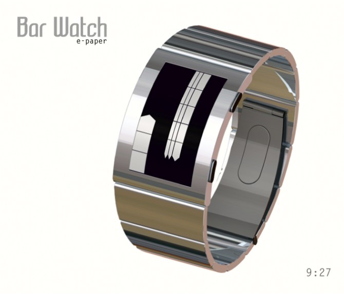
Its originality is due to its ultra-thin profile, it is curved through technology “e-paper”, a truly unique silhouette.
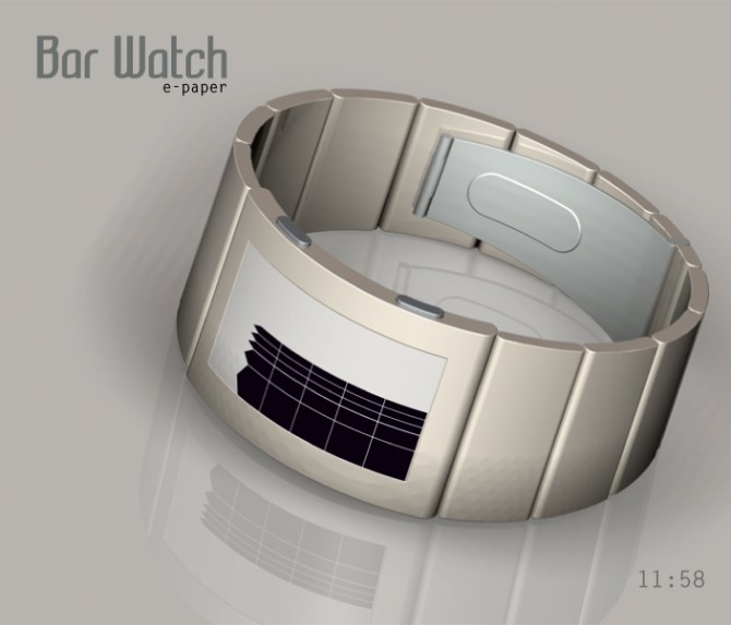
The dial displays into positive or negative according to your choice.

Its clean lines and easy to read meet the aesthetic needs of modern men and women.
With its curved dial which marries perfectly the wrist and its unique reading.


Oh now I understand – the first image has a negative display 😉 I like the general idea of those arrows. I tried something like this for Echo but it didn’t look good there. I like it here and I have some suggestions:
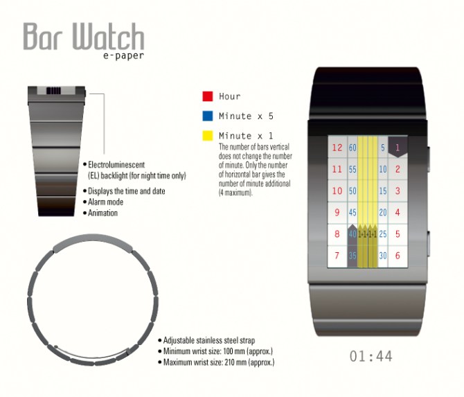
I think the segment gaps should be ^ too, then it would look more cool I think. The angle of the ^ could be the same for all bars, but then they don’t have the same height… worth trying. The gaps in the four additional minute bars can leave, because you don’t count the segments there, only the bars.
E-paper is a fine choice. It can be colored too for more diversion in the shop. I wish you good luck Patrick! 4*/YES and crossing fingers 🙂
LikeLike
Sam thank you for your advice. I agree to the bars of minutes with unnecessary additional segments (it was more for the graphics side), by cons, I did not understand for the same angle all the bars (the translation distorts the details of your suggestion?), could you give me a rough sketch just so I understand better? (without losing your precious time).
Thank you for your good ideas and your vote!
LikeLike
Oh the big ^ and the small ^ have the same height, so the angles of the big ones are more flat and the angles of the small ones are more steep. I would suggest to have the same angles everywhere for more harmony.
LikeLike
Ah Ok Sam, I understood, only the height of the arrows will vary, not the points, but the sides of the arrows will be higher for the small bars and low for large the bars, which will generate a staircase. Why not?
LikeLike
With all due respect, Sam, I for one prefer the arrows to have unique angles on them. I think it’s more interesting. I do agree with Sam in using ^ segments.
LikeLike
hihi 😀 different tastes are fun
LikeLike
With different angles of arrows, we know immediately if these bars indicate the hours and minutes?
LikeLike
Thank you with all the Tokyoflash team for the publication for this new project.
LikeLike
I like the general look and feel of this design. I agree with Sam’s suggestion regarding the chevron segmentation. Also I would suggest a reveal mode showing the numbers while people get used to the layout of the blocks. Its kinda tempting to suggest that the blocks correspond to standard analogue positions but that might destroy the concepts integrity. Details aside, looks nice! 5/Y Best of luck sir! 😀
LikeLike
Pete, thank you for your comments and your vote.
LikeLike
Love it – super stylish! 5y
LikeLike
dzign555, thank you for your appreciation and your vote.
LikeLike
It looks really nice Patrick. 5Y (voted earlier) 😉
LikeLike
Hi Lloyd, I am pleased that this new project you like it, thank you for your vote.
I waited impatiently, the opinion of the avatar of the kitten under scintillating stars.
LikeLike
Wow! Classy!!!
LikeLike
Thank you very much Sylvie!
LikeLike
So nice and pretty.
LikeLike
Glad you like this model, Lola!
LikeLike
A design very interesting and different from your style Patrick.
I agree with previous comments and I can not contribute anything constructive except my support to this concept.
Good luck. 5*/Y 🙂
LikeLike
Jose, thank you very much for your comment and your vote.
LikeLike
I prefer the negative display. I like that the last block end with ^, instead of ending flat. I like the idea to divide the hours, & 5 minutes blocks, in 2 columns. I like that the columns have different width.
LikeLike
Hi Makkovik, in the final analysis, this watch do you like? It is brilliant!
LikeLike
I like it & I would buy it.
LikeLike
Great!
LikeLike