Design submitted by Peter from the UK.
Peter says: The idea for this design is kind of inspired by a combination or jewellery and electronics controls and a previous design called “Glow”.


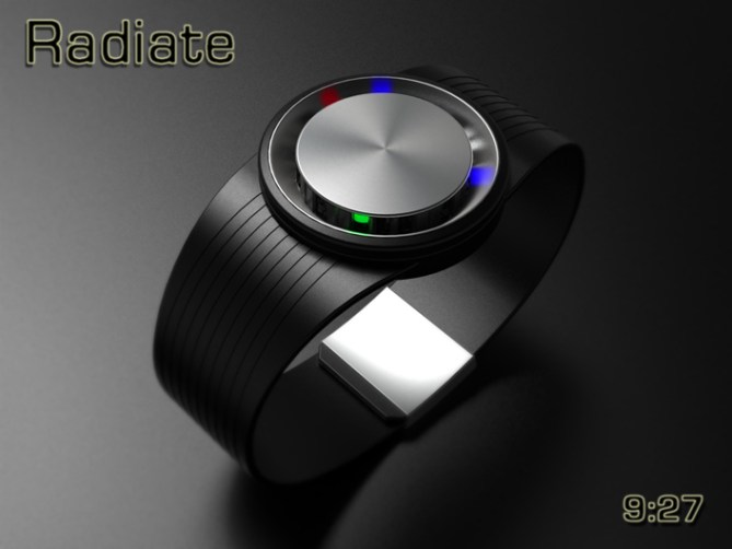
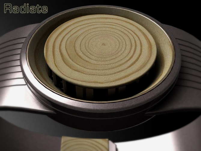
The basic premiss of this design is a central hub which looks like a knurled control knob. This hub contains an array of LEDs that display the time in an analogue format.
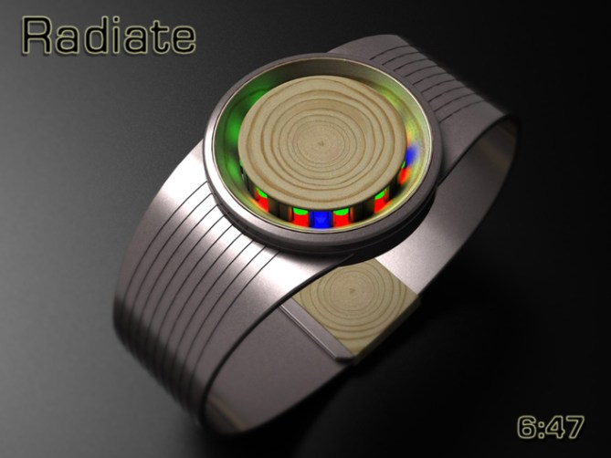
The time is told by the hub mounted LEDs in an analogue format, the 12 red LEDs display the hours, the 12 green LEDs display 5 minute groups and the 4 pairs of blue LEDs display single minutes. The LEDs don’t directly display the time but illuminate the angled ring surrounding the hub in a similar style to “Glow”


This design is simple and clutter free in style. This allows different combinations of material and finish allowing for a understated elegance. The time telling is conventional enough to be easily understood and intuitive whilst looking individual, this should suite the individuals and the masses.
The simple stark looking face and glowing display sets this design apart from others. The LEDs give a technical look combined with quality materials and finishes that give an overall expensive feel.


Thanks TF for adding this design to the blog too! 😀
LikeLike
Now this… Brilliant idea well executed, I say. I really like the minimalism, the geometric shapes and the twist of showing the glow of the LEDs rather than the LEDs themselves. I like the idea of the tree rings in the wood version, but I’m not sure it quite works, unfortunately. Anyway, top marks!
LikeLike
Thanks a lot Anders. Which bit are you unsure if it works? the time telling or the aesthetic?
Cheers for the feedback and the support! 😀
LikeLike
I’m unsure about the wood as shown (in relation to the rest of the watch), even though I really like the idea of showing the growth rings…
LikeLike
Fair enough, its a subjective thing I guess. I was attempting to be all sophisticated. Not easy when you a beer swigging commoner such as myself! lol
LikeLike
Looks really good Pete. I agree with Anders, cool shape and interesting way to show the light. Time telling is looking confusing with these three colors but is super simple once you know what they mean. Diversified display rocks. Wanna 😀
LikeLike
Yeah the time telling is a glorified version of RPM but with the single minutes even distrubuted around the perimeter. Its pretty simple when you know the layout. Cheets for the comment and the support! 😀
LikeLike
It is a good idea, I just hope that this bright LED projection is quite visible in a lighted environment?
5 * / Yes, of course.
LikeLike
Hi Patrick, I think with the right LEDs and the right materials for the light to reflect/bounce off it would be pretty clear. The central hub could always be tapered a little so you see part of the lights too if there were concerns of un-sufficient illumination. Cheers for the vote sir! 😀
LikeLike
Yes Pete, with a small effect on the conical central core and the problem is solved.
(I can not wait to see the “Shuriken” on the blog)
LikeLike
Yeah cheers Patrick, maybe a few degrees of angle will make the world of difference.
Ah I see you have been by my fb page. Yeah hopefully it wont take too long for Shuriken to hit the blog, I do have a bit of a submission back-log! lol
LikeLike
Its a great job Pete. Congrats.
(https://blog.tokyoflash.com/2010/11/led-reflection-watch-design/ 😉 )
5/Y
LikeLike
Cool! I hadn’t seen that design before (it preceeds my participation on the blog) if we both had the same idea independantly it must mean it has merit! ;D Cheers for the support Laszlo! 😀
LikeLike
That’s sharp-looking, Laszlo! What’s TF waiting for?
LikeLike
Hey, Pete! I dig the indirect lighting from the LEDs, I think that is sweet. Reminds me of a Sony XBR flatpanel that had a clear bezel with floating LEDs, created by refraction–coolest feature on a set beyond the image itself. I say no to the wood grain unless you somehow swap out the LEDs with micro solar cells, to stay in the green theme!
LikeLike
Nice feedback Xian! I’ll keep my eye out for that sony product you mentioned, sounds interesting.
Yeah the wood aint for everyone, the solar cells would look cool but how would the time be displayed? Maybe the LEDs just need to be green so they have a chlorophyll like look 😉 Cheers for the comment sir! 😀
LikeLike
I spotted that Sony tv years ago, like ’05 maybe? I’ve never seen refraction used like it did, the light just floated with no circuits running to it, just clear plastic all sides. I think the light shown from behind the screen straight down onto a rectangular surface, angled 45 degrees so the light reflected straight ahead as a square.
LikeLike
Looks very nice Pete! I gave it 5Y on Friday. I like the silver one with the black middle best. 🙂 I like the time-telling method which looks crazy until you know what’s going on. 🙂 Good job!
LikeLike
Very kind sir! a fine colour selection! (altho its meant to be white! lolol) 😀
LikeLike
hehe sorry. I can see that now it’s daytime.
LikeLike
The design doesn’t grab me so much, but the time-telling is an awesome idea! Great job!
LikeLike
And 5y…
LikeLike
1 out of 2 ain’t bad (that’s sounds like a MeatLoaf song! lol) any suggestions on design improvements? Just invade TF have inclinations towards this one (clutches at straws! lol) cheers for the support! 😀
LikeLike
*incase
LikeLike
Hi ! really nice design. I like the one with the wood, the alliance of metal and wood, nature and technology. It sounds a little bit like wookie technology ! May be you should try some ebene wood, it would be dark, like clarinets, and it’s a really strong wood. Ally some silver metal with ebene is always beautyful as berber jewelry (could look to google image with the French words : bijoux berberes ebene it display directly what I mean, more than the research in english.)
And I prefer the first 2 to the last one. The reflect of the last one is not so smooth, and feel less harmonic to the watches, which is the global feeling I get about this watch : harmony.
The time is a little bit difficult to read if you don’t look from the top. But it’s a really cool design : 5 * !
PS : The idea of solar cell for alimentation is interesting. Maybe the central circle being one would be interesting !
But needs sunny days 😀
LikeLike
Hi Shana,
Thank your for the feedback and the material suggestions. The dark colour of the ebene wood does indeed work well with light coloured metals. It would make a very nice addition to the colour varients if the concept was taken further. BTW loving the “Wookie Technology” lable! 😀
Cheers for the comment and harmonious support! 😀
LikeLike
No problem.
In facts, i just thought that ebene wood being polished would reflect light quite well I think, like my clarinet.
And yeah, wookie label is cool 🙂
Shana
LikeLike
Master Pete,
An excellent job and a combination of materials and surprising.
For me the wood combination seems very appealing.
My support. 🙂
LikeLike
Thanks a lot for the support Jose, the wood version is my favorite too! It has a softer and warmer look than the more industrial materials. Maybe if were made out of recycled materials it would also appeal to the more enviromentally aware people too. Cheers for the feedback and vote sir! 😀
LikeLike
I like the overall look. My fav is the 1st model. I like the idea of using light reflection. (this might be bad during the day but would be very nice in night/nightlife events) When I saw it on FB, it was very intriguing.
Without markers, this one is comparable to some Movado (those that have a dot at 12 o’clock and nothing else), but without the “dress” look. (both type are good) This one is easier to tell the minute because of the 4 single-minute light & markers would be very bad.
Sadly, I can only give 5*.
LikeLike
Great feedback again sir! I think there are some good points and room for improvement here. Maybe instead of markers the reflective areas could be different materials or finishes to help define the highlighted areas. Cheers for the support even tho it’s not necessarily for you! 😀
LikeLike