Design submitted by Peter from the UK.
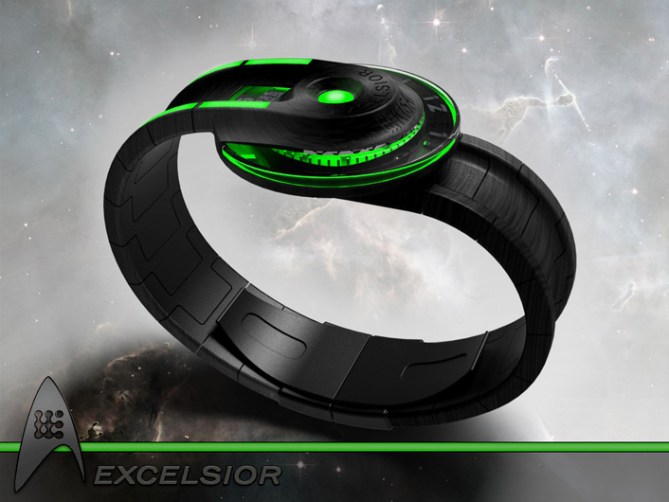
Peter says: I have submitted a few analogue designs in the past and most were perhaps a little too imaginative. They tended to be technically un-feasible and required expensive bespoke mechanisms to allow them to work. For this concept I decided to go back to basics and use a traditional disc style analogue time telling using similar construction to “Uzumaki”

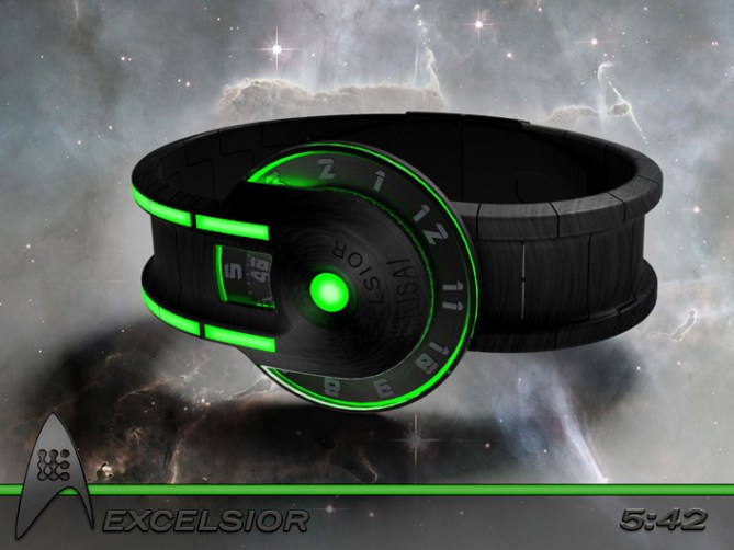
The time telling is told by two (maybe three) analogue discs that describe the hours and minutes (and possibly seconds) using similar materials to “Uzumaki” linked to a conventional off the shelf analogue movement.
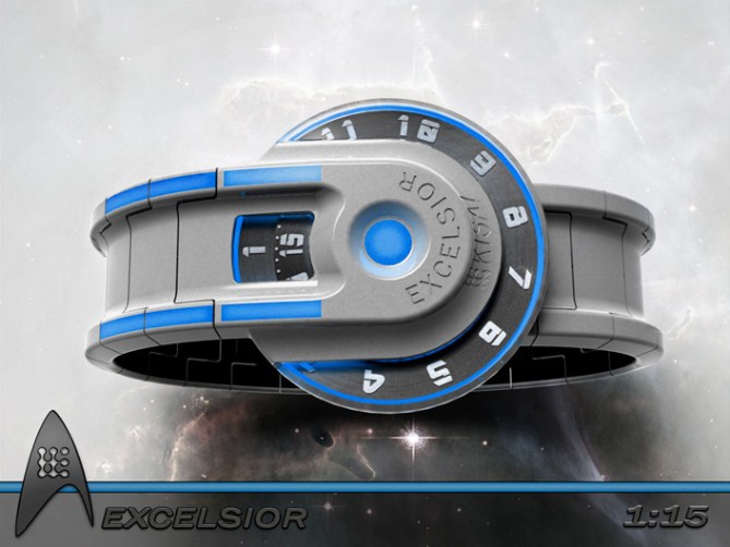
The discs in my example have cryptic looking numbers (in a sci-fi looking font) to highlight the time, these numbers could easily be replace by Kanji or maybe Klingon numerals for a more exotic look.


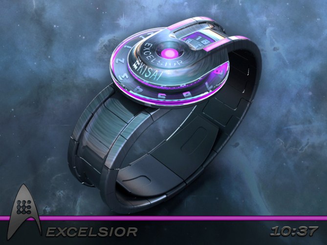
To make this design stand out the rest of the watch is inspired by star trek space ship designs. The watch features a a-symetrical case where one half of the strap attaches on the top of the watch and the other end attaches on the underside. This allows for a large internal space for mechanism and electronics etc. The display part of the watch would be a larger diameter but thinner which would make the watch look less clunky than it actually is.


The unusual layout combined with analogue disc time telling and funky backlighting/LEDs gives the watch an unusual but somehow familer look. This look should appeal to sci-fi and steampunkt lovers alike. The watch has the possiblity of being both extrovert and subtle at the same time. The extra LEDs in my example are mainly for decoration and extension of the theme but could also be used to display extra information (like am/pm indicators etc)


The combination of sci-fi looks, conventional time telling and construction set this design from others. The funky lighing schemes combined with a selection of materials and finishes allows the wearer to stand out form the crowd and to boldy go where no other watch wearer has gone before!!


Probably a bit out there for me, but looks pretty awesome. Five and yes! TF it’s “boldly”.
LikeLike
Too much for even you? Hehe cheers for the feedback and the vote DZ! \//_
LikeLike
Haha…I guess a watch box that serves breakfast is pretty cooky. Aspects of this watch remind me of Storm watches…
LikeLike
I guess there are many types of “unhinged” lol
Umm Storm watches, I like Storm stuff so thats quite a compliment 😀
LikeLike
Don’t like the multi-coloured version in the first couple of pics. Think the black/green and black/purple version looks great. Not sure about the writing stating the name of the watch either, but apart from those small niggles, love it.
LikeLike
Cheers for the feedback Davey! There is always plenty of scope for tweaks and changes for a concept at this stage. These are all refinable details if TF chose to develop the concept further. Cheers for the comment and vote! 😀
LikeLike
Thanks TF for adding this design to the blog! 😀 @=
LikeLike
Big yes for “Enterprise Watch” !
I hesitate between the green version or blue version?
It will be necessary that I order both.
5 stars !
LikeLike
hehe, picking the colour of the one I would want to buy…….that would be a nice burden to have! Cheers Patrick! 😀
LikeLike
Having avidly looked at every blog idea posted on Facebook and never commented, I feel compelled to this time. This watch HAS To be made!
LikeLike
Wow, now thats an endorsement! Thanks a lot Kris! You are always welcome here sir! 😀
LikeLike
Stellar! Seriously, no pun intended…=) This is the best concept I’ve seen for a good while, and hands down the best movie/tv-inspired one yet. It echoes the look of the Trek ships just enough for it to be recognisable, without falling into the trap of being gimmicky. And the images (love the backgrounds) are just the icing on the cake. That said, however, I’m not sure I would buy one, but if I did mine’d be a green one. =) Regardless of whether I’d get one though, this certinly deserves to be made. Fingers crossed it won’t run into any deep space IP minefields.
Keep doing good work, it’s great to see!
LikeLike
Thanks a lot Anders, cheers for the support even tho it might no be for you! Maybe the borg mind probing will convince you if it should be chosen for further development! 😀
LikeLike
http://technabob.com/blog/2013/04/29/starship-excelsior-watch-concept/
LikeLike
http://fashionablygeek.com/watches/star-trek-starship-excelsior-watch/
LikeLike
this design good but im not sure this will be comfortable to be used
LikeLike
Hi Changbachang, Im sure if TF were to develop this idea further they would make sure that the watch is practical and comfortable for the majority of wrists. Cheers for the feedback! 😀
LikeLike
Hey, Pete. I like the openness and asymmetry of the disc design, it seems very unique in that sense. My vote would be for the green as well. This design reminds me of a serpent, with the disc being the head eating the tail.
LikeLike
Thanks a lot Xian, I like the way you see the design. If you like the old snake eating its tail imagery check out “Ouroboros” which is a classic design by Gordon, its pretty darn coolio! 😀
Cheers for the great comment! 😀
LikeLike
Ooooh! That IS cool!
LikeLike
“Yumm yumm yumm yumm yumm” <– that's me, sitting in front of the screen, looking at the watch. I like the dark one with orange and blue and the starfleety grey one! Very nice analog watch concept sir. I'd like to have the chance to buy one. Oh yes.
LikeLike
We need one of them Starfleet replicators, that would allow us to have the watch and a snack to satisfy your yumming needs! I’m glad you likey sir, the orange and blue LEDs one is my favourite and the most literal I guess. Fingers crossed TF make it so, and engage development at warp factor 9! 😀
LikeLike
Stunning graphics and presentation Pete! I just wish the time-telling was a bit more interesting or different. Also the whole design just reminds me of those old hand-held label printers to be honest. Anyway, you definitely deserve 5y. 🙂 Good luck with it.
LikeLike
I have tried to keep the feasibility alive by using conventional discs to tell the time, so to make the time telling more interesting it would really need to be kept to unusual numbers, fonts or symbols. I mentioned in the text that these could be kanji or Klingon etc if a more unusual look was required, but I welcome any other suggestions that would be in keeping with the overall scheme. Star constellations might make nice numbers for example or alien species insignia etc etc. Cheers for the feedback, vote and luck sir! 😀
LikeLike
artistically, this is really amazing work, pete. it really captures the feel of sci-fi and star trek, without being a copy of anything. the time telling is easy and looks great. i’m not sure whether I would buy one, but if I did, it would probably be the off-white with blue. 🙂 5* and good luck!
LikeLike
Thanks a lot Heather! Yeah it might be a bit chunky and lacking in subtlety for a ladies wrist. Maybe a shuttle craft version would be more suitable 😉 cheers for the support and the vote! 😀
LikeLike
Love it, great layouts
LikeLike
Short and sweet and very much to the point! Thanks a lot Gordon! 😀
LikeLike
Wow what an amazing & enterprising analogue concept.
LikeLike
hehe nice one Andrew, I’ll have to Klingon to that phrase! 😉
LikeLike
TAKE MY MONEY! HERE! I really like the multicolored version. It gives it a more “traditional” sci-fi star trek esque feeling. The other ones just look to “modern”. Sound effects/Alarm would be nice as well… I can’t think of anything to improve on your concept really…
LikeLike
Great comment Keren! The multi coloured one is my favourite one too! Yeah a self destruct sequence warning would make a great alarm sound! hehe
The main it could be improved is to be made and sported on the wrists of you guys! Cheers! 😀
LikeLike
Very nice, please beam one over to me! Otherwise i would be happy to buy one…
LikeLike
Thanks a lot Jan, hopefully TF has got tha power captin! Cheers for the Stella comment! O=
LikeLike
Hello to all,
Where can I buy this watch?
I love this watch!!
LikeLike
Thanks a lot Eli for the interest!
That is the one question we would all like to know the answer to 😉 Fingers crossed it will be available for purchase on the “watches” page of the website in about a year if the TF gods are kind! 😀
Cheers for the support and the comment! 😀
LikeLike
Awesome, I want them all, brilliant design, love the lighting, love everything about this watch, there isn’t a trekkie out there that wouldn’t want one of these. 🙂 🙂 please send me one to test.
LikeLike
Thanks a lot Ian. I hope that TF could beam one too you in the not too distant future. If that happened happened my face would be set to stun! lol Cheers for the support! 😀
LikeLike
http://www.tuvie.com/excelsior-watch-is-an-ideal-watch-for-all-trekkies/
LikeLike
I like the overall look. My fav is the red/black.
However I would prefer if the names weren’t there. ( I’m not a fan of Star Trek ) The logo could be engraved in the center. ( or replace the “EL” )
LikeLike
Interesting feedback Makko, there is plenty of scope for tweaking details like the logo. It’s not a significant feature to me so if that was something TF wanted to change if they developed it further that wouldn’t be an issue. Cheers for the feedback! 😉
LikeLike
http://www.hispotion.com/excelsior-watch-8223
LikeLike
http://designsandprojects.com/2013/05/31/tokyoflash-excelsior-watch/
LikeLike
http://chickgeek.org/excelsior-watch/
LikeLike
http://www.trendhunter.com/trends/excelsior-watch
LikeLike
http://www.i4u.com/2013/05/star-trek/watch-excelsior-ideal-all-trekkies-watch
LikeLike
http://technewsnow.com/news/excelsior-starship-watch-concept-it-s-federation-time
LikeLike
http://h-i-g-h.org/the-clock-in-the-style-of-a-spaceship-excelsior/#
LikeLike
Only a few hours left in this galaxy for Excelsior, so all that’s left is to sign off the Captin’s log on this star-date.
Cheers to everyone who voted, commented, shared and supported this post and big thanks to TF for adding it here.
Cheers and live long and prosper! \//_
Pete from the federation! 😀
LikeLike