Design submitted by Clarence-Junius from the USA.
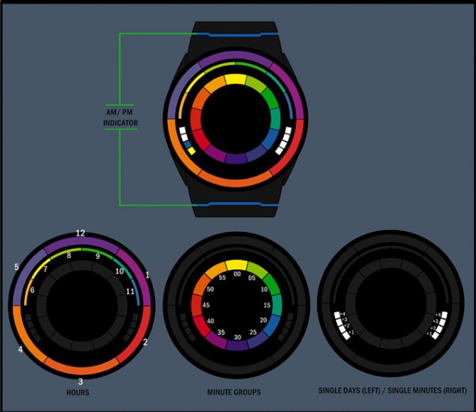
Clarence-Junius says: As an artist I use the color wheel a lot which inspired me to use that as a theme for this design. The vivid hues of a color wheel would look great as a time piece.

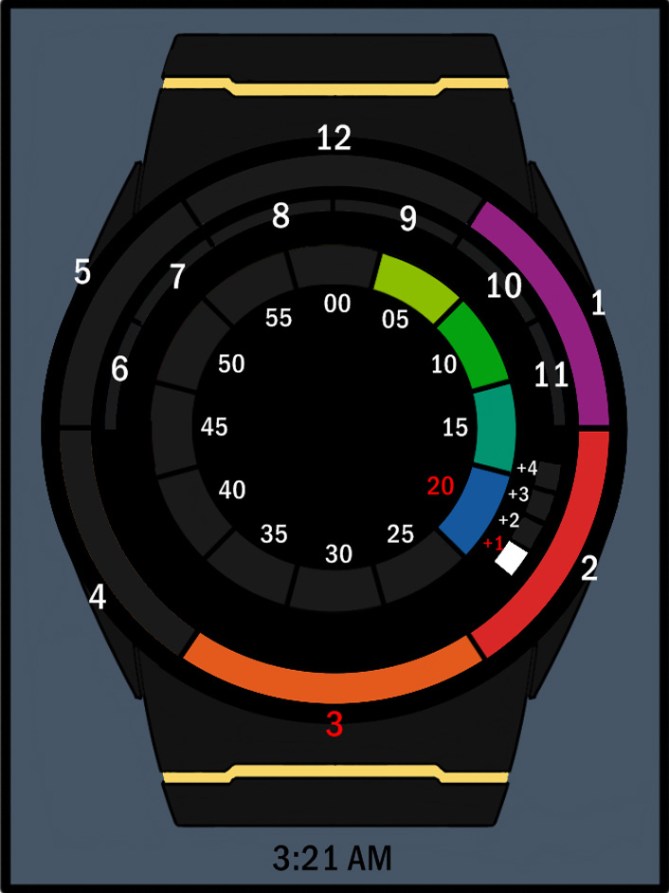
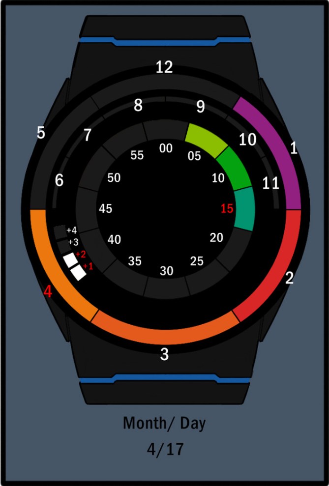
Users view the outer/inner half ring lights to read hours followed by the center ring lights in five minute intervals which are positioned like a standard clock. Four single minute blocks for reading the exact time and AM/PM indicator lights located on the body of the timepiece.

I can envision artist and designers sporting this model along with fashion savvy individuals.
In choosing a multi-color design the vivid blocked colors using LEDs will make it easy to read and cool to look at. Sleek minimal case design with touch button features commonly placed on the side along with multi-color strip AM/PM indicator gracing the strap anchors.


This one looks nice. First I thought that’s too many colors but they are so mild, they make an aesthetic artwork. Nice mixture of black, colors and white. Time reading works good. Takes not much practice. I can see this to be an LED watch as well as an LCD watch which is always on. I like the simple but elegant shape of the watch. Very nice work!
LikeLike
Hi, CJ! I dig the colors, they are harmonious and vivid. Having the am/pm indicators off the face is very different, though you have plenty of room in the face’s center (maybe two semi-cirlces, or continuations of the single day/single minutes sectors?). The only real suggestion I would make is to have the single minutes grow from the opposite end, as everything else on the watch grows clockwise. I understand why you made it mirrored for aesthetic reasons, but it’s something to consider; they could still be mirrored if all single day and all single minutes were lit.
LikeLike
Looks pretty funky! and would never look boring that is for sure. I would probably have trouble remembering which light was for which number so I would be tempted to have the numbers “etched” into the watch under the appropriate light. So it is easy enough for slow learners like me but subtle enough that it doesn’t spoil the look. 5/Y Welcome to the blog! 😀
LikeLike
Hey thanks guys for the reply’s.
Thank you Samukun! I had a lot of fun designing it!
Hey thanks for the thought Xian!
Pete thats the good thing about this design. You are not required to remember the color corresponding to the hour or minutes. All you do is count the colored hour lights that are lit. Minutes groups are easy as they are positioned just like a real clock.
LikeLike
Interesting concept well explained.
I think the reading system is a bit hard to handle day to day (but with time you can learn)
Welcome to the blog. Good luck sir!!
LikeLike
Thank you Joe! Its unfortunate I dont have 3D rendering kills or the programs. Working on changing that.
LikeLike
The idea of using different colors without a meaning is nice.
But, I don’t like the way the hours are going. The am/pm could be over the 3rd hour. The 4 single minutes should be vertically inverted ( going 1 to 4 clockwise at the right & stay th same at the left)
I like that the single date are separated from the single minute : that’s a cleaver way to not have a date indicator.
LikeLike
Cool, appreciate the critique!
LikeLike