Design submitted by Sam from Germany.
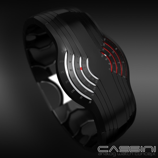
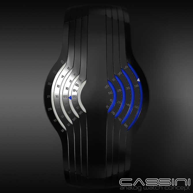
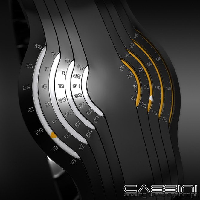
Sam says: I thought about splitting up the information of an analog display up into several ring segments. The result is the Cassini.

The watch works with a traditional analog mechanism but it doesn’t look traditional at all. There are two groups of four ring segments – one for the hours, one for the minutes. Each segment is accompanied by a scale and a little cursor shows the current hour or minute in analog precision.
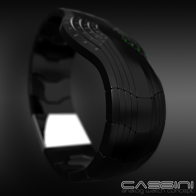
I like all-around-the-wrist elements in a watch so I let the ring segments extend into thin lines that continue in the straps. This gives the watch an elegant appearance. The Cassini is a watch for those who like a fashionable mechanical watch with an unusual and easy to read display.


i love it. it looks very elegant and sophisticated.
i love that it works with an analog mechanism, while it looks so different from a traditional analog watch.
the way the lines flow all around the wrist along the strap links is beautiful.
the two-tone hour/minute display is very appealing.
5*/absolutely yes.
as always, nice work, sam!
LikeLike
Thank you for your perspective – sounds really good 🙂 Et merci bien pour le support!!
LikeLike
Very nice!
LikeLike
Thanks, Gordon!
LikeLike
Looks awesome sauce Sam! I’m just trying to get my head around how it would work, am I right in thinking that you would have discs with dots at certain PCDs and intervals? So when one goes off the scale the next begins on the next? If it can be done, count me in! 5/Y best of luck Sam! 😀
LikeLike
Mmm sauce =)~
I don’t know PCD. Googling offered Pussycat Dolls and post creep depression :° But I understand intervals and can say yes, once the dot disappears, another one appears in the next scale. It’s just a logistical twist. Thanks a lot for your thought and the support!
LikeLike
PCD = Pitch – circle – diameter. Meaning that the dots are at different distances from the centre and at different pitches around the diameter to relate to your viewing scales/windows. Like Anders I wonder how the presuambly two discs overlap etc. But we are probably getting too hung up on the technicalities. Im sure TF have that angle covered! 😀 in short its S.E.X.Y!
LikeLike
Cool! Images look super, as per usual. I really like the segmented look. Almost minimalistic, which is a plus in my book, but I can’t help wonder how you’d make the display work as it looks. I assume it’s supposed to be two overlapping discs, but exactly how they’d overlap to avoid obscuring or interfering with one another I can’t quite work out.
Another tiny little thing is I’d like to see the ’00’ on the outermost hour segment replaced with ’24’.
All in all, solid work!
LikeLike
Hehe, I can tell you there is a little trick that makes it work. I hope 😉 I totally agree with the ’24’! We start with 00 and end with 24 – so the upper right 00 has to be 24. Thank you Anders for the insight and the compliment!!
LikeLike
There’s usually a trick, I’m just wondering what it is…=)
Each one on its own would be very simple, just a disc with four indicators spaced 90 degrees apart at different distances from the center to match up with the respective ring segment. Both together is where the troubles start.
One way would be to fold the discs in half to avoid overlap, but that’s not simple, and probably not very do-able.
Another way would be to have transparent discs with only the indicators printed on them, but then you’d need to have arcs of different radii to avoid showing minute indicators in the hour segments and vice versa, and judging from the images the segments on the right and left are the same sizes. So that can’t be it…=)
There might be one disc for each segment, but then the indicators would need to be ‘rewound’ once every hour for the minutes and once every 24 hours for the hours. And that somehow doesn’t seem elegant enough…
Oh, now I think I might have got it. There are transparent discs, and the indicators on one side are the same colour as the background of the other side, so when they move across that side you don’t see them. The question is just what happens when an indicator on the upper disc moves over an indicator on the lower one… Hmmm, back to the drawing board for me perhaps?
No problem, good luck with it!
LikeLike
I think its possible to have a 24hr analogue movement, so that makes things easier.
As for 00 or 24, thats interesting – really you are free to do either, but the standard way is 00 i believe.
I like Anders idea to have both.
LikeLike
Hi Toky 🙂
I also like the idea of having 00 at the beginning and 24 at the end. Much better.
If what I imagined works, it’s a pretty simple watch in the end 😉
Thanks for coming by!
LikeLike
I prefer ending it with 00.
When I see Retrogade watches, I see them starting & ending with the same number.
IE. : If it was a 12 hours format, it would start & end with “12”.
LikeLike
Wow, love the design and since it is an analog watch an automatic drive would perfectly fit this design. Have you thought on how to realize the deign technically? I was thinking of a disc system, but than again you would a lot of discs to realize this design. I love the design and hope it will become reality.
LikeLike
Hi Spencer! I started this design with an idea about how to make this work. It works in the computer with not much effort but if it can be done in reality, I’m not sure. But I think so. Thank you for the nice words!!
LikeLike
I have a design I worked in 2012 that uses a similar concept but upon examining Sam’s movement the issue is there is a point at which the two hand will intersect each other and overlap the time. If you want this to work I recommend an LCD design instead of a mechanical movement. Other wise you’ll need a very complex retrograde movement for this in a multiple layer fashion.
LikeLike
Hi Takuma-San 🙂 I have a really simple movement in mind actually. I better don’t go into the details 😉 I agree, if LCD is easier to make, then ok. But one essential part of the watch is the fact that it’s analog, celebrating the circular path of the indicators. Can we see your concept somewhere?
Matta ne
LikeLike
Hi Sam, this is a very original Watch.
Maybe LCD to avoid mechanical problems with the discs?
5 * / Yes, beautiful project.
LikeLike
Maybe maybe ^^
Thank you very much for the nice words and your support!!
LikeLike
Very cool! I like complicated yet simple design. The fact that its analog watch make it easy to read despite its cryptic looking face. A well done from my buddy sama as usual!
LikeLike
Thank you very much for the review and the compliment F1R!
LikeLike
Love the design Sam, and hoping you use Kelly green for that last one–I can’t tell. How did you get the hour/minute markers to look engraved in your model? It looks amazing.
LikeLike
Thanks alot Chris! Suuure, that’s kelly green 😉 The engraving is done by a so called bump map. It’s like a texture (black/white image file) but used in a hidden way telling the texture where to be elevated or not. Here I said, wherever I use white, be engraved. SketchUp can’t do it without any plugin. You could fake it with a graphic program afterwards. But in the end, the concept counts, not the look. So if you try, do it for the training 😉
LikeLike
A good concept, a good name and a good development.
I like. My support to make it happen.
Good luck sir. 🙂
LikeLike
Thanks alot Jose! Nice of you 🙂
LikeLike
I love it !!!
LikeLike
Yoohoo!!
LikeLike
I want to one!! Please
I liked so much your design, the belt it diferent and beatiful. The concept to watch the hours is simples and efficient. The covination black / gold (yellow) is wonderful.
Very good design
LikeLike
Wow thank you for this enthusiastic comment! Gold is a good idea 🙂
LikeLike
Stunning work as per usual, this is another one I would love to have strapped to my wrist. My only trouble would be picking either a red or green display 5/Y
LikeLike
😉 Nice problem. Thank you Kraut!!
LikeLike
whoa!!! nicee! better than rogue!
LikeLike
Yay, thanks alot for telling!!
LikeLike
I like the overall look, mainly because I like retrograde watches.
My fav are the blue & red lights.
It remind me of some “Aeromatic” watches. They divide the time on 3 scales & uses central hand with 3 different lengths.
LikeLike
Thanks for the input Makk!! I didn’t fine Aeromatic watches with your description but different lengths sounds a but like what I did 🙂
LikeLike
LikeLike
that store have other models, some with 1 color, which are nicer.
LikeLike