Design submitted by Peter from the UK.
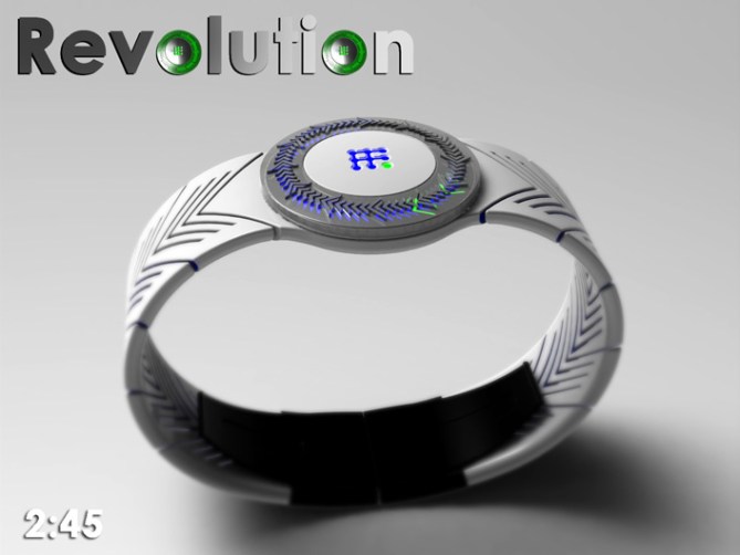
Peter says: A lot of watches have a bezel, some have it for practical reasons like for measuring a set period of time. Most however are just a styling element. The nice thing with most is that they often add a little detail and a tactile quality. I decided to use the bezel as the time telling feature of this design.
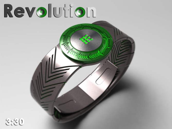

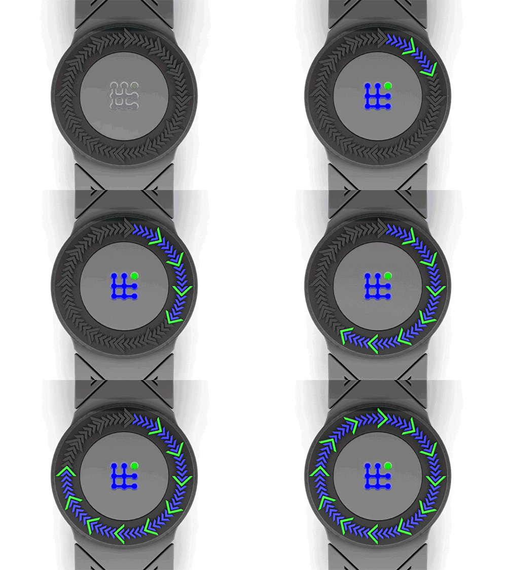
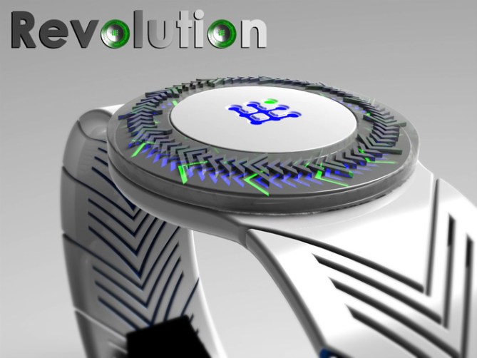
The time is told by a ring of arrow shaped LEDs underneath a transparent bezel.
The LEDs are illuminated to tell the time in an analogue format. The small arrows tell the minutes and the large tell the hours.
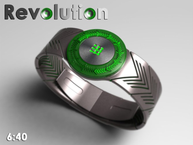

The design is bright and fun and would suite some flashy animations which will hopefully appeal to a wide audience both young and old. The time telling method is intuitive and easily read. The proportions are small enough to be described as unisex.
The bright LEDs shining through a colourful bezel set this design apart from others. The simple time telling method and fun animations add to the appeal.




Thanks TF for adding this design to the blog! 😀
LikeLike
yes very cool want it. 5 y
LikeLike
Most kind sir I thanky! 😀
LikeLike
One of each colour please 🙂 5/Y
LikeLike
Im glad you likey sir! 😉 Cheers for the comment and vote, thanks a lot KV! 😀
LikeLike
It’s not really my sort of thing Pete. But it’s very nicely done so I gave you 5Y earlier. 🙂
LikeLike
Cheers for the feedback Mushy! I must admit its not my favorit of my designs but I thought the time telling stylie was worth submitting so here we are. Cheers for the vote anyway 😀
LikeLike
A free Pete watch? Thanks, TF 🙂
5y
LikeLike
We can only hope 😉 Cheers for the comment and vote DZ! 😀
LikeLike
I like it cos it’s simple (easy to read, simple shapes, simple alignment, no unnecessary elements ) and it has a cool look ( trendy “forward” arrows alone are cool, in a group and animated definitely cool). Not sure why it doesn’t rock 100%ly. MaBe it’s not extreme enough but this is actually suitable for more people as it is. 5*/Yes and good luck Sir Peter
LikeLike
I know what you mean Sam, The looks somehow didnt work out as epic as they seemed in my minds eye. But I thought it was worthy of submission. Im glad you like the concept! Maybe with a little TF interpretation could be more than the sum of its parts. Cheers again! 😀
LikeLike
Hi, Pete! I like the arrows. It ends up looking like a woven braid, or an olive branch as would appear on an official seal. I don’t understand the purpose of the transparent bezel. It seems that might ‘muddy’ the appearance of the LEDs, or make it look cheap (Swatch). Ooh, but your concept has planted a seed in my mind for a new one….
LikeLike
Oh, and the band is supper sweet too!
LikeLike
Super. Haven’t finish my coffee.
LikeLike
I like the way you see the concept Xian! 😀 Although the concept started off about the bezel (mostly to do with that it could add a tactile quality) I must admit to looking at it now and wondering if it would look better without it (*looking at the exploded view) or if it should be simplified etc. Put it like this if TF were interested in developing the concept further I wouldn’t lose any sleep if they wanted to alter the bezel or remove it altogether. I guess that’s all part of the development process. And if the concept inspires a better design even better. Cheers for the feedback sir! 😀
PS is there any more coffee in the pot?
LikeLike
hey, pete. not one of my favorites, but i’ll put in my two cents.
i actually really like the time reading method, even though i don’t like analog…everything is very clearly indicated and easy to follow.
i prefer the LEDs to be in only one color.
although i like the kisai logo, i think the center of the watch face is too prominent for it. maybe the center of the display could be mirrored instead.
i’m not crazy about the strap, because it feels too busy, but the width is good.
i love the proposed animation. 🙂
good luck!
LikeLike
I cant argue with many of your points there really. The LED colour is a subjective one but one colour looks ok to me. Yeah maybe the illumination of the logo is too much. I agree about the strap too, It was intended to keep the chevron theme running through but like you say it does look over busy. Maybe a parred down version would work better. I think the basic premis is good so hopefully TF will see past the rough edges and see the potential. Cheers for the feedback and the much needed luck 😉
LikeLike
Another solid effort, as far as I can see. As usual, there are details that would make me want it more… The strap could be a little less ‘pointy’ and possibly a bit less detailed, though I like the concept. The transparent bezel is an interesting detail, but I’d like to see a couple of variations on the theme.
On the other hand, I really like the colours, the LED layout (the Kisai logo in the centre works very well, I think) and the slimness of it. Thumbs up!
LikeLike
Cheers for the feedback Anders! 😀 The consensus seems to be that the concept is ok but needs more work. Maybe a MKII version should be on the cards unless TF see’s the potential through this version first of course.
I think a simpler/subtler cleaner version would be an improvement. Cheers again for the comment and the Thumbs up! 😉
LikeLike
Hi Pete, far away from the blog involuntarily, I return to vote positively with your new project and I hope to make assemble the vote, this Watch deserves really better.
LikeLike
Hey Patrick,
I hope you had fun where ever your were. I’m glad for your return and I thank you for your positivity! 😀
LikeLike
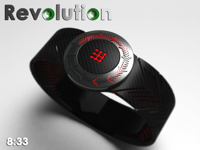
I like the idea & the overall look. My fav is the red lights/black case.
It’s making me thinking about the Harry Wiston’s Opus XIII, that was released a few day ago, but in LED’s & less pricey. (The Opus is 300K, which mean 1/2000 if sold at 150)
I would buy.
LikeLike
http://www.ablogtowatch.com/harry-winston-opus-xiii/
LikeLike
Wow that Harry Winston watch is amazing! I think comparing my humble concept to it is probably a little bit of a insult to HW but a huge compliment to me. Untill we each win the lottery and can afford such exotica hopefully something like my concept will fill the void! Cheers for the epic comment and association! 😀
LikeLike
1) “Untill we each win the lottery and can afford such exotica hopefully something like my concept will fill the void” is 1 reason I like it.
2) After reading a few blog, The Opus XIII is probably an “insult” to HW. (it’s one of their less popular)
LikeLike
but I liked it before seeing the Opus.
LikeLike
I can not bring anything new and constructive so I agree with most of the comments already made.
Good job.
The best of luck Sir
LikeLike
Thanks a lot for the comment and the luck Jose! 😀
LikeLike
This one expires very soon, so just wanna say a big thanks very much to TF for posting this design on the blog and everyone who took the time to vote, comment and share!
Cheers everyone,
Pete from the UK! 😀
LikeLike