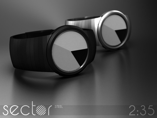
Design submitted by Sam from Germany.
Sam says: The display of sector is inspired by the popular pie charts that are used to display statistical information in mass media. I think those charts don’t only have a scientific value but also an artistic one.


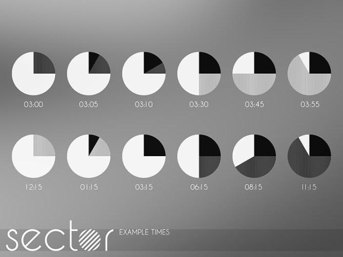
Time telling is based upon an analog watch display. I’m using differently shaded sectors to tell the minutes and the hours. To create an area, the sectors always start at the 12h position and end at the current hour or minute. The basis is white. The minutes have a slight shade created by thin lines. The hours have a darker shade created by thick lines. I suggest the usage of lines, not monochrome shades, to avoid misinterpretation. Minutes and hours overlap almost every time and the overlapping area is shown in black. This is important to remember because next to black there is only one shade left, the minutes or the hours, which make the black represent the remaining information. It might take a little at first but it shouldn’t be harder than a pure analog watch display after a day.
Sector is a watch for statisticians and information friends as well as fans of minimal art. The watch can be steel or acetate, serious or cute but in any case super stylish.


Smart, clean, beautiful! *****/Y
LikeLike
Thanks Laszlo!
LikeLike
Simply beautiful and stylishly casual!
LikeLike
Thank you F1R!
LikeLike
Stylish, certainly, and altogether a solid concept (as usual), but I can’t help but wonder at the manufacturability of it… Would it have to be e-paper? Could it be done in LCD?
On a more aesthetic note, It’d be interesting to see if it’d work with the hour/minute lines at an angle to each other.
Hm, I just realized this comment looks more critical than I intended…=)
LikeLike
Hi Anders. I cleverly didn’t mention the technology that I imagine to do manifest this display. If it can be done, yay. If not, ok. LCD could do it theoretically – the number of segments has to be checked! If e-paper, then the e-book like epaper. The price has to be checked!
What is “an angle to each other”; 180° or 0°?
Don’t worry Anders, if you see issues that I didn’t, it can only help to judge the feasability of the concept. Thanks for your comment!
LikeLike
I see what you did there! smart thinking…=)
Pete suggested doing it with printed discs. I tried to get my head around that option when I first saw it, but I’m not sure it would be possible. That should be the easiest option otherwise…
I cleverly didn’t mention an exact angle, since I’m not sure which would look best…=) At a guess; 30, 45 or 60 degrees might be worth trying. 90 might work, but I suspect there is a risk of it looking boring.
Agreed, but still, I like the concept! =)
LikeLike
Nice concept … I have one color base watch … with same concept …
Watch Name – Tian Harlan Chromachron Quartz
Site Name – http://www.70s-watches.com/n_to_z/THBook.html
LikeLike
Hello Ranjan!
I don’t think it’s the same concept. It shares the usage of circle segments but that’s about all. The watch you are showing me has a constantly dark pane with a permanent 30° gap in it on top of a multicolored layer. My concept varies in angles and uses shades. The possible identical look at a certain time of the day is a mix of mere coincidence and a logical result of handling with circle segments.
Thanks for the input and for showing me the 70s 🙂
LikeLike
Welcome Sam … your timing telling concept is different … Tian Harlan watch is an Hour Watch … will give approximate time … looks similar …
Your watch is really a outstanding looks … fetch market very well … Best of Luck 🙂
Regards,
Ranjan.
LikeLike
Nice watches. They remind me of the Noon watches. Good job.
LikeLike
Thanks DZ! Yeah, hard to find a niche in the circle segment display style sector. I sorta like the NOON watches – distinctive and fresh.
LikeLike
Yeah, me too. I almost bought one last year when I was in Japan. Oh…5y to you good sir.
LikeLike
Hi Sam, I like the simple and elegant. 5 * / Yes.
Question: The most accurate time is 5 minutes or 5 minutes if not, I would suggest benchmarks indicate “subtle” to not distort the look and have greater accuracy in reading?
LikeLike
Salut Patrick! Of course I would suggest the watch to be more precise than just 5 minute increments. But for the presentation I chose those. There could be little markings in the bezel at each hour/5 minute increment to help reading. Pie charts usualls don’t come with such marks so I left it pure for the presentation. Good hint. Thank you Patrick!
LikeLike
Looks very nice Sam! Does remind me little of other concepts like the “Pacman” watch but with a more feasible looking time telling. Could this be achieved with three thin overlapping analogue discs? If so it would be pretty easy to make. 5/Y obviously! 😀
LikeLike
Damn. Yeah, it reminds me of it too but then Sam has to add his brillance and make something else awesome!
LikeLike
Hi Pete! Nah definitely not three overlapping analog discs. I’m playing around with that but you can’t reset analog discs so quickly without some serious tricks. Do it’s digital, maybe LCD, maybe e-paper. Thanks for the comment and the support!!
LikeLike
E-paper would be cool for this design if the analogue method isn’t suitable. Lets hope TF masters e-paper in the not too distant. I can think of a couple of other watches too that e-paper could make happen 😉
LikeLike
Ok, I love a lot of your designs, Sam, but this is one that I want to buy TODAY. Maybe an advanced prototype? 5 stars and thumbs invading the pants UFO style.
LikeLike
And coincidentally I just discovered a couple of days ago that’s what you call a “pie slice” in math: a sector.
LikeLike
The monochrome is very classy, but could also have a color version. Depending on the tech you could have RED minutes and Yellow hours, and they would have an ORANGE overlap. Similarly with RED and BLUE or BLUE and YELLOW. I don’t know off-hand how to produce mixed colors with RGB–do RED and GREEN make WHITE? That would be interesting.
LikeLike
That would also be nice. I would suggest black for the “off” part.
LikeLike
Hi Chris!
Very interesting idea about the multicolor version. Yeah it would depend on the technology. More colors would definitely ease up reading. I’m not sure how to do it. Colored e-paper maybe can…
Thanks alot for the nice words, the inspiring comment and the support!!
LikeLike
Dear Sam well done on your latest Wristwatch concept publication. I also came up with a Pie Chart inspired design concept: https://blog.tokyoflash.com/2012/10/%E2%88%8F-pi-watch-design-divides-time/
I have to say that your seams to be of a higher quality than mine. However I would like to suggest the this concept could be transformed in to a Touch Screen version which would only enhance the minimalist artist style of this timepiece.
LikeLike
Hi Andrew!
Oh yeah, one can have alot of fun with circle segments and pie charts and I think there quite some different styles possible like our two. Don’t worry about the quality – the essence counts. I hade a growing circle segment idea before and moving circle segments too. There is no end in sight 🙂 The touchy idea is super. If it can be done, I welcome it. Thanks for your comment Andrew!
LikeLike
hey, sam – this looks really cool, and i like the fact that it looks mathematical — of course, since i suck at analog reading (especially without indicators), i think this one’s not for me personally – but i support it fully. beautifully executed, 5*
LikeLike
Hehe, thanks for that Heather ^^
LikeLike
I find it interesting. From your concepts, this is not my favorite.
I agree with the comment by Andrew.
My support. Good luck
5/Y_ 🙂
LikeLike
Thank you for the support Jose!!
LikeLike
Nice idea. The only thing it’s missing is the indicators.
5*
LikeLike
No indicators for youuu!! Hehe jk. Well I see the need and they can probably be implemented in a non-disturbing way. Thanks for the comment and the vote!
LikeLike
I really like this design. It is clean and simple. Looking forward to seeing it on my wrist!
LikeLike
Crossing fingers that this will happen. Thanks alot for the comment Lars!
LikeLike