Design submitted by Sam from Germany.
Sam says: This is another interpretation of the Rorschach test into an E-paper watch that challenges your imagination.
Update: this watch is now available to buy here, exclusively from Tokyoflash Japan.

Again I tried to find a middle way between the well known numbers and a symmetrical inkblot appearance. I am using a way more simple way to tell the time in this version.
There are the hours on the top right and the minutes on the bottom left part of the display.
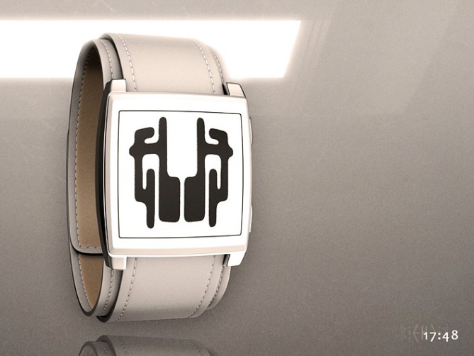

The remaining top left and the bottom right part of the display are created by mirroring the hours and minutes. This adds the typical symmetrical look of the Rorschach test cards and might already confuse some people who aren’t involved.
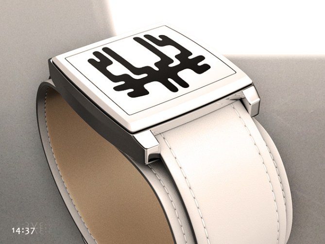
After mirroring the numbers, I let them melt together a bit by extending some of their segments so they touch each other. What I described should actually be three different time telling modes so the art fans and hobby lunatics can approach to the difficult mode step by step.

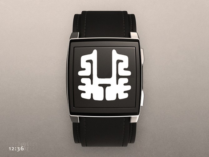
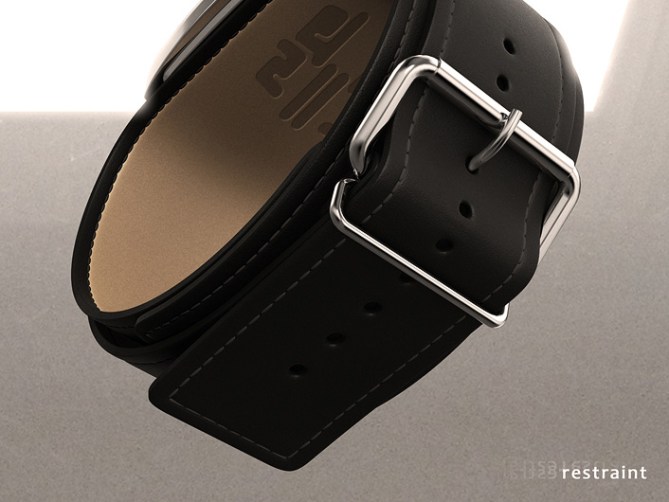
The usage of E-paper is a consequence of the inspiration. I chose a less idealistic watch geometry this time. I think it’s cool to use leather straps that create a slight association to physical restraints for extra difficult patients. The watch comes in black or white. Maybe it would be wise to have two display options in one watch: positive and negative, depending on the mental condition of the wearer.
The Rorschach watch is confusing but actually very easy. It has a high recognition value coming from the simplicity and the strong duality.



drooling. : P ““
i want this now! 50* (that is not a typo)
YES YES YES. i LOVED your first version, and i LOVE your second version!!
TF, make this – just the way it’s presented here!!!!!!! I will buy one in each color! 🙂
LikeLike
Brilliant. Absolutely perfect. I want this.
LikeLike
DAAAAYUUUUMMMMMMMMMM. Lol I want it! It’s extremely original and very cool looking! One of my Favorites!
LikeLike
Wow, this is a really fresh idea and great design. Finally we have a screen design that really deserves epaper!
LikeLike
Very nice Sam, looks just as awesome as the original but even I can read the time on it now! Congrats sir!
Just to play devils advocate, I understand your choice of e-paper as the inky shapes that inspired the design are naturally organic but I’d love to see a pixelated LCD or LED possible version. Rorschach for the machines if you will! Either way 5/Y best of look sir! 😀
LikeLike
Old wine in new bottles!
Everything get better with age.
I did like the mirror-presentation in your Glyph, but this is even better!
5*/y
LikeLike
It reminds me of those days in the musty library reading Goethe’s poetry. It’s absolutely awesome – I love it. I love the font, too!
5y
LikeLike
Love it! 5/*
LikeLike
I dig this, Sam. Very classy and clever. 5* and yes!
LikeLike
It’s a nice idea Sam and the different patterns and shapes are fun. I’d like it more if the arrangement of the numbers was a bit more user friendly. Reading from top right to bottom left doesn’t seem ideal to me. Could that be changed?
LikeLike
If not, I guess I could get used to it. 😉
LikeLike
Hi Sam, OK for the Rorschach test, I do not like the strap, although I understand your choice to stick to the theme.
With a metal strap I would be completely captivated.
The rating is positive, I am Impress with 3D rendering.
LikeLike
Yes this would have to have a metal strap for me too because I’m a veggie. 🙂
LikeLike
I have an abnormally small wrists, so I also prefer metal straps, they are usually easier to adjust. But I have to confess that is looks great with the black leather strap.
LikeLike
Sam, You should just kickstart this project – let’s get it made, I think you’d sell a ton.
http://www.kickstarter.com
LikeLike
Brilliant and outstandingly creative.
LikeLike
I like it and would get one, but can you do the strap in a faux leather, or at least the option.
Brilliant otherwise.
LikeLike
Sam, it’s a good improvement from the first version, removing the seconds make it more easy to manufacture. 🙂
Still have my doubts about if it will be possible to made non-sharped numbers, I mean, the sense of liquid numbers being mixed like drops, but the oval shape of the complete image change the squared view of the previous one. Would be nice when someone ask you the time, you answer… “tell me, what do you see?” 😀
5*/Yes.
LikeLike
It’s not a matter if I would buy, I want to buy! Do I have to come back in 27 days and check if TF is making this??
LikeLike
This watch is amazing; if it is produced to look like the concept art this will be huge. I personally like the strap and the idea behind it, real leather or faux; I feel a metal strap would contradict the soft countours and flow of the rorschach image. The icing on the cake for me would be the ability to change the number design through a usb cable so different styles could be created by fans and downloaded into the watch, and maybe even have random functionality swapping designs every few minutes to give the reader a challenge.
Huge potential with this, have never really been a watch person but this appeals so much I would never take it off!
LikeLike
Yeah faux leather would be better. 🙂
LikeLike
Great watch,why is everyone so uptight about real leather.
LikeLike
This is the first time in my entire life that I seriously considered buying a white watch. The design provides an original way to read time, while posting as a beautiful display. Love it!
LikeLike
I’m not a part of Rorschach enthusiastic but the overall design looking pretty sleek. I always wonder when I would get a watch with this sort of strap design. Maybe this is it. This is kind of unique watch you can wear in many formal occasion. The future is classically geeky yeah!
LikeLike
THIS . IS . FANTASTIC !!!!!!!!!!!!!!! O M G
LikeLike
Congrats on publication of this latest Watch Design Concept Sam. However I would like to suggest that as well as the Black / White Faux / Fake Leather there should also be Brown Distressed Leather like that of Trench coat worn by Rorschach the Watchman Graphic Novel / Film.
LikeLike
I’ve gotta have this!!! This is by far the coolest watch I have ever seen!!! PLEASE produce this! Put it up on kickstarter if you have to!!!!!
LikeLike
Wow!!! Amazing watch, great idea… just want one! 🙂
Fingers crossed for this one.
LikeLike
Totally want one of these 5/Y 🙂
LikeLike
I will buy this one for sure!! It was like love from first sight 😀 I was waiting before, more than a year, a watch to be produced and will wait again for this one! Stylish, beautiful and ming-messing 😀 Please, please, produce it! 😀
LikeLike
very nice, rating 5
LikeLike
The white is the best…
If you sell it, I´ll buy one…
White… Of course
LikeLike
I like the strap choice. I don’t like the display look. It’s too confusing.
LikeLike
After seeing a comment on the “progress report”, I would change my mind if the “digits” would be red & everything else black. The “delusional”, time hidden in a splat of blood, would be nice.
LikeLike
No Makkovik.
It’s very easy. You should look into oblique and right to left.
LikeLike
I generally prefer a watch that shows the seconds but I have to say this watch is so sleek I will gladly overlook that fact.
The fluid look of the display is just perfect.
Please let it NOT be USB rechargeable, but with regular batteries.
Very happy to read the new update and that it is already in development.
LikeLike
Unpredictable Imagination … 🙂 … Nice Presentation …
LikeLike
Hi everybody! Thank you so much for your support, your nice words and honest opinions! These four weeks felt so long because so much happened.
As you have read in the latest blog report, Tokyoflash are working to make this idea become real! So amazing!!
I’ve read all your comments and you made me smile. So nice of you, so interesting what you see and what you imagine.
Very cool that some you you checked my olders designs. It was a good idea to rethink my original concept. I saw the potential but didn’t know how to reach you. It’s still a fight between my own special taste and what can be sold.
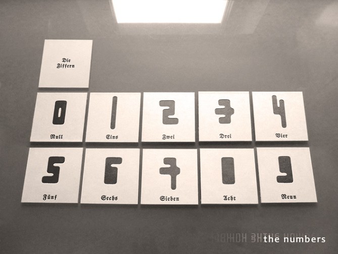
Some inside info from me 🙂 I picked this reading order for the numbers because the first hour digits don’t change often. I caught them in the middle of the display so the second hour digits can behave freely and change the appearance of the whole display more effectively. The seconds are gone because a) since e-paper needs energy whenever it changes, seconds would kill the economy and b) I like the fact that there is a little image for one minute you can look at and interprete. The top of the display is inspired by ink blot test cards. That’s why there is the metallic base case and the separate black or white part. Was so much fun to see this idea develop on the screen! The intro logo on the cardboard in the first image shows 1921, the year when the Rorschach test was published. The same image shows how to pronounce Rorschach. Much fun with the “x” which is a mean sound for the english speaking people. If you know Klingon, you might remember the word baH. The H is this sound. It sounds like a cat trying to cough out a furball hahaha.
I understand those who prefer faux leather. Good karma 🙂
I like the idea of having a distressed leather strap as alternative. Actually I thought about a full metal case and the “skin colored” leather like the real asylum restraints. That would be insane!
Thanks again everyone for the feedback!!
My best regards,
insane in the membrane Sam
LikeLike
The black version is more beautiful!
LikeLike