Design submitted by Heather from the USA.
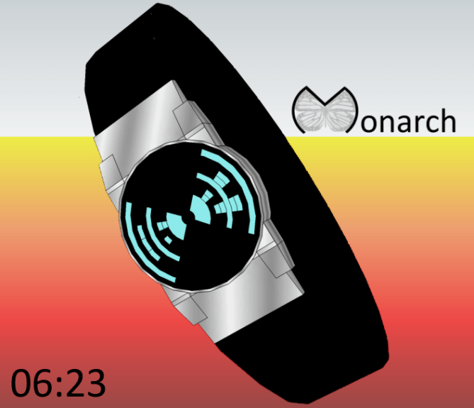
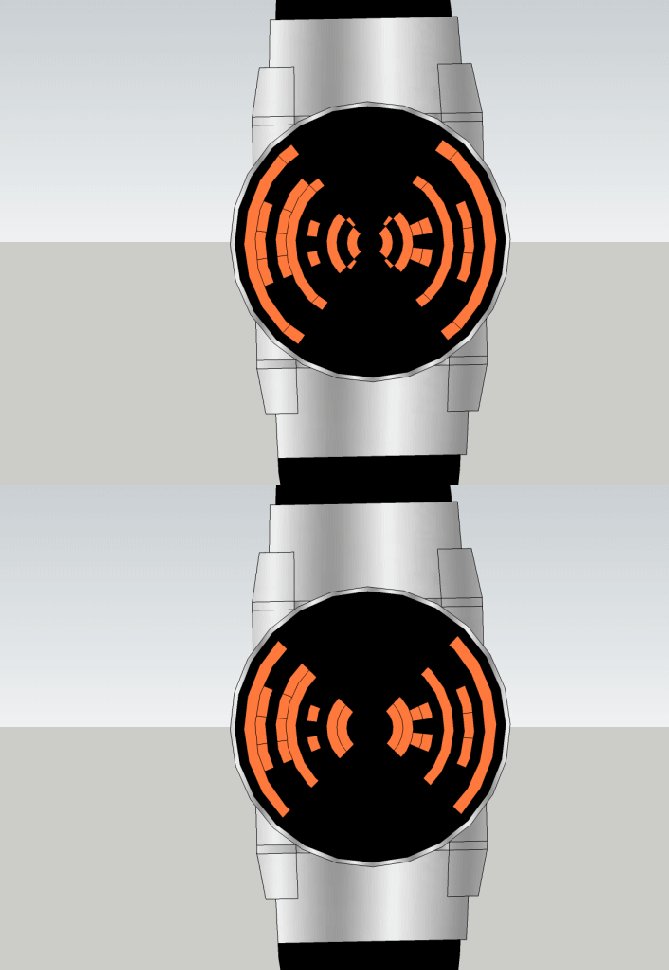
Heather says: I was playing around with radially distorted digits arranged within a circular display. By using the sectors of the display to the right and left, the time creates a silhouette that is reminiscent of a butterfly, so I call this concept Monarch.

Each digit is made up of a 5 by 3 array of quasi-rectangular segments. The dark segments (negative space) show the digits of the time in hh:mm. This concept is easily adaptable for either 12 or 24 hour modes, and is quite open to animations, or even a stopwatch mode. It can also display date and includes an alarm mode.

This watch could be appealing to the mainstream, as the digits are quite recognizable, with just a touch of cryptic flair, and the display is “always on”.
I feel the unique shape of this display helps it to stand out from other designs.


I love the watch! It was funny because I was trying to hard to decipher it without looking how then I just realize they were numbers. The only thing I don’t like is the empty space top and bottom. But other than that it’s beautiful!
LikeLike
thanks, bryce! i’m glad you gave it time to let the numbers show! 😉
i left the empty space thinking it could be used for other functions, such as stop watch, alarm, etc. also, i thought if i added anything else there it would take away from the butterfly illusion, and the flapping wings. thanks for your support! 🙂
LikeLike
Hi Heather, I saw a 3D movie on the migration of monarch butterflies, it’s amazing.
Very good idea, to fill the void, simply to add segments of circles unnecessary for the reading and useful for concept cryptic.
Your new project deserves 5 * and Yes!
LikeLike
hey patrick. sounds like a good movie. 🙂 good suggestion for the extra cryptic segments. Thanks for your comment and vote!
LikeLike
Could not for the life of me figure out this one until I read the description, then the numbers stood out like a sore thumb hehe, was trying to look for digits within the coloured bits. Very cool concept 5/Y 🙂
LikeLike
Hi Krautesh,
Glad you could see the numbers easily at least at some point! 😉
Thanks so much for your support!
LikeLike
I like the time telling, it looks slightly cryptic but is really easy to use. I agree with Bryce about the empty regions of the display. I would have been tempted to make the empty regions part of the case so the display looked like a bow tie shape. Nice concept tho so 5/Y Best of luck Heather! 😀
LikeLike
thanks for your suggestion, pete. i actually thought about that too – making the empty space part of the case, but again, i was afraid it might take away from the flapping butterfly wings illusion.
Thanks for your comment, vote, and good luck wishes! 🙂
LikeLike
Very nice, Heather! 5y
LikeLike
yay! short and sweet – thanks, dz! 🙂
LikeLike
I do like quarter circles! Could have an AM/PM marker at the head to look like antennae.
LikeLike
thanks, xian. i like them too! (hint: i’ve also submitted another design with quarter circles, but it may be a while before it’s posted, because there are also two other designs waiting) great suggestion for antennae!! 🙂
LikeLike
I agree with the antennae idea.
LikeLike
Looks great Heather. 😉 5Y
LikeLike
thank you, my fellow cryptic friend 🙂
LikeLike
Cute idea Heather. It could be even cuter of the wings would have rounded ends. Would look less technical and more fluffy hehe. The wing theme is pretty nice and distinctive – high recognition value. Good luck!!
LikeLike
hey, sam!! that sounds like a great idea – rounded ends would give a bit of a different feel..
thanks for your support! 🙂
LikeLike
Actually I had almost so like idea, but I think I discontinued it because I thought I’ve seen it somewhere…. couldn’t remember but maybe it’s your design. But how you make the display like butterfly already differentiates what I had in my mind. May be sometimes small changes could make huge different. I believe this catchy design would seduce me in person. Good job really.
LikeLike
I like this one. I like the grid which give it a spiderweb background look.
LikeLike