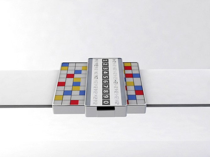
Design submitted by Andy from the Ukraine.
Andy says: I decided to realize concepts which looks very difficult from one side and very simple in time telling from the other side.

Reading time is actually very simple. At first time it seems that the watch is very complex. But once to understand the operation and everything is very simple. Here I use very easy and strong design.
This concept uses the following principle. For example the current time 12:53. The group consists of 2 digits in hour group and 2 digits in minutes group. Digits in hour group are numbered H1 and H2, the digits in minutes group are numbered M1 and M2. In our example, 12:53 means (H1) = 1, (H2) = 2 and the minutes (M1) = 5, (M2) = 3.

I think that this model is able to interest teenagers with bright colors on one side and black Classic design business on the other. Creating the watch for those who always want to look original and are always ready to amaze your friends and colleagues
New original way to tell the time


I like the concept. I love the time telling method. The overall look is good, but the central part should be in the middle. Also the “H” and “M” could be removed and have two row of “12.12.12…”
I love the black version. I don’t like the other version. ( others possibility would be : Checkered : black/red ; black/white ; rubick’s cube ; backgammon board ; Plain : any color ; plywood ; marble/stone )
I would buy. 5* ( because I can’t give 4.5 )
LikeLike
Hi Andy, this is a cool project, I love the colors of the mosaic pavement, with an animation style dance “Saturday Night Fever”, it would be great.
5 * and Yes.
LikeLike
The basic principle is very simple and kinda elegent. For me you dont need the stepped case, I would (assuming there is room for electronics) remove the larger step in the body and just have a narrow letterbox shape to the body. It would look much cleaner and simpler but still dynamic I think. Nice concept either way do 5/Y and best of luck sir! 😀
LikeLike
Pete, it is a good idea!
LikeLike
I also agree with you !
LikeLike
Hi, Andy! These are nice renderings, and I dig the primary colors. I don’t agree with the comment ‘the central part should be in the middle’, as the asymmetry is an element that makes this YOUR design and not theirs. My question to you is, how would you handle a time when the hour and/or minute has duplicate digits (i.e. 11:44)? Would only the letter ‘H’ be displayed over the ‘1’ and ‘M’ over the ‘4’?
LikeLike
I meant ‘M’ UNDER the ‘4’.
LikeLike