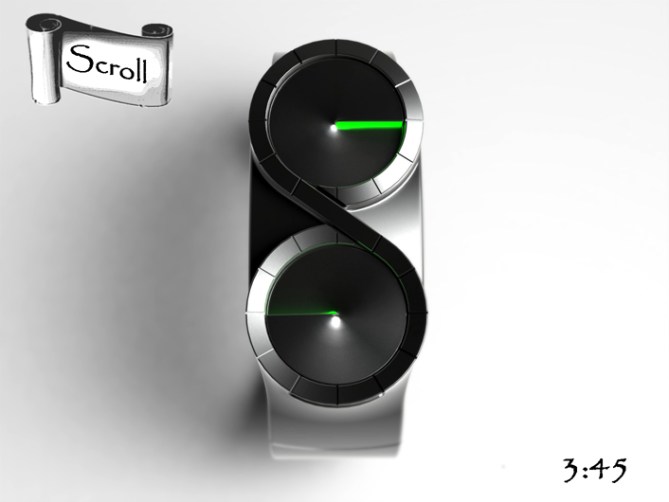
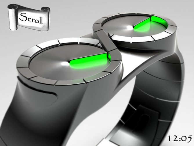
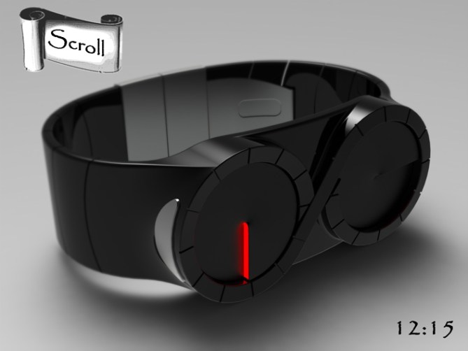
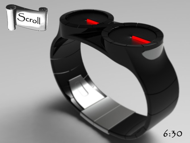
Design submitted by Peter from the UK.
This is an update to a previous design Scroll
Peter says: I have made it sleeker and edgier than the original. I have also connected the two dials to make it look more scroll like and added markers to make time reading easier.


Thanks TF for adding this design to the blog! 😀
LikeLike
Looks nice Pete. 😉 Good luck with it. 5Y Could the scroll maybe spiral inside the 2 dials?
LikeLike
Hi Mushy, cheers for the vote! Do you mean could the dials have spiral like hands? Yeah there is no reason why not. Could be a special edition, thanks for the feedback and vote! 😀
LikeLike
Just one word: WOW
LikeLike
Thanks a lot Vonkie! I’m glad you likey! @@
LikeLike
I would have called this model “Infinity”, because it reminds me, among other things, the mathematical symbol.
This watch is super nice! I already loved the first model.
For me, I would like the steel with rays of light green?
5 * and Yes to Pete.
LikeLike
For do a manufacture future, I suppose that TF will put protective glass above rotary dials, for not that they block themselves, compared to the sleeve of a jacket…? It is a detail.
LikeLike
Hi Patrick, Im glad you likey and cheers for the comment. Yeah I think there would need to be glass covers for sure. I imagine this style of hand would be putting enough strain on the movement/s with out any outside influenece. Cheers for teh feedback and the name suggestion! 😉
LikeLike
Ooooh liking this version way more 5/Y 🙂
LikeLike
Thanks a lot KV, Cheers for popping by! 😀
LikeLike
I really like the concept
Great job as usual. Infinitime and good luck Pete
5/Y_ 🙂
LikeLike
Thanks a lot Jose! I’m glad you likey!
To infinity and beyond! 😉
LikeLike
I really dig the black version with red lights!!! I love the double analog time telling. As for the maskulinity, I would prefer the original Scroll. This one’s more elegant though and could be more popular outside the blog. Good luck Peter!!
LikeLike
Thanks a lot Sam, you probably one of the only people who liked the original version of scroll! 😉
Black with Red lighting is a classic! Cheers for the feedback and the vote! 😀
LikeLike
I think this is a great design that not only brings analogue time telling back in style but does so in a way that keeps with the TF design flair. As long as it were made compact enough so as not to be too bulky on the wrist I would certainly consider one. Also any watch with leds gets my vote. I prefer them to lcd. Well done Pete.
Cheers
LikeLike
Thanks for popping by and sharing you opinion RyanMcG! Yeah analogue and LED are two very fine bed-fellows, Im glad you likey. Cheers for the feedback and the vote! 😀
LikeLike
hey, pete. i wasn’t going to leave a comment on this one, because it’s not one of my favorites, but as you mentioned you were frustrated by not getting input, i figured i’d leave mine. i think it looks really cool, and would consider a display of this shape for something like a wall clock for sure – it would look really really unique. unfortunately as a wristwatch, for me anyway, i wouldn’t want two big circular shapes for a display. it just feels awkward to me. but there are many who have suggested similar (two circle) concepts, so there must be a market for it, so good luck, my friend! 🙂
LikeLike
Hi Heather, thanks for the comment and feedback! I can understand people not wanting to comment on designs they don’t particilarly like, but then in a way they are the ones that need the comments the most if people have thoughts and ideas that may improve them. I try to comment and share on every design where I can, whether I like the design or not. I hope in a way this contributes to the blog somehow. It’s been very quite here this last week which is a shame and a little depressing (probably related to the time of year) anyway I’m rambling. Cheers again for the comment! 😀
LikeLike
Hi Pete, this is my opinion.
There are many reasons people don’t comment on a design, some people even their like will just hit the vote button. Maybe some people has no idea what to comment but yes/like. I did voted 5/yes for this but as I said, I was not sure what to comment before. Some people, inclusive some designers only care of their design. Some only entertain you if only you ever support their design. Some only support own friends or relatives. Some people can have more votes, some can have more comments. Despite busy with my work, I keep interested observing this situation. I can see some regulars are not here anymore – there could be some reasons. I’m figuring out how to tell this out but since most people think this is a competition so I believe this is one of the game. It’s not entirely wrong, but a nature of business and competition. Dam I’m su-ck at marketing.
Most of your designs are crazy and I like that. I like your attitude on how you keep struggling to refine your ideas and being active in this blog. I think you are one of asset Tokyoflash should not give up on. Keep it up dude!
Cheers!
-TM
LikeLike
Hehe crikey Fir thats quite some thoughts there!
Im sure people have many reasons for voting/not voting etc. Im sure most cant be predicted. Its just a shame when the blog is quiet (I know I probably spend too much time here! lol) but the blog is a lot more fun and vivid when people have opinions and suggestions. Hopefully this quiet period is just a lull and more folks will return with their perspectives. Anyways thats enogh waffle from me…..ummmm waffle :O~~
Cheers for your kind wordz and support sir! 😉
LikeLike
Currently, I rate all designs. I comment on almost all of them. ( sometime I just can’t express what I like/dislike on a model & don’t wan’t to be rude. In these ocasion, I don’t comment. ) I usually rate/comment during the last week, because of my busy schedule. ( I’m designing watches between part/full time & read many/many blogs, + the others things I do. ) The fact that I send models help me stay active. ( the 1st page is always on & I refresh it once or twice a day ) I’ve come back a year ago, after a long period of inactivity because I didn’t have the time anymore.
LikeLike
Your an asset to the blog sir! We could do with a few more constructively opinionated folks like youself here! Makes the blog a far more interesting place in my opinion! 😀
LikeLike
I like the added markers. I like the (un)planned use of the “infinity” symbol. I prefer the original, but not by much. ( like +.5 on 10 = 5% )
My concerns didn’t change ( helix look nice, but an almost black-out disc might be easier to make ) & I still would buy one.
LikeLike
Thanks for the feedback Makko, a couple of people seemed to prefer the original version for some reason. Im glad you likey and cheers for the support! 😀
LikeLike
1 of my reason is that, on the original, the pics #1-2 look like aviator/sci-fi aviator goggle. the pics #3-4 look like swimming goggle. in the 5th, I can almost see a frog head.
Here, they look all the same.
LikeLike
hahaha I see your point! lol After another look at the original it reminds me of the steampunkt bad guy out of the first “Hellboy” film lol
LikeLike
This ends very shortly so a big thanks to everyone who took the time to vote, share and comment and an even bigger thanks to TF for posting this design here!
Cheers everyone,
Pete from the UK 😀
LikeLike