Design submitted by Patrick from France.
Patrick says: “This new project was inspired, in its form, by my “Tsunami LED Watch“.
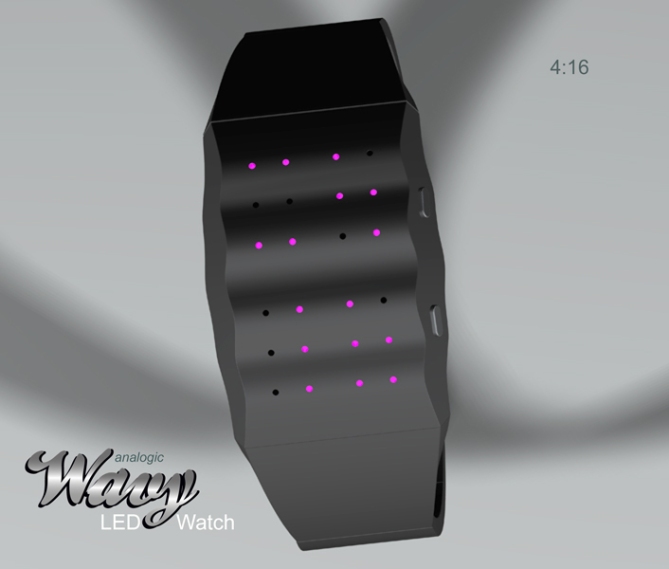
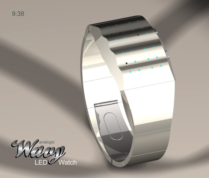
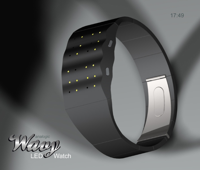
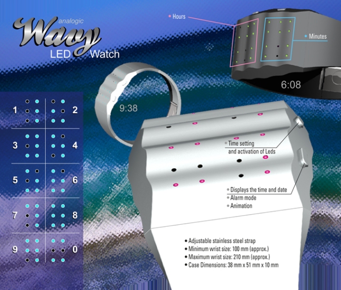
The “Wavy LED Watch” is easy to read analog (while remaining “cryptic” at first). Luminous points laconically draw numbers which, combined, indicate the time. For reading instructions see the image at the bottom of the page.

The “Wavy LED Watch”, with its undulating and soft forms is intended to the people (women and men) who have a philosophy 禅 and which wishes to face the time which passes with delicacy and serenity.

The “Wavy LED Watch” because of its unique design, the fate of ordinary codes and give to those who uses it, the air detached from the constraints of time scrolling.


hey patrick. i wish i knew who keeps entering low star ratings…i see the first one entered here is 1 star. not nice. i think these digits are very clever. quirky, but certainly readable. i like how minimal it is, and very elegant. 5* from me!
LikeLike
Thank you Heather, this watch is also made for elegant women, it is great!
LikeLike
première fois que je vois un design d’un francais ici! ca prouve que nous aussi on a des bonnes idées.
le design est pas trop mon style mais est quand même élégant. les nombres sont biens pensés aussi. as-tu pris les nombres en braille et mis des leds a la place?
5* pour moi aussi!
LikeLike
Salut Digits, merci pour ton vote.
Si tu regardes bien le Blog, tu verras qu’il y a plusieurs français qui on beaucoup de talent, comme tout ceux qui on la chance de passer chez TF, Français ou non (tape “Patrick” dans le champs de saisie “search” en haut de page à droite, tu verras d’autres de mes projets).
Non, je ne me suis pas inspiré de l’aphabet Braille, les idées viennent ou ne viennent pas, mais j’essaye, le plus possible, de ne pas être influé pour rester “original”.
Digits Hi, thank you for your vote.
If you look closely at the blog, you will see that there are many French who have a lot of talent, like all those who were lucky enough to spend in TF (French or not).
No, I am not inspired by aphabet Braille, ideas come or not come, but I try as much as possible, not be influenced to stay “original”.
LikeLike
Merci Digits pour ton vote, mais regarde bien sur le Blog, il y a aussi des Français.
LikeLike
Simply considerable. I like the classic looking of this watch and revival of your old concept in brand new time telling.
LikeLike
Firdaus, thank you for your vote, it’s a bit thanks to you that I revisited my “Tsunami-Watch” because you’d proposed to revise my old concepts.
LikeLike
You know I love the look of this watch Patrick. 😉 The only thing I would have liked to see is some slightly more original numbers. Anyway, 5Y cos, as superficial as it may sound, it looks cool! 🙂 Personally, I wish TF would get rid of the voting. It’s a bit of a farce really.
LikeLike
Thank you Lloyd for your vote. I do not have your talent to invent numbers “cryptic” as good as yours. I admire your work.
I’m a little more focused on the form, because it attracts the eye first, but reading is an essential element to remain “Tokyoflashy!”
LikeLike
Thank you to all the team at Tokyoflash have published this new project, I am honored.
LikeLike
Hey Patrick,
Very stylish piece this! Very simple and easy to read display which doesn’t look too conventional! Very Tokyoflashy in my opinion! Great work sir 5/Y Best of luck! 😀
LikeLike
Pete, thank you for your comments always pleasant and friendly.
LikeLike
Hey, Patrick! Very different case, I don’t recal seeing anything like it. As far as the voting, I think those who deal below 3 stars should have their handle posted and they must give a good reason (i.e. constructive criticism) for trashing a design. Anonymity shields the haters from what should be an open forum.
LikeLike
Xian, thank you, I appreciate your comment and I agree for the constructive criticism, this is the only way to move forward.
LikeLike
I vote it as ****. I mean, it’s a good design, it reminds me the Braille alphabet, it’s cryptic… but, as the Braille code, could be hard to understand for the newbie. When I saw the ‘4’ for the first time, I thought on a ‘5’. I see the lower part of the ‘5’ but also it could be a shrinked ‘2’. When I saw the ‘9’ I thought on a ‘4’ from the 8-segment led digit.
Maybe a 3×3 dot version instead of 2×3?
LikeLike
I mean, a 7-segment led digit… I count the dot too…
LikeLike
Thank you Jorge Luis for your vote!
I think the numbers are easy to read by connecting the LED lit, there is just the numbers “2” and “5” to be learned, it is a primer of these two figures, otherwise I will not have been able to satisfy me with 6 point, it would have been necessary, indeed, to add a seventh.
LikeLike
Nice! I think this is a very clever way to represent the numbers in a way you can recognize them without writing the actual number.
Very original!
LikeLike
Thank you for your vote Sylvie, I’m glad your remarks.
LikeLike
Very cool concept and nice digits 5/Y 🙂
LikeLike
Thank you very much Vakir, I am content that you like it.
LikeLike
I really like the new concept, cool and clever.
Great job.
5/Y_:)
LikeLike
Jose, thank you very much, glad you like this project.
LikeLike
The Tsunami was a bit more elegant I think. If the strap would continue as wave and the thick part of the case would be below it, in a different color (wave = metallic, case = black) it would be better for me. But tastes are different 😉 The numbers are pretty cool. So the Wavy is nerdy and elegant at the same time. Good luck Patrick!!
LikeLike
Yes Sam, normally I’d gone on another design, but it looked like too much to my “Grid-Watch”, with a ripple more modern, but I wanted a new look.
Thank you for your comments, I always consult with great attention.
LikeLike
I like the digits & the 2×2 grid. I don’t like the “wavy” apearance much. ( maybe it’s the amount of “wave” or their size, which can be modified easily ) I like the way the sides are made. This one is better than the “tsunami”.
LikeLike
Makkovik, thank you for your comment.
At first, I picked up this idea where the dial is the same thickness as the bracelet, but this watch too much like my “Grid-Watch”, even if I found more beautiful. I must make a version 3, but leaving a little bit to spend time …
LikeLike
Great, i surf and everything has a wave shape, i like !
LikeLike
Hi Yo, thank you for your comment.
LikeLike
nice design! i hope it will soon be released.
LikeLike
Thank you Lolo, me too.
LikeLike
beautiful design and easy to read: i love it!
LikeLike
Thank you very much Paule, I am content that you like it.
LikeLike