Design submitted by Heather from the USA.
Heather says: “After completing my VISE concept, with vertically elongated digits, I considered trying to develop some horizontally elongated digits, and LATITUDE was born.
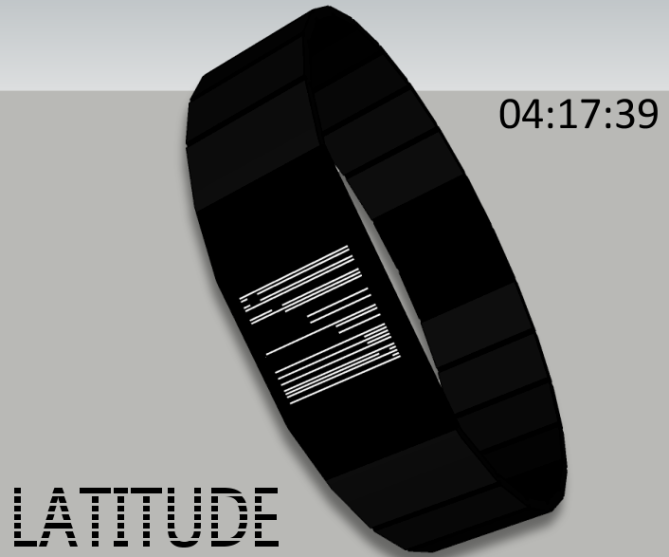
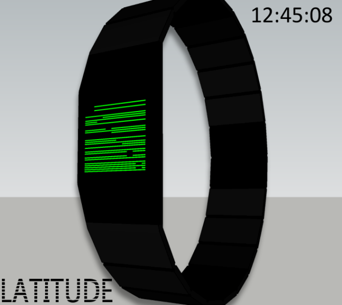
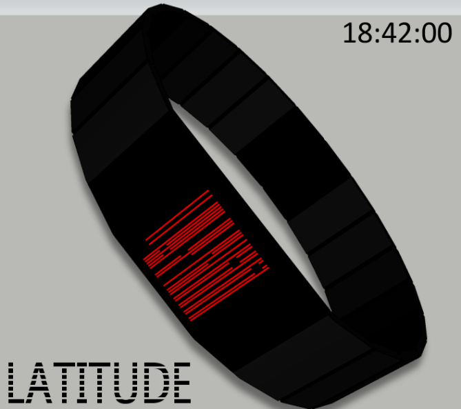
Latitude is an always-on digital display that includes hours, minutes, and seconds in the format hhmmss from top to bottom. Each digit is made of seven segments, but they are all horizontal, which makes them flatten out a bit and allows for 6 digits to be displayed quite easily.
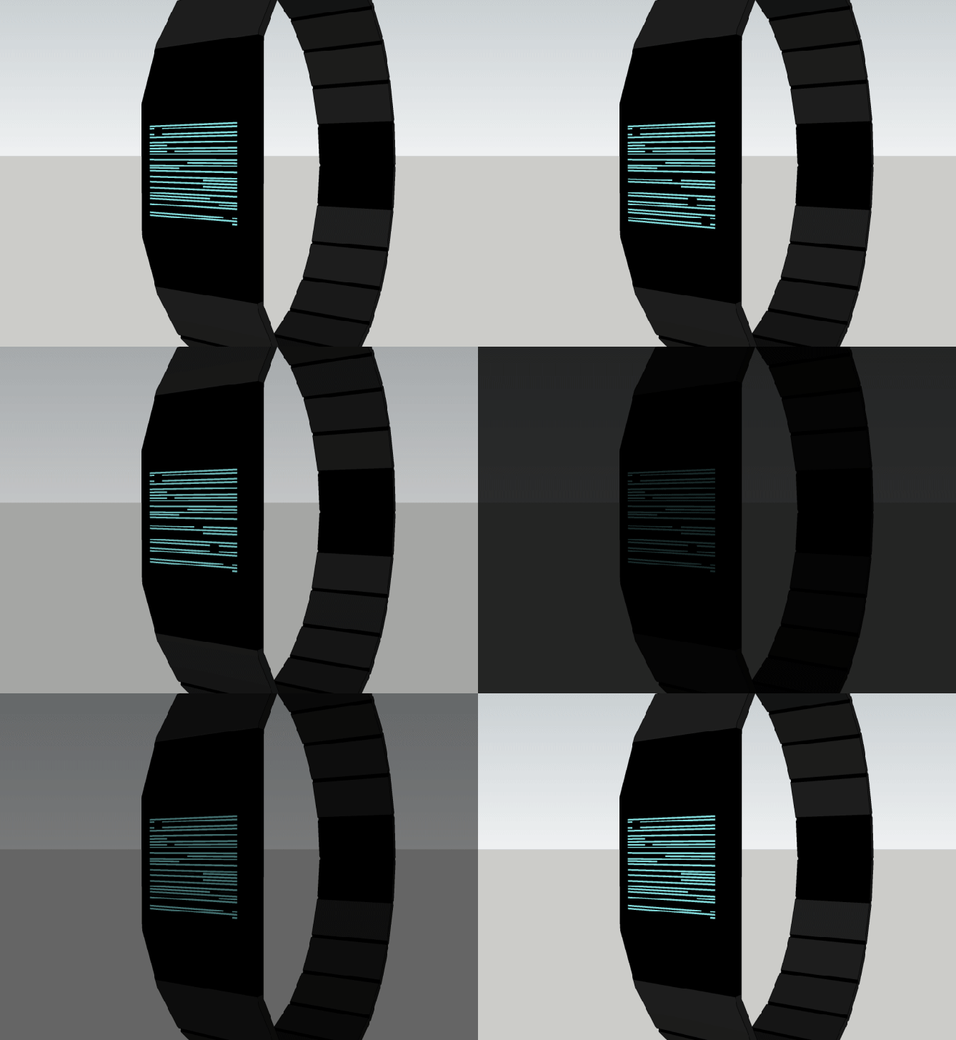
Those who prefer a read at a glance, accurate time display will appreciate this easy to read concept, which gives the time to the second.
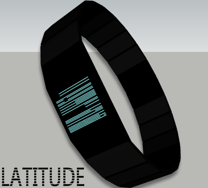
This unisex design stands out because it is offering a new arrangement for digits, without taking up too much space. This design can be executed with a relatively small case to wrist ratio (and slim), which can make it very appealing to the small wristed Tokyoflash fan community.”


As always with your work.
Exact the right level of mystery until you solve the riddle, then it is as easy as anthing.
I do like the slim, elegant case. 5*/Y
LikeLike
Thanks Jens, for taking the time to “solve the riddle”, and for leaving your nice comment. Thanks for the stars, too! 😉
LikeLike
Hey Heather,
This looks cool! Cryptic but easy to read at the same time. It reminds me of the way early computers used to load up images a line at a time, real retro futuristic look! 5/Y Best of luck! 😀
LikeLike
Hey Pete. Thanks for the comment and vote! 🙂
LikeLike
Damn cryptic, but I think it’s cool. A good rival for Kisai Upload for smaller wrist. I can imagine this in real. Good luck!
LikeLike
Hey, Firdaus. Thanks. You know, I didn’t realize how cryptic this one was until some people started telling me to explain it because they didn’t know how to read it…If you can imagine it real, that’s quite a compliment, so thank you!! 🙂
LikeLike
The black & white one looks like a barcode ^^ I really love it, good job 5*/Y
LikeLike
hi romain. yes, i thought it had a bit of a barcode feel too — although that idea has already appeared on the blog a while back, so i didn’t want to focus on it. 😉 thanks for the comment and vote!
LikeLike
Stylish visual effect of the display (liiiiines) , easy to read, cryptic at first glance – quite nice. Maybe too simple display, maybe simple enough. Good luck in any case 🙂
LikeLike
well, thank you very much, Sam. simple for some, but as i’ve been hearing, not too simple, so i’m happy with it 😉 thanks for your support!! 🙂
LikeLike
Nice work, Heather! I love the design and colors of this watch, as well as the way to tell time. At first I had a bit of trouble, but then i was able to read it easily! 5/Y
LikeLike
Thanks, Matthew. I tried to pick colors that would stand out nicely on the black background – thanks for noticing! Glad you took the time to see how to read it – thanks for the comment and vote!! 🙂
LikeLike
It’s a very nice looking watch Heather and people do seem to like barcodes round here! 🙂 However, having so many horizontal lines in close proximity makes me feel a bit sick. Please don’t hate me and good luck with it. 🙂
LikeLike
aww, mushy, i would never hate you. can’t please everyone – thanks for taking the time to leave a comment. 🙂
LikeLike
Comments as you wish (I am like you), mine is a little closer to that of Lloyd, but I know the work involved to invent something new and that’s why I give you a 5 * and Yes .
LikeLike
Once again you have done a awesome job, easy to read but still looks cryptic, love it 🙂 5/Y
LikeLike
I really like the concept
Great job. Interesting variation VISE concept.
My support. 5/Y_:)
LikeLike
Very cool display idea. I think with a little more flair on the case without being obnoxious the whole watch would look excellent.
LikeLike
WOW….THIS IS INCREDIBLE…
IMAGIEN IF THE WATCH FACE WAS EVEN BIGGER SOOO COOOOL!!
LikeLike
The idea & overall look are nice. I like that the seconds are there. It would help to learn the digits.
LikeLike