Design submitted by Valentin from the USA.
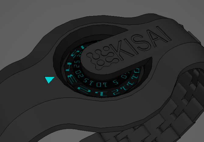
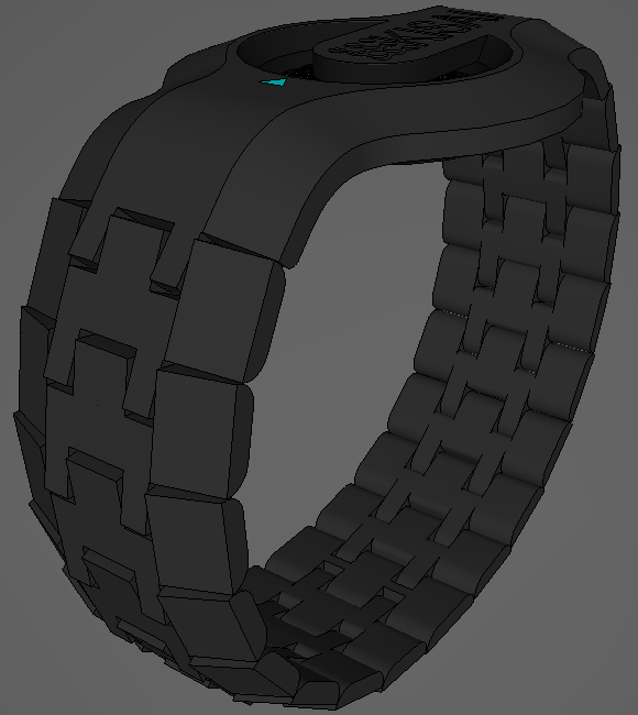
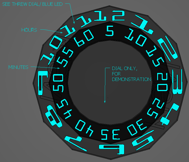
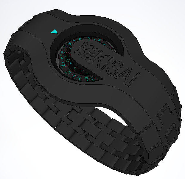
Valentin says: I came up with this idea from my favourite type of watches, so i decided to design this one. The design has translucent dials that light up and rotate to the specific time. The time is read from top to bottom under the arrow on the case of the watch.

I believe that anyone could wear this watch, it also looks unisex.
The design is very wearable by anyone and could give you a brake from decoding the time, all you got to do is put this watch on, and you could read the time with no trouble at all.


Looks cool Valentin! Nice modelling too considering sketch-ups limitations. Would you be able to read single minutes too? ie 3:27 etc (I presume that the discs would turn as per a regular analog, and just doesnt have markers between the numbers) Looks awesome so you got my vote! 5/Y Best of luck sir! 😀
LikeLike
yeah thats how it works, anything in between are sigle minutes as the wheel rotates. thanx for your vote(:
LikeLike
V@lentin good, the reading system already exists (I’ll let you look on the internet), but the shape and the lighting figures pleases me well, by indicating the division of the minutes alone as Pete pointed out, with all that, I put 5 * / Yes.
Nice work in 3D.
LikeLike
i will make sure of it, thanx for your feedback.
LikeLike
Hi Val 😉 Very appealing watch geometry!! I have to agree with Patrick, the time telling method isn’t really screaming new. If there are really two discs, there could be another way… another style to tell the time working with a traditional analog mechanism. Keep up the good work, and try to rethink time telling. It’s easy to say of course. And it’s better not to force it. You seem to have the energy to visualize your ideas. I wonder what you come up with next. Good luck!!
LikeLike
Awesome, but how would you set it?
LikeLike
like a regulare anolog watch, i just didnt want to give tokyoflash limitations, i would want them to choose where it would be best to put it , if the watch was ever made.
LikeLike
Very nice design. I love the dial style of watch. I’d suggest that the way to set it is a dial on the underside of the watch. Maybe a smaller backplate and the dial to set it next to that. It keeps the sides and face clean.
LikeLike
that would be a great idea:D
LikeLike
Awesome watch, my only suggestion as others have said, would be to include markers for between the 5 minute increments to give an accurate time reading. Other than that 5/Y and good luck 🙂
LikeLike
dang, it’s really superb design! you sir are genius. i just hope that the date dial were similar like that and perhaps, got an arrow to point me where’s is north ;p so i can use it in hiking without lost direction. 5*
ps: is it always on (the number was turn on when the dial spin) or perhaps, it just illuminate when you press a button? or perhaps, it only lit the current time and leave the rest hidden in black?
LikeLike
Yeah, I don’t know if I added to the discription that the kissing logo was suppose to be a touch type button that would illuminate the numbers also the indicator arrow, because the display is suppose to be completely see threw, that way when you need to see the time you would touch the button to illuminate/ show the numbers to read the time. And thanx for your complement! 😀
LikeLike
KISAI**, not kissing. Sorry it’s my auto correct. Haha
LikeLike
I really like the way it looks. It’s simple, elegant, and easy to read.
The aesthetic is a tad lacking. though. Why don’t you try adding a decorative ring around the watch and/or on the top of the center piece. Give it a bit of flare, a bit of contour.
LikeLike
This is a cool concept with a deep structure and an mechanic and also an electronic feeling.
I want to order such a watch!
LikeLike
I like the overall look but it’s not unique enough. There too many watches with that type of time reading on the market.
LikeLike
nice job. I like the concept
thank you valentin
LikeLike