Design submitted by Peter from the UK.
Peter says: This design was inspired by a computer game logo from a game I played recently. As soon as I saw the logo I thought it would make a great watch face. “Hexecule” was the result.


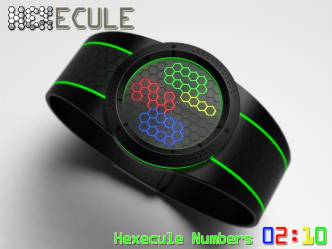
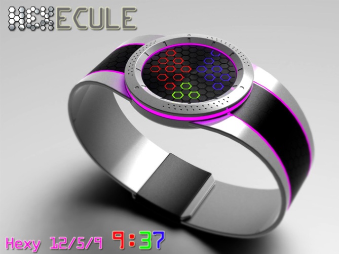
The face consists of a flat face with a array of hexagon shaped recessed LEDs.
This array allows for a selection of time telling methods.
The hexagons can show digital time in a chain of lines “Hexyline” numbers.
The digits could also be shown in full hexagons “Hexecule” numbers.
Other formats could include “Hexy 12/5/9” and form of analogue.


This design has an alien looking display but shows the time in recognisable formats. The styling of the watch is techie and industrial but not too extreme to not have mass appeal.
The hexagon based display gives the design an unusual look that separates it from others.


This watch is gorgeous Pete!
I love the dial bevelled spokes and read the time.
This watch is really beautiful and I am sincere (and not “nice”)
5 * / Yes, yes!
LikeLike
Hehe I thank you for your sincerity and the vote! And your are definately nice! :p
Thanks for the support Patrick! 😀
LikeLike
Another great watch Pete! I really like the idea of a watch having more than one display too. 5Y. 🙂
LikeLike
Thanks a lot Mushy, Yeah the choice of display styles has to be a bonus! 😀
Cheers for the vote! 😀
LikeLike
Thanks TF for adding this design to the blog! 😀
LikeLike
Hey, Pete. Man, this is an ambitious design, excellent renderings. One question: with displays that show 2 adjacent hexagons that differ in color, how did/ how will you decide which color the shared side is? For the record, I think the magenta clashes with those other colors; maybe by itself or another combonation would be tolerable for me. The first red one is my fav!
LikeLike
Hi Xian, regarding the colour of the “Hexecule” numbers the position is probably more important, left and top for hours, bottom and right for minutes (not that this is set in stone of course) the colour or order of colours of these numbers is less significant (to me anyway) maybe the order could be cycled thru by the wearer so they can choose their preference. TF may well have a pre-determined number/colour structure that they would want to use (if they developed the idea further) Also the face could be made larger or the hexegons smaller allowing more room between the numbers which would mean that less colours could be used as the numbers would be clearer anyway. The outer colour (case/strap) again are not set in stone, I just try to give a few examples. The magenta may suite a ladies taste more than the chaps. I prefer the red option myself. If would be nice if these colours could also be selected by the wearer (this would add complication and cost no doubt) Sorry for the novel! 😉 So many options!!!! Cheers for the feedback and comment! 😀
LikeLike
I just realised you ment the colour of the shared parts of the hexegons where the numbers meet. The colour was merely decided by the order them were added to the display ready for rendering! lol
No specific logic used 😉 But like I said above, if more and smaller hexegons were used there could be gaps between the numbers which would illiminate this potential issue. Cheers 😀
LikeLike
A good design, with easy to read display.
Diane.
LikeLike
Thanks a loy Diane! Im glad you likey! 😀
LikeLike
The mirrored hex one is stunning & I love the various modes that it can do.
The pink one is also outstanding – although its more for women, i would certainly buy this for my wife.
LikeLike
Thanks a lot Tokyo! Yeah the mirrored/metallic one is my favourite too and the original/initial scheme.
I should just point out my mistake on the 12/5/9 image as it says 12:69 lol.
I’m supprised no ones mentioned it yet!
Yeah I tried to include at least one lady friendly colour scheme.
PS Don’t let your wife read your comment she will hold you to that! 😉
LikeLike
Many of designs here are good. But this is one of the few I am excited about!
The first silver version is my favourite. I would like to see this design with white illumination. I think there is no need for the band to glow, it is too much in my opinion. 5* and Yes from me. Good luck!
LikeLike
Thanks a lot Pawel, you’ve have a couple of special designs on the blog yourself! The silver one is my favorite too. The white LEDs would look very modern and crisp. The glowy band is probably too difficult to make so could just be coloured highlights rather than illuminated. Cheers for the vote and the luck! 😀
LikeLike
Great design Pete. The choice of displays would give a number of watches in one, which should increase its popularity. I like the hey line option best and the first colour set is the one I would choose. Definitely 5*/Y.
LikeLike
I meant hexyline, not hey line! Spellcheckers strike again!
LikeLike
Hehe no worries Nev, my terrible spelling is only topped by my shocking typing. I’m glad you likey and cheers very much for the support! 😀
LikeLike
Hi Pete! -This watch is really cool. Best of luck!
LikeLike
Thanks a lot Peter, Im glad you likey sir! Cheers for the comment and the luck! 😀
LikeLike
Great job as usual and a very interesting concept.
5/Y_ 🙂
LikeLike
You are too kind sir! and I thank you for it! 😀
LikeLike
I love the overall look. My fav are the “12-5-9” & the “hexecule numbers”. My favorite is the green.
LikeLike
Also, I don’t like the “hexyline” & analogue is ok but not my cup of tea.
LikeLike
Thanks for the feedback Makko, I tried to bring a selection of time telling to appeal to as many people as possibile, so I can understand not all of them will appeal to everyone. Im glad you like a couple of the modes tho and the look! Cheers for the comment! 😀
LikeLike
Only half day left for comments and I probably wont get the chance to comment later, so will quickly just thank everyone who commented, voted, liked and shared this post.
And a big shout out to the TF massive for adding this design here.
Cheers everyone,
Pete from the UK
LikeLike