Design submitted by Anders from Sweden.
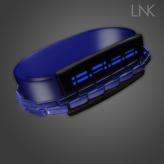
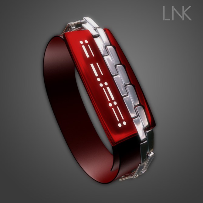
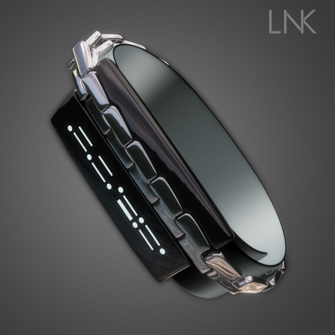
Anders says: I wanted to design something simple, both with regards to the display and the hardware. I call the result ‘Link’. Partly for the strap which is the design’s signature feature, but also for the morse code-esque display of bars and circles.

The display is very simple; basically a 2×2 display of seven-segment digits, but the horizontal segments have been replaced by circles, and the vertical segments have no separation. This makes the digits appear much as cryptic pieces of morse code, but still surprisingly easy to read once you know the trick.

This concept should have a certain unisex appeal, with the stand-out feature being the magnetic link strap on top of a softer fabric or rubber strap. The links fit indentations in the body of the watch, and magnets in the links and the watch keep the strap closed. The style of the links can be adjusted to suit different customers, and the colour variation possibilities are of course nearly endless.

I hope Link has a modern sleekness about it, informed by the elegance and style of the 20’s coupled with a certain kitsch factor straight out of the 80’s. The display is very simple, and I’ve tried to strike a balance between cryptic and immediate. Also, the novelty of the magnetic strap hopefully tickles some peoples’ must-have nerves.


Awesome digits!!! And very nice way of showing them. I like the chainy element and the asymmetric case. The case could continue into the straps just like it is. Crossing my fingers for this one. Good luck Anders!! 5*/YES
LikeLike
Thanks for the support Sam, always glad to get positive comments! =)
LikeLike
It took me a little while to realise the dots and dashes were actually cryptic digits, when you get your eye it this is really easy to tell the time on but uber cryptic for the uninitiated. This looks fantastic and probably my new favorite of your designs. Also the images look great, really stylalised (I will have to find out your secret there!)
Great work and best of luck Anders 5/Y/Shared 😀
LikeLike
high praise there, thanks Pete! There’s no big secret to the images, these actually took less time than most of my other ones…=)
Thanks for the support!
LikeLike
Your welcome! I just hope the score improves, criminally low IMHO
LikeLike
We’ll see, it seems to be going the right way at the moment. Nice to see the number of votes displayed as well.
LikeLike
Very nice 🙂 seams easier to read than my morse code submission. Looks better too 5/Y
LikeLike
Thanks KV, glad you like it!
LikeLike
I like this cryptic digits! *****/Y
LikeLike
Hey, thanks Laszlo! I really appreciate the vote! =)
LikeLike
Love the style, Anders!
LikeLike
Thanks dz, I thought it might be a bit too dainty for some, but no-one’s made that comment yet…=) Otherwise straps seem to be my achilles’ heel…
LikeLike
Hi Anders, when Pete said after reflection, it is easy to read, I really dug my vision problem and I found, phew!
I wonder if reducing a little the height of characters, it would just be easier to read, without revealing the cryptic side?
5 * / Yes, subtle work.
LikeLike
Thanks for sticking with it Patrick! It might be possible, but I think you’d have to be careful to keep the contrast between the dots and dashes, so to speak…
LikeLike
Yes Anders, just moderately figures to gather for better discerner separately, but this project is very much like that.
LikeLike
And where are my manners? Thanks TF for adding this one! =)
LikeLike
My support for this idea
LikeLike
Thanks Jose!
LikeLike
absolutely love it!
LikeLike
Thanks for the support Niels, much appreciated!
LikeLike
I like the digits idea, but not the wristband. ( I don’t wear that type of wristband ) 5*, even if I wouldn’t buy.
LikeLike