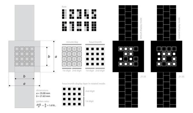
Design submitted by Pawel from Germany.
Pawel says: The quad watch was my first submission to the blog. Surprised by the positive feedback of the community I decided to develop the idea further creating quad². The objective was to design a minimalistic display that shows time in a un-obvious fashion but is easy to read if you know how. (original concept here)

Just as the first design, overlays digits using filled quads and frames showing the two digits of hour and minute on top of each other. The design incorporates three mathematically captured natural phenomenon.
(1) It consistently uses quadrate shapes.
(2) Each display quad and its frame repeats the shape of the whole display just like fractals do.
(3) The size of the whole display area and the active region is in golden ratio, just as each display quad and its frame. For the three-dimensional preview of quad² I used the “Kisai Satellite” watch, because it has a virtually quadrate display and minimalistic design.
This watch is “more than meets the eye” just as people who would wear it. On the obvious level it is a futuristic watch with minimalistic display design.
There has not been any display before that overlays digits in this way.


Ja, ich will 😀 Although I prefer the first one which is still a super mix of simplicity and crypticness.
The display on the first and last pictures is turned 90° clock(hehe)wise, took me 1/4 minute to get it. Very nice additional difficulty. Good luck Pawel!!
LikeLike
3.6? star what the hell…this is worth 5!!!
Please give me the red one, it works so well for me O:)
I love square shapes because it looks good and simple, 🙂 i like it alot.
LikeLike
Pawel, you make some very nice designs! 5y
LikeLike
Thank you for publishing this design so unexpectedly soon. And thank you for your positive feedback and support guys!
LikeLike
Simple and clear. Nice job!
LikeLike
This is a nice re-work of an already nice design. I think I still prefer the orginal version as it seemed a little easier to read. Maye be the original time telling can be used as the easy mode on this version. Either way a very nice piece of work! 5/Y, Keep um comming Pawel this is good stuff! 😀
LikeLike
Cool upgrade to the first one 5/Y 🙂
LikeLike
love it. love the colors. cryptic to others, but awesomely easy if you know. default mode and rotated mode are both very cool 🙂 5*/Y
LikeLike
My support for this idea
5/Y_ 🙂
LikeLike
Wow TF should make this one!
LikeLike
I like the overall look. I like that the grid, for one number, is 2×4, not 3×5, like the other version, whick make the display look smaller. 5*. I would buy.
LikeLike
I also love the band.
LikeLike