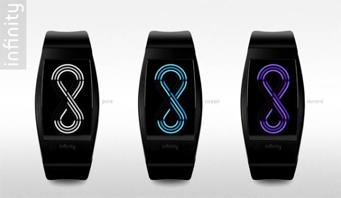
Design submitted by Pawel from Germany.
Pawel says: My objective was to come up with a futuristic display design, that comprises a universal concept that is mysterious yet understood by many and has an underlying deep meaning. Some inspiration for the display design came from the inside-out concept in Sam’s NEON IO watch.

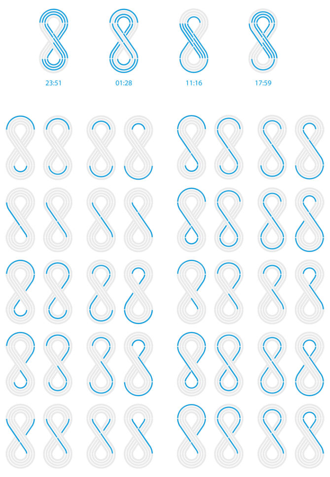
This is a four digit LED/OLED display with numbers placed within the four layers of the infinity sign. Each number layer is separated in segments to achieve balance between readability and producibility. The display is activated with a finger slide gesture over the screen surface. In the increased readability mode the layers light up with alternating intensity. As an option, a short animation of the infinity sign is played back before and after the time is displayed.

This watch is for people who like unique and unusual futuristic watches and appreciate the symbolism with deep meaning: infinity is a source of inspiration and creativity. While infinity itself is incomprehensible and unimaginable, it is mysterious and resonates with everyone of us.
Here and on the Web, there are couple watch designs dealing with infinity. None of them came even close to the idea of placing digital numbers within the infinity sign.


Nice one Pawel! I had a similar idea a while back but never came up with an optimised design for the digits. This system looks great and once you get your eye in works well. Nice addition to the stacked, concentic numbers catagory. Love the animation too! 5/Y Best of luck! 😀
LikeLike
Not sure how to read it but it looks awesome!
LikeLike
Pawel, it looks nice but it isn’t very easy to read and the basic idea isn’t very original.
LikeLike
Beautiful!! The hint about my NEON IO helped to understand how to read the watch 🙂 Very interesting but very difficult too. While the numbers can be learned of course, the arrangement makes it hard to read them, even if known. Moooore learning necessary here. Well it looks so yumm, it would be worth it. The numbers could be shown one after the other in a special mode so one can practice and after a year it’s so easy that the stacked display can be used. I think the 4 and the 9 should be flipped so the 4 looks more like a y and the 9 more like a… 9 hehe. Ok anyway, I think a more comfortable way to tell the time can be found. The display, the animation, the watch look great! I’d like to buy it! Viel Glück!!
LikeLike
this watch is cool ehehhehe
LikeLike
Zauber! Fuenf Sterne plus ja!
LikeLike
Coolest animation I’ve seen on a watch here. I concur with Sam regarding the 4 and 9 being modified, but I think this is sweet!
LikeLike
https://www.facebook.com/media/set/?set=a.10151100687885766.433560.574970765&type=1&l=a71da2cc5d
I love the look of your original design here. Very elegant, but a bit difficult to recognize the digits. I noticed that if you take the mirror image of your digit template, the digits can look much more readable. I put a link to an example of this.
5*/Y 🙂
LikeLike
Thank you Tokyoflash for publishing and you guys for your feedback.
Great idea Heather, your digit design looks indeed more readable and more elegant!
LikeLike
Marvelous Design sir……
LikeLike
I really like the concept
The animation is powerful.
Good luck!!
LikeLike
I prefer Sam’s NEON IO watch concept, mainly because I don’t like the twisted “overpass” part in the center of this concept. I also think that the proportion would be worst, vs always good.
LikeLike