Design submitted by Lloyd from Australia.
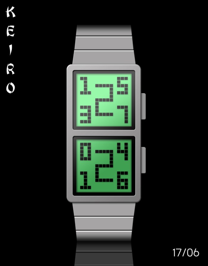
Lloyd says: This LCD concept watch design is named “Keiro” after the Japanese word meaning pathway.

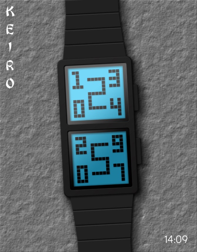
The time and date are displayed in a cryptic way, but are very simple to read once you know how. All you have to do is look at the ends of the 2 large digits, each of which is always either a ‘2’ or a ‘5’, and see which four small digits they are pointing to. Each of these large numbers forms a pathway connecting the first two digits and the last two digits in the time and date, hence the watch’s name. There is an additional non-cryptic mode that enables you to display the time (with seconds) and the date at the same time.

“Keiro” has an alarm and is USB rechargeable via a computer. It also has an EL backlight which makes the display easier to read at night. The watch’s case and strap are made from stainless steel and are available in silver or black. The LCD display is available in different colours and is “always on”.
This design would appeal to anyone who likes cool modern gadgets, puzzles, creativity and thinking “outside the box”.
It stands out because of its unique, quirky and easy-to-read cryptic display.


It’s a great idea and I like the styling, just a little concerned with the length of the case. Seems you might have to make it pretty narrow to fit on the wrist.good job
LikeLike
Thanx a lot for the feedback Gordon. 🙂
LikeLike
A narrow case would be a nice change!!! Lots of Tokyoflash watches are big and bulky (though beautiful) and not the sort of thing most women can wear. This watch would be ideal for anyone. The criptic time display is very easy to read, and would be great for those in a hurry. It is simple and stylish ……. a hint of Deco. I love it!
Diane.
LikeLike
Thanx Diane! Yeah I was hoping this could maybe be a unisex watch. 🙂
LikeLike
Thanx TF for posting this design. 🙂
LikeLike
Keiro is original, yet simple and direct–the ideals that all ingenious designs require. It may be a bit on the tame side compared to some of the other design entries, but the fundamental concept is strong enough to forego the excesses.
Lloyd is keepin’ it classy without the froufrou and I like it! Hope others feel the same way too!
LikeLike
Cheers Ai. 🙂 Yeah I can’t compete with some of the other guys’ awesome 3D designs. I just have to hope that the concept shines thru. 🙂
LikeLike
Looks nice Mushy, unique time telling method and interesting styling! Gets my vote sir 5/Y Best of luck! 😀
LikeLike
Thanx Pete. 😉
LikeLike
I Like it.
Good job. ***** / Y, 🙂
LikeLike
Thanx Jose! 😉
LikeLike
Very nice, indeed! 5y
LikeLike
Cheers Dietrich! 🙂
LikeLike
Eye catching, colorful, and easy to read.
LikeLike
Very eye catching, colorful and easy to read!
LikeLike
Thanx Lynn! 🙂
LikeLike
Too much of something is bad.
But not for this concept ! Eye catching & easy to read for those who know the secret. My fav are the classic blue & green display with black case. I also like the easy mode. I would buy.
( the case could be engrave to look like an 8 )
LikeLike
Hey thanx for your support and feedback Makko. 🙂 Let’s hope TF like it too.
LikeLike
I also like that you used the numbers 2 & 5 and not just & /
LikeLike