Design submitted by Andrew from the UK.
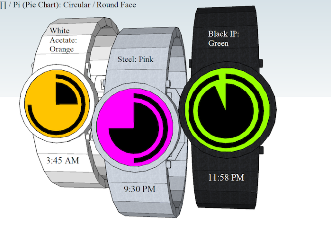
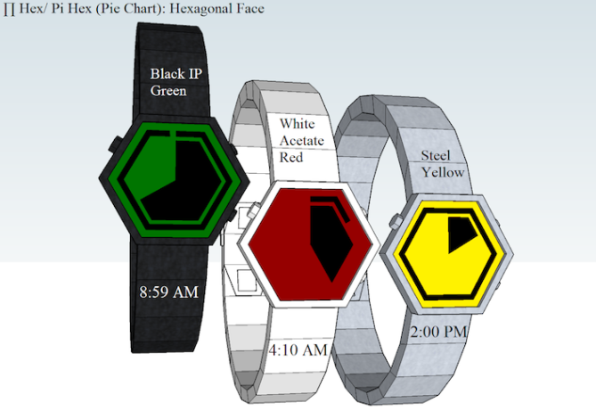
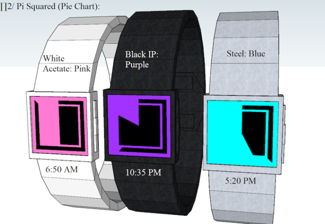
Andrew says: “The following LCD watch concept uses an analogue display based on a Pie Chart to display the portion / percentage of time that has elapsed.
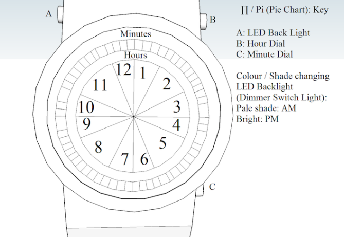
I call this design: ∏ / PI. The watches use a one Push Button & two dials (∏s / PI Squared: three Buttons) controls: LED Light (Push & Hold to set Time), Hour Dial & a Minute Dial.


A central Hour dial is divided into 12 equally sized 30 degree sectors (one per Hour). The Outer dial is used to display the number of Minutes that have elapsed within an given Hour. This is achieved using sixty six degree segments which are arranged around the outer edge of the Hour dial. The shift from AM to PM Hour is display using a shift in the shade of LED Back light: Pale: AM, Bright: PM.

This watch is aimed at people who are looking for a watch with minimalistic style.
The display on these watch designs are clear,simple & easy to read. Plus this design is available in Three separate Watch Face Styles: ∏ / PI (Round),∏2 / PI Squared & ∏ Hex/ PI Hexagonal.


Ummmm pie! :@~~~~ (imagine Homer Simpson drooling sounds) Nice simple time telling method. Looks good and is easy to read. I dunno if this has been done before or not, feels familiar but couldnt say from where. If it hasn’t been done before congrats and I cant believe it hasnt been done before! lol Nice work Andrew! 5/Y
LikeLike
I heard pie, got here and found pie shapes 😀 Hey, nice time telling method. I like the square one the most!
Btw, draw a line, rotate it by 30° while holding ctrl (creates a copy) then just type x11 and you have a perfect polar array of 12 lines 🙂 Same works for the minutes (6°, x59). SketchUp is a lil difficult when it comes to round things. When you draw a “circle” I can recommend it to have 60 segments for watch designs. So you always have the important angles resting on a vertice. Good luck and more fun!
I like Pi(e) and the minimalistic time telling looks good. I just hope for you that noone had this cool and simple idea before (happens more often than one wants). The watch geometry is definite enough to see what you mean and neutrally simple – not bad I say.
5*/YES for the work and the idea.
LikeLike
This is a great idea, Andrew – well done. Like Sam says try the multiplier and divide tools in Sketchup – it’ll save you a HUGE AMOUNT of hassle:
The following sounds like Spanish or Portuguese, but it’s fairly obvious what’s going on. Look in the bottom right before the guy creates the 23 segments:
Hope this helps, and 5y
LikeLike
I would like to thank Tokyo Flash for publishing this latest Design on there Blog. This is the 10th design that I have had published. If you want to check out some of my other published concept copy & paste the following Link: http://www.tokyoflash.com/blog/?s=ANDREW+UK
Furthermore I would like to add that this design could also be available with Touch Screen Controls.
LikeLike
Touch screen Controls: Touch the screen to activate back light. Then press & hold to enter setting mode. The Hour & The Minute dial will flash. The user Selects the dial they wish to alter, then scrolls their finger Clockwise to increase the Hour / Minute or Anticlockwise to decrease the current Time.
LikeLike
Hi, Andrew. I like the round and hexagon faces!
LikeLike
My DevHour concept resembled a rotated pie chart every 5 minutes, but other than that they are different approaches.
LikeLike
I think this is your best design so far, Andrew. I’ve sent another post with some Youtube links that are awaiting moderation. Sam is right about Sketchup – his tip will save you hours of frustration.
Cheers – 5y
LikeLike
When will it be availabe?
LikeLike
I like this watch, it looks like fun to have, it reminds me of math.
LikeLike
I like the simplicity. I prefer the round ( even if the buttons position look wrong ) & the hexagonal. I would buy a green or red display. 4*.
LikeLike