Design submitted by Peter from the UK.
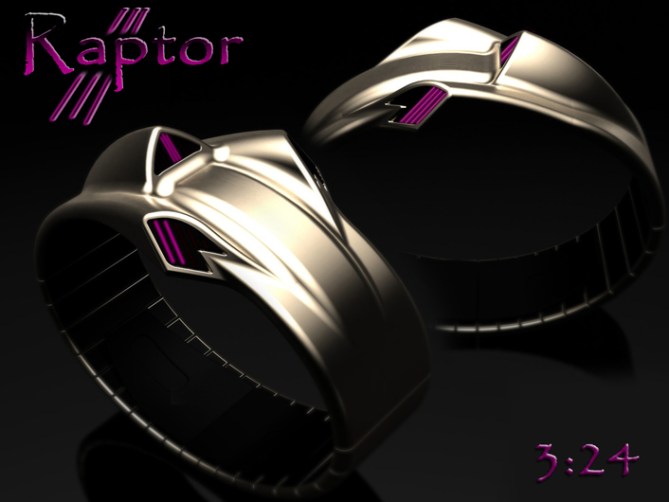
Peter says: This is “Raptor”. I didnt really have a preconception for this design. I simply wanted to create an organic design with a simple time telling method. I started off sketching simple organic snake like forms which subconsciously became more engineered.
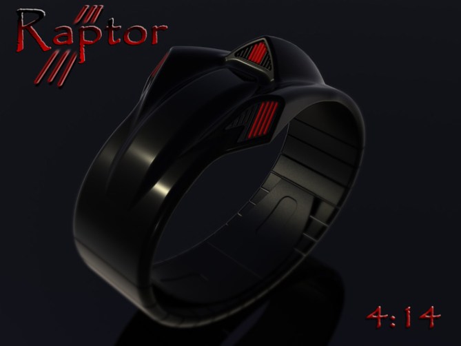
I soon came to the realisation that a lot of human creations have shapes and forms taken from the natural world shaped and formed to suit their application. So I decided to make the design organic, engineered and abstract. The shape will resemble different things to different people.
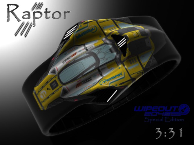
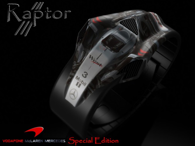
I like sci-fi and motor-racing so to me this shape looks somewhere between an F1 car and a spaceship, to others it might look like an alien or a snake.
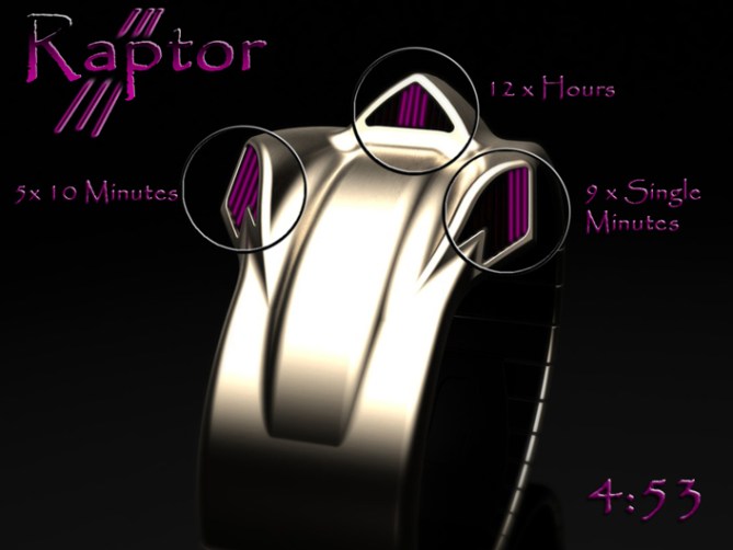
The time telling method is a back to basics LED 12-5-9 format. The 12 x hours are displayed by the central rear array, the 5 x 10 minute groups are on the front left hand array and the 9 x single minutes are on the front right.
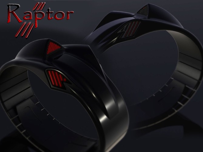

Due to the abstract form suggesting different things to different people I have shown it in different finishes with different colour LED combinations. This gives the customer a certain amount of customisation. To take this further still I have also included a couple of special edition based on my personal interpretations of the form. These are based on the Mclaren F1 car and a race-ship form the wipeout 2048 computer games. To make this a customisation feature I suggest that these could be self applied skins made form self adhesive vinyl. These could perhaps be sold as a printable decal sheet with a CD with template software which would allow the customer to use their choice of image simply printed onto the decal sheet then peeled and applied. This would also act as protection to the watch like often used on mobile phones.
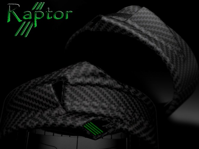
The abstract and slimline form gives the watch a wide appeal, the time telling method is simple and easily recognisable. The added bonus of the customisation feature and choice of colour combinations will add to the universal appeal. The simple time telling method also makes this design viable from a production perspective.




I love this design. 5*/yes
LikeLike
Thanks a lot Romain, Im glad you like it! 😀
LikeLike
FEISAR EURO POWER!!! Hehehe, luv this texture 😀
Omg Pete, this watch rox. It looks good with texture and without it. The shape is so myum ♥ Time telling is easy, looks good and is perfectly combined with the shape, looking like exhausts or speed indicators.
Maybe the strap segments have to start earlier to make the watch fit to more wrists – piece of cake.
So great idea with the special editions! The high speed vehicles fit well and although it’s cheesy, I like it. Luv Wipeout ^^
★★★★★/YES
LikeLike
hehe I wondered if the “decaled” ones would be too cheesy and a bit much but I wanted to show a customisable element. Skins seem to be a popular means of customisation for personal electronics so why not watches.
Yeah there is no reason the segmentation of the strap couldnt start sooner, starting at the half way point is force of habit. Cheers for the positive feedback! 😀
LikeLike
it’s really beautyful, of course i’ll by it, particulary the sylver and pink, just hope the size could also be for women this time…tokyoflash often made only for men, means big size 😦
great job peter
LikeLike
I see no reason this couldnt be small enough for a ladies wrist, in mettalic finishes it could look quite jewelry like (briel used to make snake like jewelry a couple of years ago) Cheers for the great comment Tigroo! 😀
LikeLike
Wow this is awesome. The wipeout and F1 versions look sweet and works well. *looks for pre order button* 5/Y
LikeLike
Yeah they should have a pre-order button shouldn’t they. Mind you if they did I would be in huge potential debt! lol Cheers for the comment and the vote! 😀
LikeLike
OMG I love Tokyo flashes designs but this tips it all well done
LikeLike
Thanks a lot Zammy! Im glad it appeals! 😀
LikeLike
Thanks TF for adding this design to the blog! 😀
LikeLike
WOW, this is the funnest lookin watch i have seen in a while. The F1 decal was brilliant 5* y
LikeLike
Thanks a lot Gordon, I like the way you see things, cheers for the vote! 😀
LikeLike
It’s better without the decals, imo. Your designs are good enough to where you need not use other IP to boost the likes, Pete.
I loves me some F1 and Wipeout is one of my favorite racing franchises of all time. That said, the design is strong enough without them.
LikeLike
Hi Cory, the decal examples are just examples. They show things that I like and see in the shape. I was temped to do kind of Xeno style one but lazyness got the better of me. Yeah I think it fine plain straight out the box but I tried to cater to as many peeps tastes, and some folks like to customise. Cheers for the feedback 😀
LikeLike
yes but its still cool
LikeLike
OH! and, carbon fibre for me please.
LikeLike
The carbon is my favorite too, but it’s gotta be real! None of that fake printed plastic rubbish!
LikeLike
Reminds me of a driver’s watch, which makes sense. Very creative!
LikeLike
Yeah the angle of the displays does lend itself as a drivers watch, I wish I could tell you that was fully intentional! But it was a happy accident! lol cheers for the comment Logan! 😀
LikeLike
If your going for the organic approach stay simple. Elegant lines , I say keep it. I want one.
LikeLike
Thanks for the feedback and the comment Mike! 😀
LikeLike
Like it! It’s not hard to read the time, serious futuristic design, and really attractive. No one would suspect it’s a watch.
LikeLike
I like the way you see it Jerry, I couldn’t have put it better myself! Thanks for the great comment! 😀
LikeLike
5 and a yes from me. Hell yeah I would buys something like this. I love the ambiguity of the design! I can see how it can look organic to others and how it can look technological to another. I love it! It looks like something out of Alien!
LikeLike
Hi Jonathan, Im glad you likey and that you see the form in a similar light to me! Yeah I considered doing a xeno skin image too but figured the shiney black one was sugestive enought. Just turn off the lights, imagine it dripping with slime and play an eeri bleeping noise in the background which slowly gets faster for full effect! hehe
Cheers for the support and the great comment! 😀
LikeLike
A litte Xeno fun:
http://www.facebook.com/media/set/?set=a.370776316337435.87111.159423137472755&type=1#!/photo.php?fbid=372473089501091&set=a.370776316337435.87111.159423137472755&type=1&theater
LikeLike
A little Preddy fun too:
http://www.facebook.com/media/set/?set=a.370776316337435.87111.159423137472755&type=1#!/photo.php?fbid=372866949461705&set=a.370776316337435.87111.159423137472755&type=1&theater
LikeLike
Tokyoflash read this: make this watch real. Wipeout HD and McLaren editions are so outta this world!
LikeLike
Thanks a lot Jerry! I hope TF listen to you! 😀
LikeLike
So want this! I love how organic yet pissed off it looks.
LikeLike
hehe yeah its like an angry engineered snake! =====D-=
Cheers for the comment Dave, nice profile picture btw 😉
LikeLike
http://www.wishwall.me/profile?uid=4efc01a421a863079302cd56#s/4f759548b233951b8d08da76
LikeLike
http://chime.in/user/TechCracks/chime/196510177966370816
LikeLike
http://techcracks.com/2012/10/raptor-led-watch-concept-by-peter-fletcher/
LikeLike
http://weheartit.com/entry/40470969#
LikeLike
http://phowi.com/487847/raptor-led-watch-concept-by-peter-fletcher/
LikeLike
http://vi.sualize.us/raptor_led_watch_concept_by_peter_fletcher_gadget_design_tech_art_picture_BuXd.html
LikeLike
http://imgfave.com/view/2819101
LikeLike
http://lockerz.com/u/tech.cracks5044/decalz/19809504/raptor_led_watch_concept_by_peter_fletch
LikeLike
http://designspiration.net/image/3273458662881/
LikeLike
http://gadgets.9square.net/raptor-led-watch-races-onto-your-wrist
LikeLike
http://designotorius.wordpress.com/2012/10/18/raptor-led-watch-concept-by-peter-fletcher/
LikeLike
http://zootool.com/watch/nrx4t/
LikeLike
Very sculptural, a real work of art, and the different designs on the band are a great option.
LikeLike
Thanks a lot Diane, I have focussed on more industrial imagery but I think the shape would also lend itself to more softer suble themes which hopefully widens its appeal.
If anyone knows someone arty who would like to add a theme to an image and post it here please feel free. Would be interesting to see someone elses customisation ideas. Cheers for the great comment 😀
LikeLike
The F1 car / race-ship special edition are nice. ( I like to watch F1 races ) I don’t like the plain version because something is missing. ( but it’s nice that you show them so we can appreciate the overall look )
LikeLike
Im glad you like the decal’d images. Maybe chrome or camo will appeal too, check these new images out! 😀
http://www.facebook.com/media/set/?set=a.370776316337435.87111.159423137472755&type=1#!/photo.php?fbid=380220645393002&set=a.370776316337435.87111.159423137472755&type=1&theater
LikeLike
The xeno, preddy & chrome versions are nice. I don’t like the camo because I don’t like this in anything, but it would be a very popular one. Also, I like the idea of the CD with a template-making software.
LikeLike
Cheers for taking a look at the other images. The template and skins kit would certainly allow people to make it their own and offer protection to the watch too. Cheers for the feedback Makko! 😀
LikeLike
Time runs out for this post very soon, so just wanted to say cheers to anyone who voted, commented and/or liked/shared. Thanks for TF for adding it here and any external blogs that featured it on their sites.
Cheers folks,
Pete from the UK 😀
LikeLike