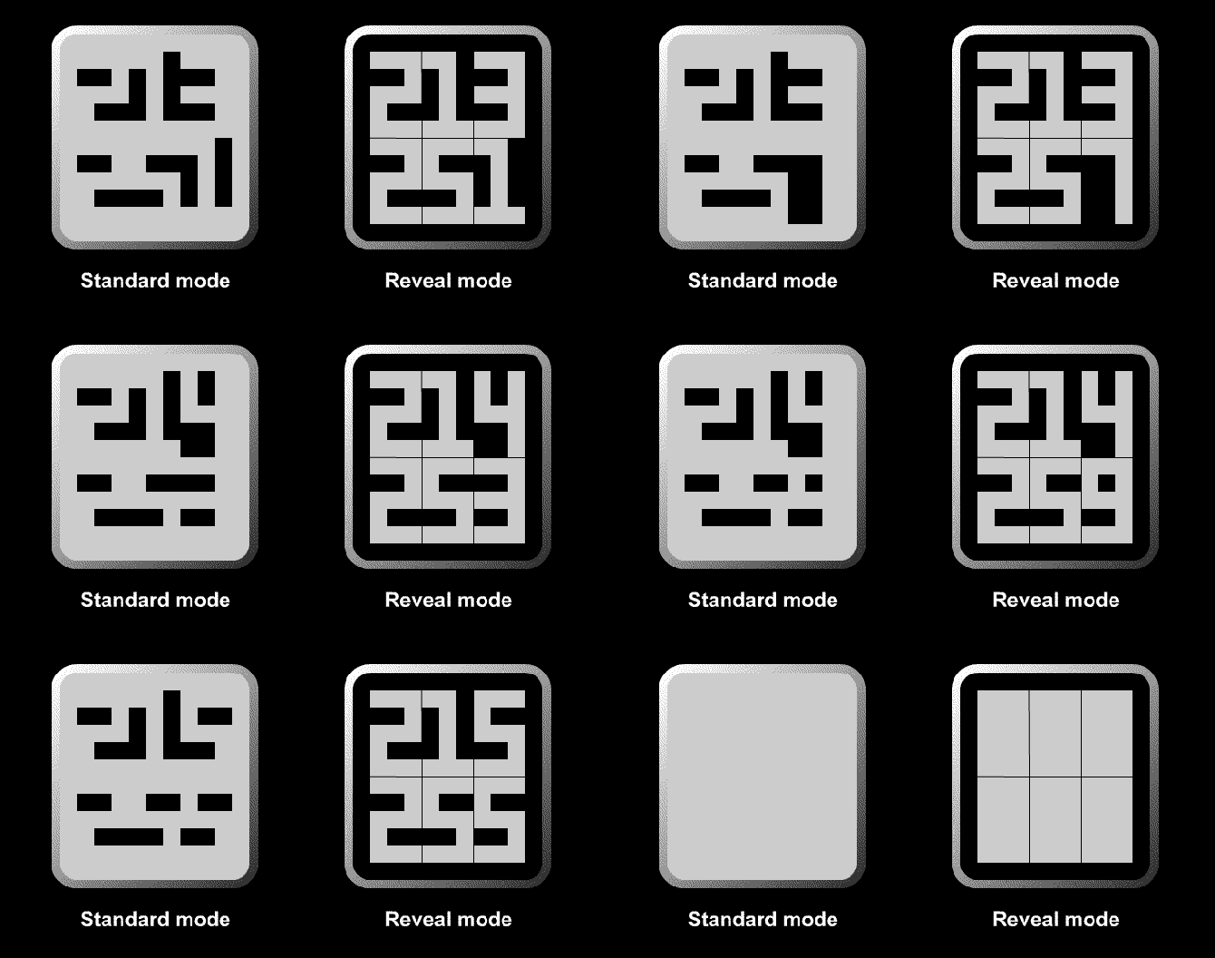
Design submitted by Jens from Sweden.
Jens says: The concept is called Leftovers since the presentation of time (or date) is based on what’s left when you remove the figures.

By emphasizing on what’s not seen, the display tricks the eye and mind. Instead of seeing numbers there are (almost) incomprehensible shapes of blocks.
The time is shown in three columns, one for hours, one for minutes and one for seconds.
The secret is to imagine the hidden outlines of the figures. For those who prefer a more easy-read watch or need some time to get acquainted with the concept, there is a reveal mode.
With the brushed metal case, pleated bracelet and bold figures in reveal mode, it is worn as a designer piece of those who like to do an understated statement. In standard mode it is more a matter of showing off your skill in interpreting something more or less obvious.


Great idea!!! Cool standard mode, helpful reveal mode, easy to make, fun to read 5*/YES
LikeLike
Thank you for your kind words and support / Jens
LikeLike
Nice, I agree with Sam’s comments 🙂 5/Y
LikeLike
Thanks, every vote is welcome / Jens
LikeLike
Välkommen!
Not many nits to pick here; simple and lagom difficult time telling, consistent overall design, not too flashy…=) Very nice indeed!
LikeLike
Tackar, tackar!
I suppose you like it because it is in the Scandinavian design tradition of “less is more” ;-)…
…although I am not sure everyone understands the Swedish word “lagom” in your comment.
/Jens
LikeLike
Probably true, my own submissions tend in much the same direction, but i prefer the version ‘less isn’t always more, but more is very often too much’…=)
Well, they can look it up (it’s on english wikipedia, as I found out), and it’s such a good word it deserves to be used more, I think…
LikeLike
I really like the look of this design, its very clean and simple with a cryptic but easily understandable time telling method. The reveal mode is a sensible addition. My only concern is it does remind me a little of a couple of TF designs (on the blog from a while back) that use the negative parts of the numbers in a similar way. But this does look differenent and more bold. Very support worthy 5/Y Best of look Jens! 😀
LikeLike
Thank you for your appreciation and support.
I do understand your concern. I hesitated before posting this because I thougth the idea was too obvious and assumed someone should have came up with it.
I tried to scan the blog, but couldn’t find anything exactly like this, even if there are designs with the same basic idea to show what is not shown.
/Jens
LikeLike
The designs I mentioned arent exactly like this, they just use similar principles. TF probably would have mentioned to you before posting your design if there was a conflict. If they think its different enough then there is no problemo! 😉
LikeLike
Right, exactly my conclusion when I finally decided to post this. If it is orginal enough it will be piblished, otherwise not…
… by the way, I have not had the opportunity to thank you for your encouraging words as the last respons to my first posting. I am working on a Empty space mk2, and trying to do it in Blender, but the the learning step is quite high… 😦
LikeLike
It’s clever! I like it. *****/YES
LikeLike
Köszönöm szépen, which is almost all Hungarian I learned when I was i Budabest many years ago,
except from “két sört kérem” 🙂
/ Jens
LikeLike
Ah, negative space! Simple and cryptic. I love it! Is there a possiblity of a multi-color version with each digit background being a different hue?
LikeLike
Thank you for your support and suggestion.
With a coulor disply it should not be impossible, but I think you will lose some of the clean look and it will be less cryptic when you define the different digits’ backgrounds… on the other hand you could have the same hue on joined blocks and get something even more confusing.
/ Jens
LikeLike
Different coloured backgrounds could be an alternative ‘reveal’ mode, and being able to set the background colour yourself would probably widen the appeal, at least that’s my guess…=)
LikeLike
The overall look is nice. I don’t like the normal mode but the reveal mode save it, for me. I would buy if the reveal mode could be always on.
LikeLike