Design submitted by Kolora from Russia.
Kolora says: Looking at photos of the star sky we reflected that here doesn’t suffice? This idea so instantly was born. And why not to make our planet? A subject very interesting reflecting Earth breath.
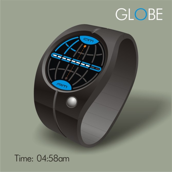
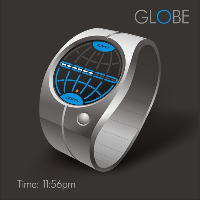
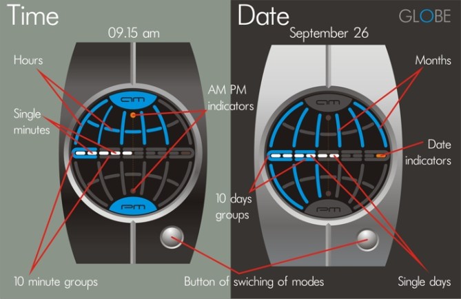
The dial with light-emitting diode color illumination. The equator divides the sphere into two hemispheres: the top hemisphere – AM and the bottom hemisphere – PM tell designations about it on poles and orange indicators about them.
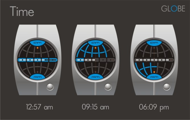
Time: meridians and parallels show hours. Equator: 5 blue sectors for 10 minutes and 9 white points for 1 minute.
Date: the orange indicator on the equator on the right burns. AM and PM are switched off. Meridians: number of month from 1 to 12. Equator: 5 blue sectors for 10 days and 9 white points for 1 day. The button of switching of date and time settles down on the case and symbolizes the Moon.
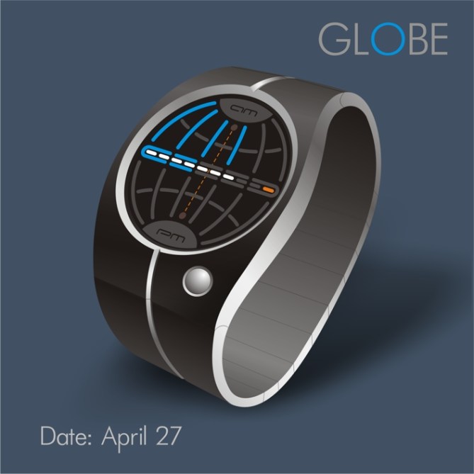
We assume that such design will be interesting to any person irrespective of age, sex, a nationality and a profession. A bracelet and the case from white metal. Light aluminum approaches more all to a space combination and the correct perception of a subject. Such bracelet will comfortably lie on a wrist. Possibly and other combination of materials. The similar concept shouldn’t leave indifferent anybody who Earth loves a planet!

Even at a passing this design brings up a global question: And where I live? The name “GLOBE” so was born. Here, here on a planet Earth will instantly be carried by the answer in the head. And already then how many here time how to learn? We think our watch will draw attention. As our time is time of a planet on which all of us live. And “GLOBE” as though speaks: “Remember time the inhabitant of our planet! With each its turn You go to the future”!



Nice concept and color scheme.
LikeLike
Thanks, Logan, for an assessment of our work. The scale was chosen not casually. We wanted that the dial corresponded to color of our planet. The blue sphere in black mysterious space is the most suitable option of a color score for our planet.
LikeLike
Love it 😀 Looks cool, it’s clever, it’s simple. I like the moon button hehe and the line around the wrist. Normally I don’t like complete logos that are only shown partially to show the time, but what you show here still looks stylish. Leaving the un-illuminated globe still visible is a very good idea. ★★★★★/YES Good luck Kolora and welcome to the blog!
LikeLike
Thanks, Сamukun, for hospitality. You talented and generous. We delighted with your projects. Your works caused to create our own project. The fine feeling of the master allowed you to notice an axis on which mother Earth which we made hardly appreciable rotates not to break the general picture of perception. Pleasantly when colleagues notice such “trifles” over which think. Your opinion is expensive to us. We appreciate it.
LikeLike
I rather like this, the simple but detailed display, the clean looking case and strap. The moon button is cool I especially like the top image in grey and black, has an Alessi feel to it. I think the time reading could be slightly clearer (not sure how at this moment) either way awesome design! 5/Y Best of louck and welcome to the blog! 😀
LikeLike
Thanks, Pete, for attention to “GLOBE”, for an assessment of design of the case, we didn’t want it to overload to reflect space round a planet. Probably black-silvery scale will suit more to the people conducting an active way of life, but this subjective opinion. And also for the Moon button is not only it is symbolical, but also it is very convenient to use below on the right where the hand doesn’t block the screen. (we so think)
LikeLike
Im really diggin this watch. Very unique way of telling time and great style.
LikeLike
Thanks, Gordon. We tried to keep Tokyoflash style of non-standard reading of time.
LikeLike
Really love this watch Kolora. Good job! 😉 Welcome to the blog too. 🙂
LikeLike
Very cool concept, nice work 5/Y
LikeLike
Krautesh Vakir! We are glad that the concept of “GLOBE” found a response in your heart. Thanks.
LikeLike
Thanks,mushy, for friendliness and heartiest welcome.
LikeLike
Huge gratitude of Tokyoflash for that that placed our design of a watch in the blog. It is a pity to us that we didn’t know about you earlier. Your view of reading of time is very conformable with our outlook. Let looking at your o’clock people think not only of time, but also about what that bigger.
LikeLike
I like this watch in LEDs, will look modern, casual and global as the name suggest! Pretty simple and decent design.
╔╗──╔╦═══╦═══╦╗──╔╗╔═══╦═══╦═══╦═══╦╗
║╚╗╔╝║╔══╣╔═╗║╚╗╔╝║║╔═╗║╔═╗║╔═╗╠╗╔╗║║
╚╗║║╔╣╚══╣╚═╝╠╗╚╝╔╝║║─╚╣║─║║║─║║║║║║║
─║╚╝║║╔══╣╔╗╔╝╚╗╔╝─║║╔═╣║─║║║─║║║║║╠╝
─╚╗╔╝║╚══╣║║╚╗─║║──║╚╩═║╚═╝║╚═╝╠╝╚╝╠╗
──╚╝─╚═══╩╝╚═╝─╚╝──╚═══╩═══╩═══╩═══╩╝
LikeLike
Thanks, Firdaus, for a praise! Very pleasantly when your thoughts highly appreciate.
LikeLike
It’s a nice twist on the 12-5-9 type. I like the overall look. I would buy it, even if I would prefer if it was an lcd. ( or any always on tech )
LikeLike
It is noticed precisely, Makkovik that time in “GLOBE” is divided into twelve, five, nine… twist on the 12-5-9 type but with a step in the future and with big sense. Why also isn’t present? The lcd display quite would approach too. And the Titan or Carbon for the case and strap… hehe… wouldn’t leave indifferent admirers of a watch from Tokioflesh.
Oh, yes of course equipment by a power supply system and additional charges from a sunlight, located on the dial would be quite good addition in this device (we so think)
Our Mother Earth is charged and lives thanks to the Sun and it is very symbolical… appealing to consciousness ecology. Thanks for feedback.
LikeLike