Design submitted by Gordon from the USA.
Gordon says: My friend told me I should make a large format watch so I did. Time telling is pretty obvious, I think people with pinky rings and those who want pinky rings will wear this watch.
This design is unique because it doesnt try to be different.
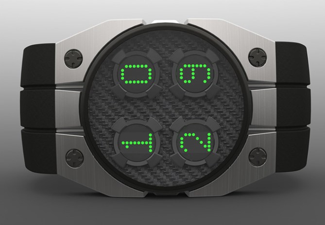


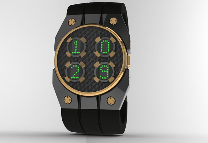
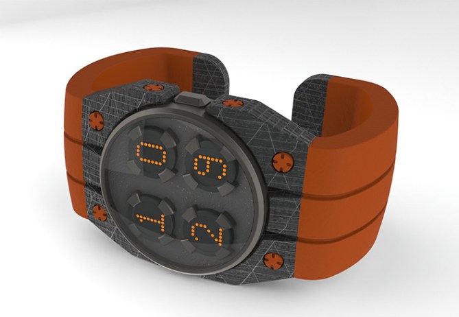
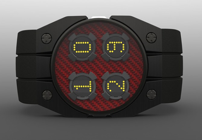
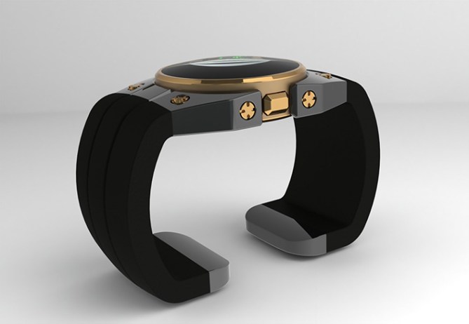


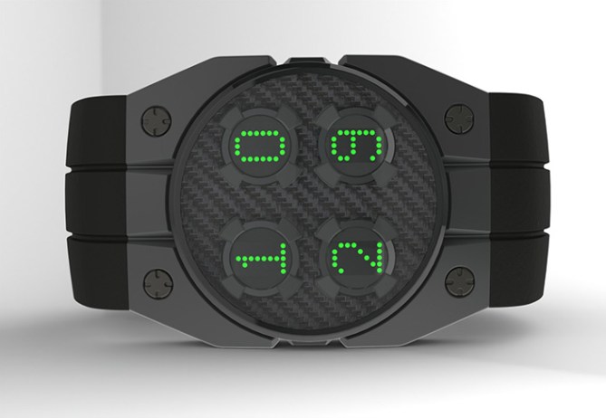


Very strong, durable looking watch. It looks like a containment unit for some futuristic power source. Very clean lines and bold execution, Gordon. I could see this one with the strap as is, or like Satellite with a PU strap and steel clasp. Big vote, big yes in this corner.
LikeLike
Thanks Cory, good take on the watch I think you get what I was goin for
LikeLike
If you would like to see more variations of this watch please visit my site http://www.coroflot.com/GordonLardi
LikeLike
CHUNKY!!! That’s an understatement! Thank you for your delicious variety of designs! Love the pocket watch. I’d buy one if my wife would let me.
LikeLike
If TF makes I promise to buy for you and your wife and take you and your wife out to dinner!
LikeLike
McChunky burger anyone? lol 😉
LikeLike
Agreed, this watch has a very strong presence about it. Does it belong amongst the rest of Tokyoflash’s absurdly appealing complex time readers… I’m not so sure. Still a nice looking design though.
LikeLike
Nice looking watch, Gordon. And I do love chunky watches! 5*/ Y from me.
LikeLike
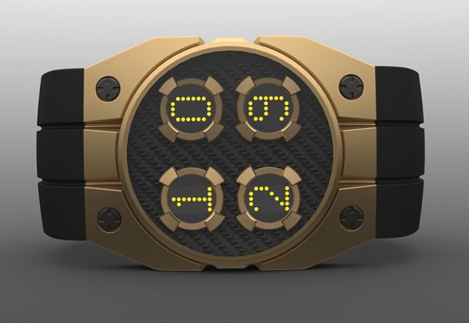
Nice robust looking deign with clean looking display. Love the black and natural carbon and the black and yellow carbon combinations. For me I would prefer a bracelet strap with chunky metal clasp but thats subjective thing. 5/Y Best of luck! Nice to see you back on the blog Gordon! 😀
LikeLike
Easy to read chunky awesomeness, love your other designs on your site too 🙂 5/Y
LikeLike
Thanks everyone glad to see there are fellow chunky lovers. Lol
LikeLike
Real men love chunky watches. I purposely wana say that I’m freaking love the concrete version with browny strap there. I like these idea dude, if TF is making these, they can be an digital and affordable alternative to these insanely priced masterpieces …. http://www.dzmitrysamal.com/en/collection2.html
5* yes to Gordon-chin!
LikeLike
Wow! those are nice Firdhaus. Im totaly into the concrete look. Adimar Piguet uses a material called “forged carbon” for some of their cases, I would love to use that for this watch
LikeLike
It really is a different design than the ones you see around here.
I Like it and I agree with most of comments.
Congratulations Gordon for the job.
5* & Y -:)
LikeLike
Thank you Jose ,working o n THE REmix
LikeLike
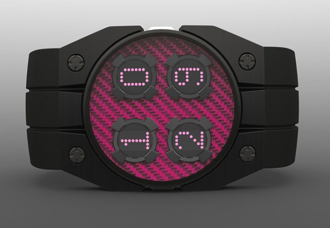
Hi, Gordon! I really like the version with the red carbon fiber with yellow LEDs!
LikeLike
Thanxs Xian, I like to mix it up because everyone has different tastes
LikeLike
I love the design (even though I don’t wear a pinky ring). I love the Oakley style industrial watches and this hit the spot for me. I agree with Pete about the bracelet. I prefer a full on strap to a clip on. Not too keen on those. Grey and black for me all the way!
Paolo
LikeLike
By the way, what 3D modelling software do you use for your watches Gordon?
Paolo
LikeLike
Thanks Paolo, I hear you about the clasp, probably more practical too. I like the cuff style because it is easy on easy off. The software i use is Solidworks.
LikeLike
Oh and Gordon, your watch design is good and you should feel good
LikeLike
thanks Lana
LikeLike
OMG!, don’t forget to look at the watch
LikeLike
Nice design – no doubt. Very cool color and material variants – hard to pic a favorite. Appealing geometry 🙂 I’m not sure if the numbers are too traditional (definitely not nerdy) and if the look alone it spacey enough to be tokyoflashy. But I agree with what Toky said: if people like it, they should make it. It would be a cool addition to the catalog because it would cover a different kind of clientel.
LikeLike
thanks Sam to be honest the display part was not totaly satisfying me but i am working on somthing now that that i think might work better or at least different
LikeLike
if you like chunky style check out the remix at the bottom of the pictures, more styles to come at http://www.coroflot.com/GordonLardi/watches
LikeLike
There’s a lot of interesting models. The remix version would be more interesting if there was 6 circles and go HH:MM:SS not S:MM:HH.
LikeLike
Hey Gordon, I checked out you remix version, I like it! The extra detail brings the face to life more. Nice work sir! 😀
LikeLike
Thanks Pete I’m glad you like it,I’m done with changes now
LikeLike
You got any more submissions in the pipeline?
LikeLike
Just kickin some thoughts around at the moment
LikeLike
The case overall look is nice, mainly because it look very durable & strong. ( specially the digits surunding area ) I like the band except the buckle area. Howerver, since I don’t wear chunky/heavy watches, I wouldn’t buy.
LikeLike
hey thanx for takin the time to see the remix and commenting, i submitted and hope they will present it here on the blog
LikeLike
GO SEE CHUNKY STYLE REMiX!!! COMING SOON!! I HOPE
LikeLike