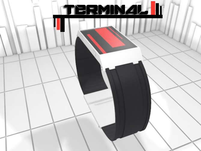
Design submitted by Eivind from Norway.
Eivind says: I got my inspiration from classic science fiction, like 2001: A Space Odyssey and games like Mass effect and Deus EX. I liked the minimalistic design of the equipment and different tools. The style is simple, but it stands out. I also got inspiration from the popular products on the market today, like an iPhone or a pair of beats by Dr.Dre headphones.

My design is not based on numbers, but its still easy to tell time.
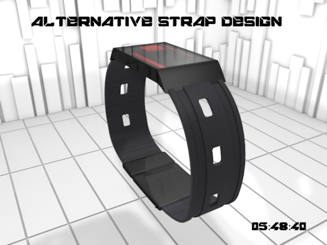
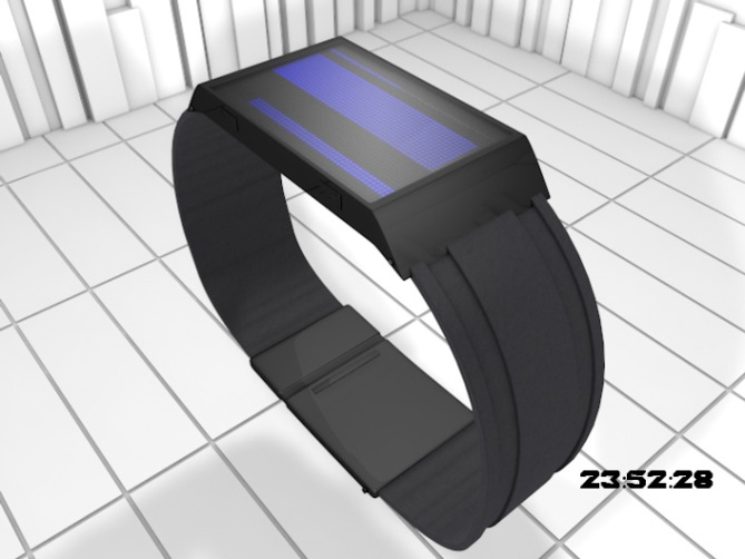
The widest bar is hours 0-24, the smaller one is minutes 0-60 and the smallest is seconds 0-60. The display consists of many cube-shaped LED diodes which is extruded slightly from the background and covered by scratch resistant glass. The strap is joined together on the bottom with a adjustable link that snap together with neodymium magnets (or regular hook system If the fabrication is problematic). The magnet system is inspired by the iPads “smart cover”. The watch is also supposed to be USB rechargeable, and it should be possible to set the time via USB also.
I think people who are in to scifi or people who like cool gadgets with a good design, or the general pop culture would like to wear it. This watch is designed for people who like a clean design, in other words it looks good in both a casual and formal situation. Because of the modern contemporary design it fits in anywhere. The watch can be a bit masculine, but looks good on both genders according to tests I have done.
My design stands out because of the simple and elegant design, and the magnetic link that many people will think is a cool detail, which is a little bit different from other watches. My design is also a bit more “adult” than the other designs. If I were to compare it to anything, I had to say that it is somewhere in between the Changing Lanes LED Watch and the Seven LED Watch. The way the face of the watch tells time is also completely different from anything on the website.


Welcome to the blog Eivind!
Wow respect for all the work you put into this project! I love what you did there! I like the look of the watch, great style for me: thin, 45°♥, minimalistic.
There are two points that are negative though. The most heavy point is: the watch can’t be read. Ok the seconds are alright, noone really needs the exact seconds. But the minutes and hours are really needed. I would let a number run next or inside the bars to give exact information. Maybe the numbers are off all the time and only on when you press a button… This or something else has to be done to fight against the second point: the similarity to existing watches. Ok, there is no watch that looks exactly like your concept, but rectangles and grids have been used alot by now. But aside from that, it looks so cool. That’s probably why rectangles and grids are used so often. Add some numbers or a scale (like on a ruler maybe) to improve readability and this watch is a competition.
So, and just because the rating is this down, I support you with ★★★★★ because I like it and I want this watch improved 🙂
LikeLike
Welcome to the blog 🙂 I agree with Sam on the number thing, it needs either numbers somewhere or some kind of markers along side the bars to keep it a bit more cryptic to indicate precise hours and minutes, mayby a contrasting colour on one of the squares where the hours and minutes are. Other than that cool as concept and nice video there as well.
LikeLike
oh and I gave you a yes and 5 stars 🙂
LikeLike
It looks great. But it is exactly like samukun said. You have to guess the right time because you don’t know it exactly. Thats not great. so 4 Stars because you had a lot of work with it but i have to choose no.
LikeLike
Looks great and the display has a lot of depth considering its simplicity. My only issue which echoes the others comments is the ease of time telling. Maybe if you have a reading mode where the grid is divided into blocks of 3 or 4 hour/mins etc for quick and easy reading. This could be easily achieved by just shortening the corresponding line a little for each block. Has potential 5/Y best of luck and welcome to the blog! 😀
LikeLike
This is a nice clean design. The presentation video was a brilliant piece of work,good luck and welcome to the blog
LikeLike
Hi guys.
sorry for the late reply. I had some problems with my account.
Thanks for the awesome feedback. And i agree, there should have been a number system or something. I got the design idea one day in my head, and just had to make it! and i will take all the suggestions under consideration. i originally wanted to make the numbers of LED diodes the same as the unit of timeit is supposed to represent, so minutes and seconds 60 LEDs and hours 24 LEDs.
LikeLike
I have to say that I think that the ratings are unfairly low on this post (3.0) when I wrote this comment. Rate fairly people!
LikeLike
Thanks Pete!
LikeLike
Thanks everyone! 🙂
LikeLike
I registered JUST so I could comment on this! Gave it ***** + a Y. Love the design, the look, etc.
I’ll agree with others saying that there needs to be some kind of marking that can help pinpoint the exact time.
Aside from that, wow, love everything about the watch. Really great work with the video, too!
LikeLike
I like the overall look, but it need some indicators to help to read the exact time. Also, I would prefer H-M-S not S-H-M & if they would all go up or down.
LikeLike