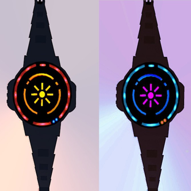
Design submitted by Sarah from the UK.
Sarah says: This is my second attempt at designing a watch and has been a development of the previous snowflake idea, except this one is inspired by sunrises.

I’ve started to try to use sketchup for 3D drawing and a free rendering package, but I’m not good yet so sorry again for another rough design.
The minutes of the watch are in the centre of the face, and light up starting from 1 at the top, moving clockwise around, finishing with a centre dot for 9 (please see pic), no yellow lights at 0.
Tens of minutes are around those in orange, again starting at the top and moving clockwise around, however for this a dull orange pattern is always visible, but lights up brighter sequentially from 10 mins onwards.
Hours are shown in the red band around the edge. Like the orange pattern, the red pattern is always on but dull, and gradually lights up with points around the outside, these points are positioned in normal analogue clock positions. As each hour progresses, the LEDs light up and stay on in sequence (just 1 outer LED at 1am/pm, 2 outer LEDs at 2am/pm and so on), however this could be modified maybe in the settings to just one light per hour.
Am/Pm lights are blue and in bottom right position of the face. One light for am, two for pm.

Buttons on the side of the watch allow modification of the settings such as brightness, or method of displaying hours etc.
The other side has a concealed USB charge port.


A big thank you to Tokyoflash for posting this on the blog! Apologies for the roughness of this design, it was my first stab at 3D with sketchup
(-.-; )
I’ve since started using blender and current designs are looking a bit smoother lol.
LikeLike
Nice decision Sarah, goodluck with Blender!
I think this design is pretty good, I can imagine its designed more subtly, would look even cool!
Keep up good work and all the best!
LikeLike
Thanks very much 🙂 I’m really glad you like it.
Yeah blender was tricky at first, but I’m slowly getting the hang of it… sloooooowly. I’ve submitted a revamp of a previous design in blender, keeping my fingers crossed that it shows up soon. I did however submit a few other designs in sketchup too so it’s possible one of those rough ones might pop up at some point first.
Thanks again! 🙂
LikeLike
Nice colourful fun design! Nice inspiration again, I think I prefer the snowflake design better but both are nice. The model is pretty good considering how new you are to the software. I look forward to your next submission! Keep up the good work! 😀
LikeLike
Thanks Pete!
I also prefer the snowflake one lol. Funnily enough, I’ve redone it in blender with some nice lighting effects and submitted it, so fingers crossed it gets posted soon. As I was saying to Fir above, I did bash out several designs in sketchup first before abandoning it for blender, so it’s possible one of those might turn up at some point… but I’m really liking the render engine in blender, and lighting effects. I can’t get it as cool as the stuff you and Fir do (that stuff looks reeeeeeeeeeeeeeal 😮 ) but it’s definitely an improvement on sketchup for rendering!
Thanks for the support, I’ll keep trying my best to improve! 🙂
LikeLike
I like the easy to read display layout with these interruptions here and there plus the little am/pm indicators. The 30 minutes in the 6:39 example are a little hard to see as well as the 20 minutes in the 4:26 example because the bright and dark areas look too similar… assuming I understood how to read it hehehe. Well I like the mix of well known analog indicator positions with countable elements. As for the geometry, I’m sure Tokyoflash would pick a suitable one 😉 It’s a lil too much like a cluster of grapes, you know, many little things combines. But step by step. The base idea is cool! I’m looking forward to see your further steps Sarah. Enjoy the work!!
LikeLike
Thanks Sam 🙂
Yeah I realised now that I didn’t make the ‘dark’ areas dark enough lol, supposed to be much more dull when not on! Oops…
Cheers for the feedback! 😉
LikeLike
Nice that you are now messing about with blender, thats what ive used for my submissions. I like how you used the 12-5-9 format and the general look of it, like me theres lots of room for improvement. Looking forward to seeing future designs 🙂 5/Y
LikeLike
Thanks for the comments ^^ . Glad you approve of the shift to blender! Any tips? lol.
I look forward to seeing more of your designs too! 😀
LikeLike
I like this one. But, just like the snowflake, : I would prefer if the buttons where on the right side and the usb connector on the left.
LikeLike