Design submitted by Sam from Germany.
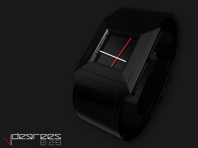
This is a concept for an unusual interpretation of an analog watch. It works with a traditional mechansim but the display doen’t look traditional at all.
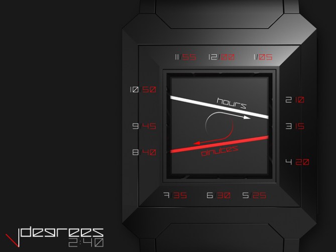
You read the watch like an analog watch. But the watch hands touch both ends of the display, so how do we tell, which end is important? The watch hands have been moved away from the center. Imagine you go from the center to the watch hand, perform a CLOCKWISE rotation in your mind, then you find the important end of the watch hand. That end points at the well known analog watch indicators.

Moving both watch hands away from the center and extending them until the display limits creates interesting situations. Using an edgy case and a square display removes all traditional elements of an analog watch.
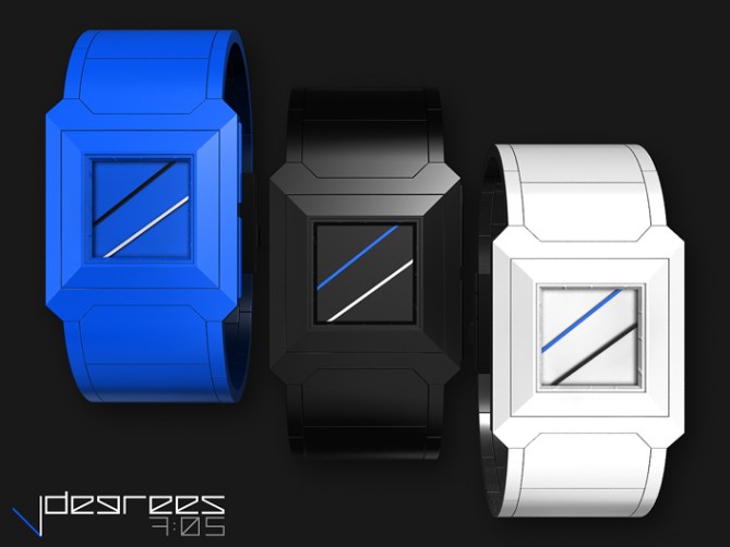
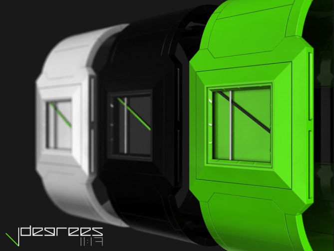
This watch can be worn by men and women and by serious or funny people, depending on the colors. If you like minimal arts, you might like this watch too.
It is a minimalistic re-interpretation of the analog watch with an artistic, interesting looking display which is confusing at first but easy to get used to.


_| Thank you Toky for posting the DEGREES! |/_
LikeLike
Congrats Sam! I have been waiting for this to appear! I’m impressed by the simplicity of this design. I want a black one on my wrist. I can imagine this a wall clock too!
5*/Yes
LikeLike
I have never been able to get my head around the time telling method on this one, even tho I have had the time to learn since seeing on future watches. That said I love the simplistity and the look enough for that not to be an issue! 5/Y best of luck Sam! 😀
LikeLike
Superb watch Sam, I love the sleek look, really good!
5 * / Yes.
LikeLike
Simple, contemporary! But, which end of the lines that point to the numbers?
LikeLike
Hi Leonard!
Look at the 3rd image from above, the one that says 2:40. There you see which end of the hands are the important ones. Thanks for the comment 😉
LikeLike
Without the arrows, there are several reading for 3th images: 9:40, 2:40, 9:17, and 2:17. My suggestion was designed one of the end of each line a little bit different so that we can know which end is telling the time. 5/yes.
LikeLike
This is Sam!
LikeLike
as long as it’s not plastic…….5/Y!
LikeLike
Hm durable acetate would work and heavy stainless steel in black. Thanks for the support!
LikeLike
Thank you buddies for the nice comments and your support! *hugs all of ya* ^^
LikeLike
Looks like a lightsaber duel! 🙂
LikeLike
Took a little while, but I think I get it. Might take some practice to get really familiar. Love the design, and this time no numbers! Wow!
5/y
LikeLike
think it needs a backlight though, which is usually missing from all or most analogue watches…having a backlight would make it really cool! I think….such as having a green backlight for the white strap green hand version and a white backlight for the green strap version etc. The backlight should be something totally backlit like a digital watch, not just a small light at the corner of the watch.
LikeLike
Uzumaki has a backlight, and it’s analog. Just depends on how the design is realized, but I agree, LEDs would be awesome with this.
LikeLike
perhaps a leather strap would give it a contemporary look, and leather straps come in many colours nowadays, thus I think green or red leather straps wouldn’t be much of a problem. Besides, it would go well with aluminium or stainless steel coated in their respective colours.
LikeLike
Woah Chris, awesome input, thank you! I agree with all of it, the light, the straps and the materials (stainless steel with coating ♥). Leather straps just have to be made looking good with the case – hard geometry vs soft strap.
Check HERE for a lit version of the DEGREES!
LikeLike
I love this idea, skewed analog for the win!
My concern with the build would be it seems like it would be necessary to put a round cover piece in the middle. Something similar to the eleeno watches to cover up the mechanics of the movement and keep the design sleek.
Perhaps making this element the same color as the background would minimize the deception.
Then again, I don’t know, the movement could be concealed in the outer edges of the case on transparent plastic layers… hmmm, R&D would be interesting on this design.
five star yessir!
LikeLike
You are right about R&D and light would rock! I now see the issue with the cover piece. There might be a solution… or two, and you mention a really interesting one! I had a similar challenge with my ZAGA concept… Thank you Cory for the insight and the support!!!
LikeLike
more sam awesomeness at work here, still figuring out the time telling method but id still get one 🙂 5/Y
LikeLike
Hehe, good luck and thank you!!
LikeLike
Nice minimalist design. I could see the blacK one being popular with Goths!
Diane.
LikeLike
Thank you Diane! Ooh Goths 😀
LikeLike
Nice looking, and easy to read!
Mr.Taco
LikeLike
Thank you Tacoman ^^
LikeLike
I like the overall look. My fav is the black with red/white lines. However, it’s hard to tell which side of the lines are important. I would suggest that you add a dot on the extremity of the lines. They could be of the color of the other line. Then, I would buy it.
LikeLike
Oh that’s an interesting idea, thanks for thinking this through. Maybe not a dot but a line, something not round 🙂 Cool you like the look Makko!!
LikeLike