Design submitted by Peter from the UK.
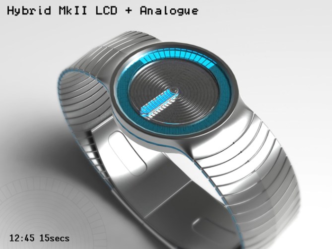
This is “Hybrid MKII” a redesign of “Hybrid” which featured on the blog back in March 2012.
The original design combined both LCD (or LED) with a mecahnical analogue movement. The analogue part of the design utilised a metal disc with the LCD hour blocks mounted into it. The disc rotated to highlight the mins. The seconds were shown by LCD segments in a ring around the disc. The disc proved to be the designs achilles heel due to technical and cost implications.
This is the reason for this MKII version.

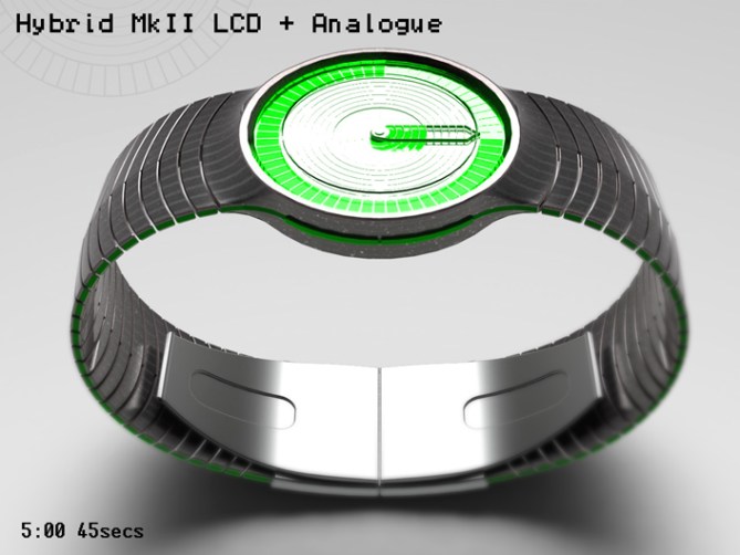
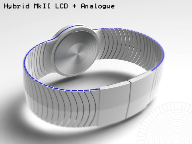
The MKII versions does away with the metal disc all together, whilst keeping the time telling method exactly the same. This time around the hours are shown by a two piece analougue hand. One part of the hand acts as a background contrasting against a mettallic background layer, above this background hand is a mettallic LCD layer which hides the hand when the segments are turned on. The segments are turned off in rings to show segments of the background hand below. The second part of the hand lives above the LCD and helps frame the segments and highlight the mins like a conventional analogue hand. The mettallic backgrond layer and mettallic LCD replicates the metal disc of the original design, this is aidded by an embosed glass lens again sharing a similar shape to the original disc. The seconds are displayed like the original design by a ring around the outside of the dial in the same manner as the hours. The LCD segments are turned off showing a contrasting background layer below.


Like the original design the simple visual language is traditional in its form and proportions so shouldn’t scare off traditionists, while the addition of the LCD (or LED) element gives the design a contempory feel that hopefully will attract the more adventourous.

This design will hopefully stand out due to its simple time reading method and combination or new and old. Using two technologies that are tried and tested should add feasability to the designs credentials. The form also lends itself to pre-existing watch housings, again adding to the viability.


★★★★★/YES
Smexy new version of a very nice concept!
LikeLike
Thanks a lot Sam for the Smexy comment and the support! 😀
LikeLike
Love the design. Only thing is the size of the hour-blocks, looks a bit small and uneasy to count…perhaps it’s possible to highlight the even or the 6th hour. But beside that I would buy: 5*
LikeLike
The 3rd, 6th and 9th blocks are narrower than the rest to aid speedy time reading, they could be more obvious than they are in the images. It’s a valid point! Cheers for the feedback and the likey! 😀
LikeLike
Thanks TF for adding this design to the blog! 😀
LikeLike
I just realised that the “exploded view” image wasn’t posted, was that an accident or deliberate or just too many images? If deliberate I wont show it on my fb page.
LikeLike
@@@@
@ @
@ @
@@@@
@@@@@
@ @
@@@@@
@ @
@ @
@@@@@
@ @
@ @
@@@@@
@@@@@
@ @
@ @
@@@@@
@
@
@
@@@@@
@
@
@
@
@@ @
@ @ @
@ @ @
@ @@
@@@@
@
@ @@
@@@@
LikeLike
*DROOLING*
LikeLike
5 * YES SIR
LikeLike
Oh “drooling” lol Cheers very much! I thankey sir for the vote and the high 5! 😀
LikeLike
Baffelled me Fir! lol
LikeLike
All that drooling makes me think of Alien. Eew!
LikeLike
hehe 😀
LikeLike
I can’t believe how terrible this watch design is, Pete. This is by far the worst of your designs…how could you serve up this dross!!
Fooled ya. 🙂 I absolutely love it! I’m a sucker for anything analogue/ LCD. You’ve got the balance exactly right, stylistically superb, I’m drooling for this watch!! Gimme, gimme, gimme!
A resounding 5/y!!!
LikeLike
Awww ya bugger! You had me going for a couple of seconds there! ^^
Im glad you likey and its causing keyboard puddles! lol
Cheers for the support, the comment and the vote! 😀
LikeLike
It’s very nice Pete but I preferred the original. Why did you do it again? Anyway I give you 5Y. 😉
LikeLike
The reason for doing this version is TF seemed to like the original version but I got the impression that the metal disc proved to be too expensive or difficult to make. So this version is ment to tell the time in the same way, look very similar but hopefully be more viable! Cheers for the feedback and the vote! 😀
LikeLike
OK. 😉
LikeLike
Should have read the blurb shouldn’t I. 😀
LikeLike
burb?…….blurb?……… you mean finely crafted textual description! lol
Yeah on occaisions its relevent! hehe 😉
LikeLike
hehe
LikeLike
Very nice redesign Pete, liking the matching strip of colour on the sides, gimi one now!!!! 5/Y
LikeLike
Thanks a lot KV! Yeah the little added colour breaks up the monochrome. I wish I could give ya one (thats sounds kinda wrong) hopefully one day I will be able too! 😀
Cheers for the comment and the vote! 😀
LikeLike
I think… It is ready for market. When can it be available? Another suggestion…. I think black strap also can go well with this design. I like the strap!
LikeLike
Hi Leonard, Yeah a black stap would look nice. I did a fully black version when I did the MkI version which is why I didnt this time around. If I get 5mins I do one and link it to the comments. Im glad you likey and I hope it will be available one day! Cheers for the comment and the feedback! 😀
LikeLike
I did a black strap version which also includes additional minute markers and more exagerated hour markers.
I didnt know if you would prefer gloss or satin black so did it half and half.
http://www.facebook.com/media/set/?set=a.265928810155520.62781.159423137472755&type=1#!/photo.php?fbid=353330824748651&set=a.265928810155520.62781.159423137472755&type=3&theater
LikeLike
Hi Pete, I went to look at the previous model and I have the same request to add notches to the hours, for facility the counting.
5 * / Yes, this version is as good as the first.
LikeLike
Sorry Patrick, I must have missed that comment when I was looking at the feedback prior to doing the new version. I will add some markers and do a rendering in black, killing two birds with one stone.
Im glad you likey this version too, cheers for the feedback and the vote! 😀
LikeLike
You killed two birds with only one stone? Are you Robin Hood? (I do not know this expression, ah ah ah)
LikeLike
Its just an expression, I dont really have sharp shooter skillz! lol
LikeLike
I just realised you ment markers on the hour hand (I was thinking about markers around the diameter of the face but that would only help with the minutes). I made the 3rd, 6th and 9th hour block narrower to aid the time telling/counting, you can just about make them out on the images. The exploded view that didnt get posted was the clearest image…typical. They could probably do with being more obvious, but I did act on your original feedback 😉
LikeLike
I’m not sure I understood the translation? But it is sufficient to divide the hours of 3 slices (4 x 3 = 12), beyond these, the human eye must assess more carefully.
LikeLike
To highlight the 3rd, 6th and 9th hour I made those particular blocks smaller than the rest.
So it divides the hours like you suggest but using the size of the blocks rather than using a marker or different colours etc.
LikeLike
OK Pete.
LikeLike
i want thissssssssssss
LikeLike
I want you to have it! Cheers for the comment Jun! 😀
LikeLike
very cool! i love the color/lights (witch is it btw?? lights would be better) on the sides of the strap 🙂
LikeLike
In an ideal world the colour around the edges of the strap would be lights that illuminate at the same time as backlight on the display. But going from feedback on other posts on the blog that have tried similar, it seems to be difficult or too expensive to achieve. I think an luminescent colour would probably be the best compromise, so it gives a subtle glow in low light. I’m glad you like the look however it would be achieved! Cheers for the comment! 😀
LikeLike
very good design, when the clock hits the market
best regards
Olaf black forrest germany
LikeLike
Thanks you very much Olaf! I hope it does one day hit the market! Im glad it appeals to you!
kind regards
Pete West Midlands England 😀
LikeLike
I prefer the 1st version, for the polished effect on the central disk, but it’s nice that you found a way to remove a problem. I like with black lights ( 3rd pic ) & red lights ( fb ). I would buy.
LikeLike
Yeah I liked the original version too, but I think the metal disc proved too heavy for a standard analogue movement. This hopefully gets around that issue whilst still keeping a similar feel. Im glad it is something you would consider purchasing if it ever became available. Cheers Makko! 😀
LikeLike
My initial comment was about the grooves over the hours part, unless they’re used for something. But they might be visible only because the pictures are oversized & might not be a big deal on the end result. + I really believe that they will make asap since it fit well with their current collection.
Also, I have a similar idea in my sketchbook. ( well, for the hour part. ) I’ll probably do it during the winter ( D-F ).
LikeLike
The reason for the rings: the hours are made up of rings in the LCD, as the rings are turned off they show parts of the “background hand” which is below the LCD layer. This shows the hours in the same manner as the original. This system allows the hours/hour hand to move small incruments for the minute display. To get an LCD to do this would require many very small blocks (very dense) which I assumed would be too difficult. The bonus of using the rings also means that the main face looks like a “turned” disc keeping the original theme, they are probably more obvious in my images than they would be in real life, they would be just visible.
I wish I had as much confidence that they will consider this design but i keep all my fingers and toes crossed! xx^^xx
Cheers Makko! 😀
LikeLike
by similar hour I meant : LCD rings
LikeLike
I meant 4th pic, for the black light.
LikeLike
http://techcracks.com/2012/09/hybrid-mkii-lcd-watch-concept-by-peter-fletcher/
LikeLike
http://designspiration.net/image/3273458569763/
LikeLike
http://vi.sualize.us/hybrid_mkii_lcd_watch_by_peter_fletcher_concept_gadget_design_futuristic_picture_AMVQ.html
LikeLike
http://gadgets.9square.net/hybrid-mkii-%E2%80%93-hybrid-redesigned-lcd-watch
LikeLike
http://weheartit.com/entry/37775859/via/techcracks#
LikeLike
Big thanks to everyone who voted, commented and shared!
Cheers to TF for posing this design here! and ta very much for the external blogs that featured it too.
Cheers everyone!
Pete from another dimension! 😀
LikeLike