Design submitted by Andree from Australia.
The c.r.y.s.t.a.l watch is based on the stereographic projection of a cubic crystal. Crystallographers use this projection to display three-dimensional crystal info (directions and planes) onto a two-dimensional surface such as paper.
The watch is “crystal” themed; has monolithic/facetted/polished geometry and the design of the octagonal case and LED display have origins in the field of crystallography. The wide/facetted band, having monolithic links, is meant to impart a male/female jewellery/bracelet appeal and designed to complement the bold but minimalist style of the octagonal case.
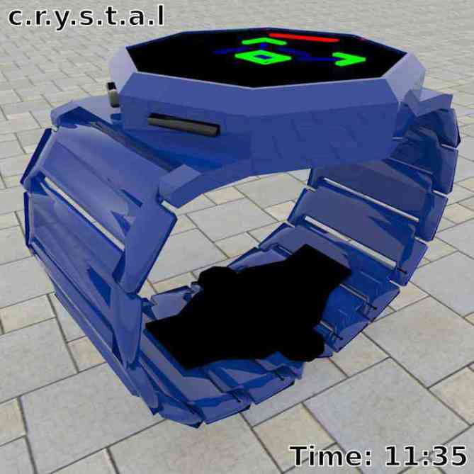
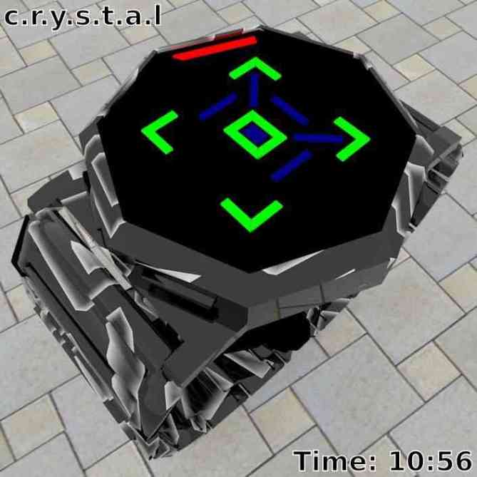
12 red LEDs at corner/edges of octagonal perimeter are for display of hour/month values; top corner of octagon perimeter is 12 o’clock position. 5 green LEDs around centre of dial are for display of 10-minute/10-day values. 9 blue LEDs around centre of dial are for display of 1-minute/1-day values.
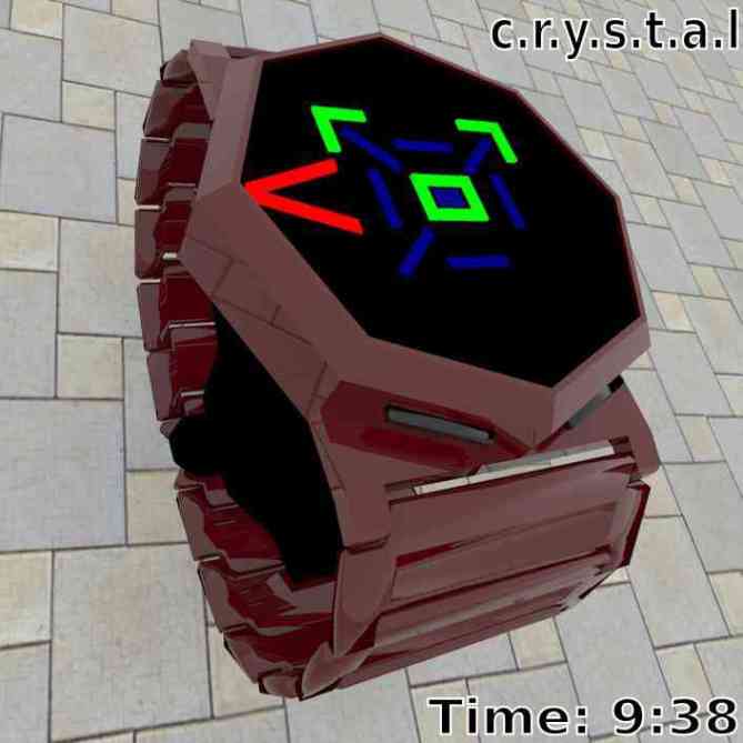
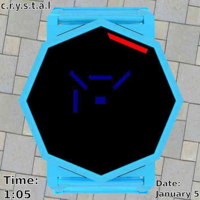
People who embrace style and uniqueness as well as people having technical/scientific/style curiosity. Any style-conscious person proud of their individuality and who would respect a simple/novel time/date-display system complemented by a stylised case/band geometry. With a decent range of finishes coupled with the jewellery/bracelet “look” of the band, the watch would serve as a bold statement for fashion-conscious people.
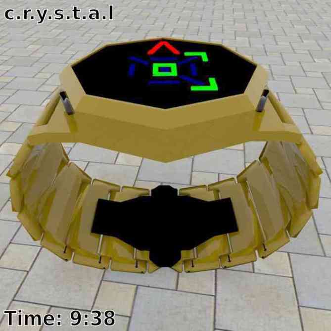
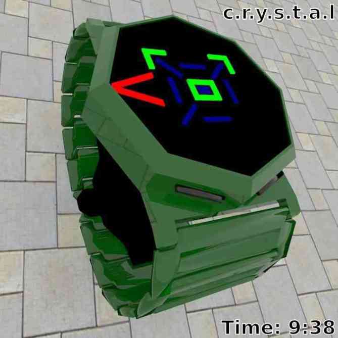
The geometry of the case/band and the time/date display is unique, simple, bold and minimalist. The “crystal” theme and avoidance of numeric digits adds to the uniqueness factor. The watch has a meaningful character due to it’s design based on the long-standing important principle of the stereographic projection which was known as far back as in ancient Greece in the second century B.C.
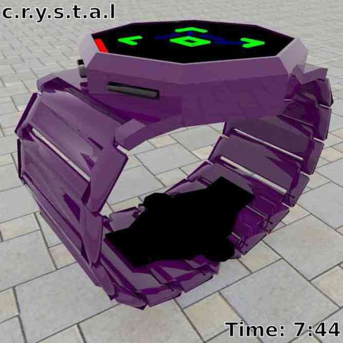
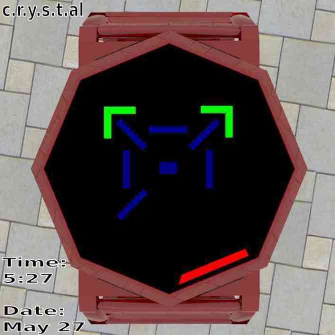
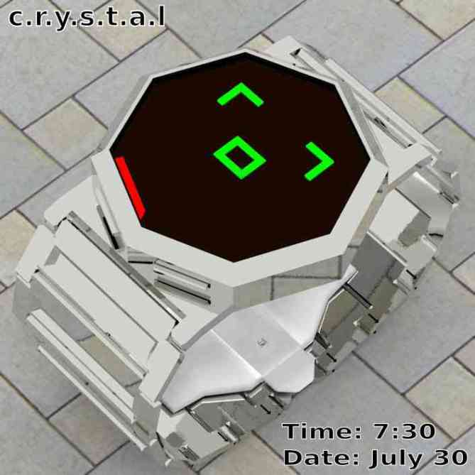


Nice design, Andree. Time-telling is pretty easy on this watch. I’m not sure if it totally grabs me – it would need some tweaking for that. It looks too LED for me, but it’s probably possible to make an LCD version. I think you need to include some graphics of the watch from a distance…it’s a bit too “close up”. The colours are also a little bit on the clashing side, in my opinion. Anyway, with Tokyoflash’s massaging, I’m sure it could be made an eye-catcher, so I’ve given you 5*/y.
LikeLike
Thanks for the comments. The design is very faithful to the respective crystallographic theme (simply explained in a PDF I authored/submitted to Tokyoflash). The well-grounded foundation for the watch’s design has been one of the factors that has made me accepting of the character of the watch; in a way, it has “meaning” in that it faithfully replicates the respective crystallographic theme in a novel way. Ultimately, I was able to appreciate the watch design due to this and had strongly themed the watch towards the crystal/facetted/pseudo-blocky look. Aesthetic/subtle modifications to this concept, by TokyoFlash, would be appreciated presuming at least the octagonal case is preserved. I chose red, green and blue coloured LEDs for the hour/10-minute/1-minute components of time because of the well known red-green-blue (RGB) colour space in computer-graphics/photography/etc. disciplines (an attempt to make decoding of time more intuitive for the owner of the watch) and figured at least LEDs can offer these colours. If a multi-colour (e.g. red-green-blue) LCD display is possible then I would also be fine with the use of LCD. Yes, good idea about “far” shots of the watch and I will submit some renderings for this scenario. I actually included additional coloured/textured finishes. The intent was to show that the geometry of the watch amplifies the presentation of the watch’s finish (flat-coloured or textured) to the point that you may consider matching up the watch finish with the clothing the watch owner is wearing. For example, I submitted a white coloured watch (case, band) with black buttons and this would match well with someone wearing an all-white uniform/suit/etc.. The blue watch can match well with a “jeans” look, burgundy/black watch with a dark suit colour, one of my textured finishes matches the texturing of a shirt I have, etc.; obviously this all depends on the owner’s perception of style. Basically, either the watch contrasts with the owner’s clothing or it conforms with it (in a colour sense) with the case/band geometry offering a platform for the expression of the watch’s colour/texture.
Again, thanks.
LikeLike
Very bold and fun looking design. I like the geometric theme and the brightly coloured display. The time telling is nice and simple which works for me. My only critism is that it looks a bit on the chunky side, 5/Y best of luck and welcome to the blog! 😀
LikeLike
Thank you for your comments.
After a few iterations of the design the “bold” look really grabbed me.
The bonus with the geometric theme is that the octagonal case has an aesthetic/uniqueness factor as well as being fundamental for the display/reading of time. Also the geometry and display are inspired by real principles in the crystallography field developed over 2000 years ago; comically, this watch design was over 2000 years in the making … :-). The “chunky” effect is partly in line with the “crystal/facetted” theme of the watch and may partly be an exaggerated artefact in my concept; for the latter, I’m sure TokyoFlash would have enough experience in massaging any of the “too chunky” look. Then again, I have seen watches just as chunky (or more) than this concept and ultimately like yourself, I, and others … the individual’s taste is the priority.
Again, thank you.
LikeLike
I like the case and I think the display is pretty decent (any 1259 would be decent). I chosen you!
LikeLike
Thanks for your comments.
I tried to keep the time-display simple, interesting and inline with the crystallographic origins of the design. The time-display draws from the respective crystallographic theme and later I realised that the resultant type of time-display is what TokyoFlash recognises as being the
“12-5-9” system. It is a coincidence that my design matched up to a “12-5-9” system as I was not aware of the “12-5-9” terminology and did not even start my design with a pre-determined time-display system (such as “12-5-9”) but had derived/inferred a time-display, independently, from the crystallographic theme connected with the watch design. As it worked out, the resultant time-display was of the “12-5-9” type.
Thanks again, especially for mentioning “1259”.
LikeLike
I like 12-5-9 watches and I like what you have presented. Digging the last image especially 5/Y
LikeLike
Thanks for the comment.
As I replied previously to “Firdaus R”, the “12-5-9” terminology/concept was unknown to me and the type of time-display had been determined during later stages of my design. I was confident that the respective crystallographic theme connected with the design of the watch had enough mathematical detail that a time-display would be able to be derived later. As it worked out, this time-display ended up matching the “12-5-9” system. I had submitted other interesting textured finishes and flat colours, unfortunately they were not included on this webpage.
Thanks, especially for mentioning “12-5-9″.
LikeLike
A very novel, fun and futuristic approach to display of time.
The color possibilities are an advantage when seeking that individual look.
I could definitely see this type of watch on my wrist while I’m out in a nightclub and while at work in my architectural studio.
Well done Andree, well conceived watch.
Definitely a 5* effort.
LikeLike
Thanks for your comments.
One freaky aspect is that although the watch appears futuristic, it is based on some mathematics developed over 2000 years ago and some crystallography developed a few centuries ago. A broad range of solid colour and texture finishes would allow good options for aesthetic-based matching between watch-finish and clothing. I can imagine people owning multiple versions of the watch, each having a different solid-colour/texture finish. For example: a white watch to match an all white uniform/suit/etc, a blue watch to match a “jeans” look, a black/burgundy watch to match a dark-coloured suit, a textured watching matching some textured clothing, etc. After getting used to the minimalist, but bold, design of the interesting c.r.y.s.t.a.l watch it is easy to imagine this watch as being worn during work, leisure and formal occasions provided the finish of the watch fits the occasion. Imagine a groom dressed in a black suit and wearing a black glossy c.r.y.s.t.a.l watch. Imagine a bride dressed in white and wearing a white glossy c.r.y.s.t.a.l watch. Nice.
Again, thanks.
LikeLike
Wow. Are you one of those people who is submitting design ideas, left and right, to Kisai, in hopes that, eventually, they’ll select yours? The chances are slim, unless you have a design that gets EXCESSIVELY high ratings all around. Unrealistically high ratings. Furthermore, you were really trying to pander to a really wide audience there with the “Well, you know, if anyone has any taste at all for fashion and whatnot, they should definitely vote for this watch.” If you really intend to do that, please make it slightly more subtle next time, okay? Again, I’m being obnoxiously hypercritical, but I genuinely hope that people will eventually start submitting designs like they used to: the idea is to create a functional, nice-looking, and well-thought-out watch concept.
LikeLike
Actually, this is my first and only watch concept submitted to TokyoFlash. The detailed info submitted to Kisai and replied above is related to my “enthusiastic” attitude towards the design. Honestly, I do not see myself submitting another design to TokyoFlash unless the design has a strong grounding in some well established theory; i.e. the “watch” really means something (it’s just my attitude towards this design submission opportunity). I’ll elaborate as follows ….
Minimally, a watch is a pictorial representation of time. As my background is in crystallograpy (in the Greek, “graphics of crystals”), I considered if the pictorial representation of a crystal or crystal-related theme could be adapted to a simple/novel time-display system. After a few iterations in design, and to my surprise, I realised a final design that achieved this; it turned out at the end that it was a 12-5-9 system. My enthusiasm with the watch is that it’s geometry/time-display setup concerns mathematics used over 2000 years ago (ancient Greece, 200 BC) being the stereographic projection (used in the astrolabe device that was replaced by the sextant in ~ 1700’s, both used by mariners for navigating the oceans) and also concerns crystallography detail developed a few centuries ago. Hence the name c.r.y.s.t.a.l for the watch due to it’s design having strong links to the field of crystallography. Unlike other octagonal shaped watches, the octagon-shaped perimeter is not just an aesthetic touch but also a critical/helpful aspect in telling of the time/date and it’s origin is from the mathematics/crystallography that the design borrows from. Similarly the positions of the LEDs are from the mathematics/crystallography that the design borrows from. My motivation behind the watch design is that theory/experiments/research that I have been happy to study/use/program during my life ended up being source material for a watch design; I would love to have various versions of the c.r.y.s.t.a.l watch (different finishes) for my own personal use.
The fashion-related comments stem from a video of a currently selling acetate-finished Kisai watch where a comment was made that a blue acetate finish would match jean clothing. This made me remember the Swiss Swatch and it’s various colours used during different mood/clothing combinations. I refer to various finishes (solid colour and textured) since crystals in real life do come in different colours and degrees of transparency and we all can have different tastes; from the individual to the person-in-a-group. I particularly admire the pearl acetate finish, per-se, and it’s application to the case/band of the c.r.y.s.t.a.l watch would be desirable (to me at least); the “pearl” finish has a stereotypical “crystal” look. References to the finishes is an acknowledgement that colour is an important theme; it triggers emotions, affects style/design and there is a colour factor for most things worn by a human (i.e. we care about colour when shopping for clothing, car, etc.). I remember when I showed my final renderings to a friend of mine (architect) and was impressed with the yellow-finished watch because it was a reminder of a dependable yellow Datsun car used during university and early work-years and this person instantly imagined driving this yellow car while wearing a glossy yellow c.r.y.s.t.a.l watch. Colour does have it effects.
“functional” –> c.r.y.s.t.a.l tells the time, date, alarm time, displays pre-programmed animations to allow for alternate communication between entities all in a simple/novel way
“nice looking” –> “Beauty is in the eye of the beholder”; i.e. the perception of beauty is subjective. Design can have a “beauty” aspect, c.r.y.s.t.a.l being “pure” and not cluttered with overly unnecessary aesthetic/feature/non-functional detail and attempts to faithfully push a “crystal” theme in a minimalistic/bold package.
“well-thought-out” –> c.r.y.s.t.a.l concerns math/crystal theory stemming over 2000 years with the 12-5-9 time-display system being determined from analysis of pictorial detail of crystallographic theme; i.e. I did not start out with a time-display system (e.g. 12-5-9). The stimulus for the design was the assumption (or appreciation) that pictorial representations of crystal-related themes have various levels/scales of detail and that this characteristic was enough to provide a framework for the development of a time-display system. As a result, the time-display system was of the 12-5-9 type.
Thanks for the comments.
LikeLike
It’s an amazing design. I like the lights position and the color used. It would be nice if the buttons where closer to the center. Also, then, the “link connector” could be higher to make it look less chunky.
LikeLike
and, I would buy.
LikeLike
Thanks Makkovik for the comment.
Yesterday I finally finished my playlist (titled “c.r.y.s.t.a.l watch concept”) on my museGrafx youtube channel. It’s located at ….
The playlist contains animations showing a camera-view of various colours/textures (including colours/textures not shown on this webpage) of the watch being worn by a stationary arm with the camera doing a fly-by around the arm. This gives a realistic feel of the wearability of the watch, has impressed my local friends/relations. I have emailed TokyoFlash about this new content (video and images) and hopefully they will update this webpage soon.
I have a video showing a relatively simple pictorial explanation on the mathematics/crystallography-related detail that is connected with the design of the watch. This detail accounts for the octagonal shape, the position of the LEDs (“lights) and the V-shaped red lights for the 12, 3, 6 and 9 o’clock times (December, March, June, and September months). This is the aspect of the design that really impresses me, that techniques in math/crystallography spanning over 2000 years were fundamentally relevant in the design of this watch and happens to be related to my engineering/crystallography background. If you like the light positions then you’ll probably find this video (number 4 in playlist, titled “c.r.y.s.t.a.l watch design”) interesting. When my brother saw the light positions and their meaning in relation to time/date, after a short while he was impressed to the point that he asked if this time display system can be patented. I’m not into patenting “knowledge” (knowledge must flow not be “bottled up”, but I am against reverse engineering of a product without the permission of the product’s owner/designer).
The 12-5-9 (i.e. 12 symbols for hours, 5 symbols for 10-minute intervals and 9 symbols for 1-minute intervals) was not an initial target of the design. This initial target of the design was to determine a time/date display system using certain principles of math/crystallography. It happened that this time/date display system was of the 12-5-9 type.
The colours of the lights (LEDs) are inspired by the well known RGB (red-green-blue) colour space in graphics/photography fields. Red is for lights representing hours and located at perimeter of watch case, green is for lights representing 10-minute intervals and located around centre of watch case, and blue is for lights representing 1-minute intervals and located closer to centre of watch. This RGB progression in consistent in terms of resolution of time (i.e. hours –> 10-minute intervals –> 1-minute intervals) and in terms of position (perimeter of case –> close to centre of case –> closer to centre of case). This design aspect is intentional in order to provide a more intuitive experience while reading the time/date.
The “chunky” factor can always be “massaged” by TokyoFlash as it is a lower priority aspect of the design, less important than the octagonal case, LED positions, etc.
Again, thanks.
LikeLike
The “chunky” factor is indeed a lower priority because, at the end, the electronic circuit board size is an important factor when determining the watch thickness.
LikeLike