Design submitted by Peter from the UK.
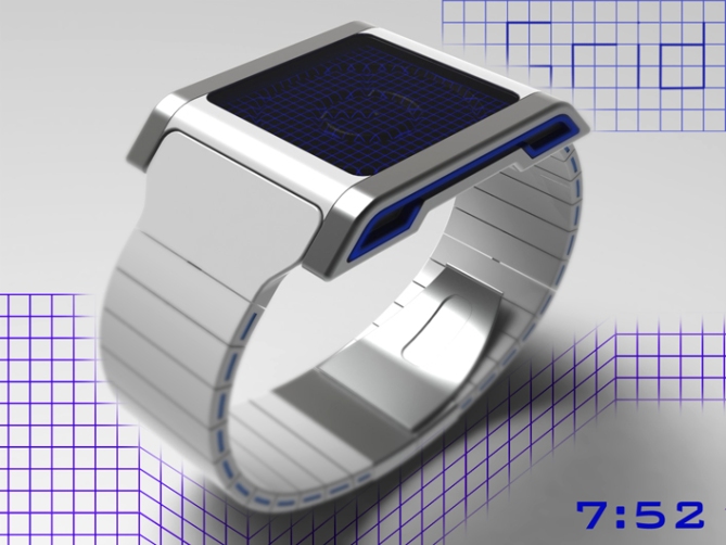
Peter says: I have an interest in retro style computer games, the old 8 bit type stuff that tended to consist of wire frames to describe 3D forms. I figured this would make a nice watch face.

I wanted to use this wire form 3D look to tell the time in a retro style.
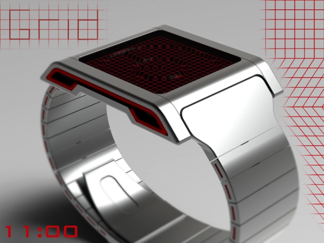
The watch is basically a disc analogue watch with a stealthy dark matte face, the face would be 3D with grooves or extruded shapes where the hands would be. The time would be just readable in normal light. When activated the watch would project a grid over the face to help describe the 3D shape of the discs and help highlight the time. The grid size and colour would be custiomisable by the wearer to suit their mood or outfit.
This style of display may also lend itself to a dense LCD which would be flat but give the same 3D look.

This watch has a retro futuristic look feel that may appeal to nerds and geeks who get nostalgic for early computer games and merchandise. It may also appeal to clubbers and people who tend to come out at night as that is when the light show would be at its best.
The grid theme may also attract Tron fans both new and old who fantasise about riding their light cycles around the grid.
The time telling method is very conventional but the means of describing it is unusual and helps the design stand out for that reason.


Apparently, I’m not allowed to rate this design… But if I could…….
5****** All across the board 😀 It’s beautiful and I love the white+side lights. Looks very stylish and the wire does indeed look fairly cryptic. I call the first made one and Tokyoflash, if you’re reading this, please engrave my name into the back of mine 😉
Another great design Peter, way to go 😀
LikeLike
Wow great comment Jordon! Cheers very much!
Great idea about the engraving! and im more than happy to have watch No 2! 😉
Thanks for the comment and the vote! 😀
LikeLike
I guess I commented too early as the voting appeared to be closed at that point (rated 0 stars with no option to rate or yes/no)
Now that I can, however, I have 😀
LikeLike
Yeah you must have been one of the first to try to vote, when I went onto the blog this morning (where I am, it will have been on a few hours by then) it was working ok and on about 4.4. Dipped a little since then! Doh! Now that you can, I thank you! 😀
LikeLike
First the presentation: Timelapse and color variations ♥ Now the watch geometry: Wow so great Pete! Pure sci-fi. And the time telling method? Wonderful *.* Ok it’s a little hard because we look a still images. But in reality we just need to quickly turn the wrist a little to be sure what time is it. The retro 3D look is so cool! 5*/YES/NYOOM NYOOM (my lightcycle)
LikeLike
Yeah its a lot easier to see with a little movement, a seconds ring would be awesome for constant animation etc (maybe pushing it) Yeah its great TF added all my little animations they do help a little over the static images. Im glad you likey! Cheers for the feedback and the vote! 😀
LikeLike
Thanks TF for adding this design to the blog! 😀
LikeLike
I like it a lot Pete. 5Y 😉
LikeLike
Im glad this one appeals Mushy, cheers for the comment and the vote! 😀
LikeLike
I am impressed by the work in 3D.
5 * / Yes.
LikeLike
Thanks a lot Patrick, if it impresses you I am a happy chappy! 😀
LikeLike
5/Y – fantasticamundo!
Ditorikku kun
LikeLike
Thanks a lot DZ, cheers for the vote! 😀
Just out of interest what does “Ditorikku kun” mean?
I tried it through a translator and had not joy! lol
LikeLike
Pete, I suspect the reason Sam is called “Samukun” is because in Japanese this translates as something like “Master Sam”. “Kun” is used after boys names and “chan” is used after girls names. So I copied him. Am I right, Sam?
Cheers,
Dietrich
LikeLike
Samu = Sam in Japanese, Ditorikku = Dietrich in Japanese.
LikeLike
I believe Samukun is Japanese for Sam-buddy but I couldnt say for sure, Should have guessed it was your name translated! I was a little slow yesterday! lol
Cheers,
Pedro
LikeLike
More Pete Awesomeness has hit teh blog 🙂 this is another one i would happily have in my collection 5/Y
LikeLike
You sir are too kind, cheers very much! thats quite a collection you would have so far! 😉
LikeLike
Really dig the tactile nature of the indentations in the display, Pete. It gives the design a feeling of a gravity well from a warp drive gravity well or similar tech. Case and strap are pretty awesome too. Well done, man!
LikeLike
HA can you tell the part of the second sentence that I left the computer and came back? lol
LikeLike
At least you had a reason for broken English! lol My typing allways looks like that! hehe
Im glad it appeals, I dont think I got the optimum size and shape for the hand “grooves” I imagine with more work they could be more clear and impressive but as long as the idea come across that’ll do.
Cheers for the positive comment and vote! 😀
LikeLike
Wow, I have something like this in my Inkscape file, so I’ll pass to comment but it’s 5y from me.(maybe ill pass my file for our next collaboration if possible)
LikeLike
Crazy minds think alike I guess! @o@ cheers for the vote!
Sounds interesting, I would be interested to see your sketches 😉
LikeLike
such a cool watch!
LikeLike
thanks a lot Jun, cool comment! Nice to see your still around! 😀
LikeLike
http://techcracks.com/2012/08/grid-analogue-3d-space-watch-concept-by-peter-fletcher/
LikeLike
This concept is really cool. More than retro, it has a uber high sci-fi feel.
I’m less fan of the sides of the case, but it adds something to the whole watch. (Maybe a bracelet as large as the case would change my feeling)
The display is really catchy, it grabs the attention at first sight, looking like an electro-organic thing.
A full black with green lights would be my order !
LikeLike
Yeah a bracelet style design would work nice and to the retro sci-fi feel. I agree a full black watch with green LEDs is a nice combo, reminiscent of early computers. Thanks for the positive comment and feedback Nico! 😀
LikeLike
The idea and the overall look are amazing, but I prefer without the grid. Maybe some glow-in-the-dark stuff could be added to the hands.
LikeLike
So you would prefer a more conventional watch with these looks? Interesting. There would nothing stopping us having a grid off mode where the hands alone were illuminated, could be a power saving mode too. Cheers for the feedback Makko! 😀
LikeLike
This is realy cool
LikeLike
Thanks a lot Jared, im glad you likey! Cheers for the comment! 😀
LikeLike