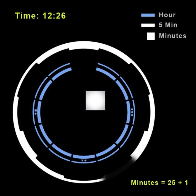
Design submitted by Alan from the USA.
Alan says: The design was inspired by two science fiction films, 2001: A Space Odyssey, and Tron: Legacy. Both films were beautifully designed, and translate well to an LED watch. The “time” animation was inspired by the flickering screens on the spaceship Discovery.
I wanted the face to be as clean as possible, so I chose a simple square counterbalanced by a circular dial. The simple geometric shape lends itself well to any band. In these renderings, I used an existing Tokyoflash watch band. A wide leather band with a fine texture would give it a very clean appearance.

Telling time is quick and intuitive. The circles echo the sweep of the hour and minute hands. The hour circle has markings at the 12, 3, 6, and 9 o’clock postitions to make orientation easier. To calculate the minutes, you just need to find the 5 minute increment, then add the minute squares.

This watch will appeal to people who prefer classic styling. Also, people who like to easily read the time will appreciate this design.
This is a museum style watch with a minimalist case design. The dial is clean yet has style, and interest. This design was meant to be timeless, and appeal to people who like customers that purchase Movado or Skagen.


Love the look! And I love the inspiration! Space Odyssey was also inspiring for me, stay tuned 😉
I really like the varying thicknesses anf the little double dots at the prominent hour positions.
Flickering ♥
But my fist thought here was: Aww, we have the Kisai Seven already. If there is any chance for this watch to become alive: YES. 5*/Good luck.
LikeLike
Actually, Sam, the hour markers aren’t just little dots; they’re much more clever… =) If you take another look I’m sure you’ll see it…
The concept as a whole is pretty clever, I think. I like the cleanliness of the display and it seems to be just cryptic enough…=) My only real criticism is that the display is too big for the strap, but that’s easily fixed. Very nice work Alan!
LikeLike
First, I want to thank everyone for the kind words. Second, you all are right, the face is a bit too big for the band. I noticed it too, but since it takes up to to 5 hours to render each image, I decided to leave it as is. If they decide to make it, I’m sure they’ll heed your recommendation.
LikeLike
Crikey thats a loooooong render! what software do you use Alan?
LikeLike
Pete, in answer to your question…I use Max + Vray. I rendered them at 1080, and I had to crank up the samples, because the reflective surfaces looked grainy. Most renders took 2-3 hrs.
LikeLike
In hindsight I shouldn’t have commented as I have a rendering doing that will easily exceed 5 hours! lol
Damn you steel and glass textures, you take too long!! 😉
LikeLike
Yeah, I know about rendering times…=7
LikeLike
THIS WATCH IS AWESOMEEEEEEEEEEEEE!!!!!!!!!!
LikeLike
This looks very nice, loving the glossy square display. I thing the display is a little on the large side in comparison to the strap but that is a very minor detail. Nice simple time telling suites me just fine. Very nice 5/Y Best of luck and welcome to the blog! 😀
LikeLike
.:Not liking the squared off edges:.
LikeLike
This is superrrrr…. Scifi!!! I’m however the display reminds me of modern induction cooker. But I think the design already good as it is, the face is not that big, and it complement the whole design. Futuristic + classy! In my list!
LikeLike
I love it . . .
LikeLike
Very cool!!!
reminds me of the “rogue” line, because of the spaces in the circle being where the hr/min are.
i would buy it.
LikeLike
As a filmmaker who appreciates both Tron and Odyssey’s brilliant inspirations and visual icons, may I say PLEASE MAKE THIS WATCH EXACTLY AS IT IS! The large face is exquisite, taking the design into the next century by implying some sort of advanced telecommunications features. I think it would lose much of its futuristic cache if you made the face smaller, becoming a more ordinary and terrestrial model altogether. Add touch functionality to this watch and beam me up Scott…
LikeLike
Awesome…you are a film maker. I always wanted to be one when I was a kid, but I ended up on a different path. Have you made anything I might have seen? Thanks for the compliments, and I’m glad you approve of the design.
LikeLike
I agree the case is too big. Narrow it a little and widen the band or it will snag things. I love it however and would buy it.
LikeLike
Agreed with one comment that the face is a bit too large. Would consider buying depending on price. I prefer the metal band as pictured vs. the suggested black leather.
LikeLike
I’m glad I didn’t render the leather band version 🙂 I’m not a leather person, myself, but I think it can offer the cleanest appearance.
LikeLike
Please contact me with pricing information when this watch becomes available.
LikeLike
Im in agreement about the size of the face compared to the strap, other than that love it. 5/Y
LikeLike
Now we’re talking !!!! I love it – please contact me after you grant my first wish – build it!!!!!
LikeLike
The overall look is nice. The band could be larger, without being the same size as the case. I like that it’s a circle in a square display. I prefer ss band over leather and a gray one give a nice contrast to a black display. I would prefer that the applicable single minute would go off, just like the 2 circles. ( or they could all light up ) I would also prefer a LCD display.
LikeLike