Design submitted by Peter from the UK.
Peter says: As people will know by now I am a bit of a petrol head and love anything to do with cars and motorcyles etc. I was looking at designing an LED watch using a standard analogue format when I realised that the LEDs looked rather like the spokes of a car alloy wheel, “P-Zero” (the name of a famous performance tyre) was born.

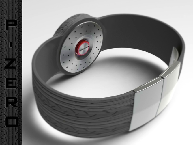
The time setting controls are on the back of the watch to avoid cluttering the design, they are arranged in such a way to look like a brake disc and wheel hub
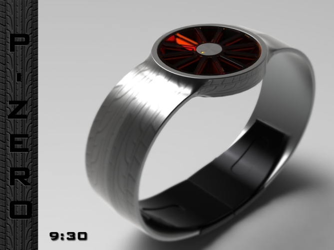
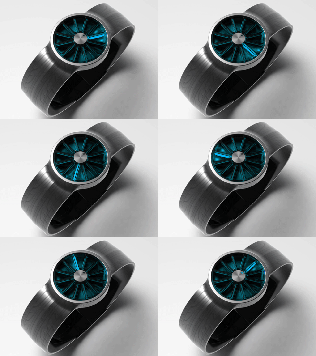
The hours are displayed by the 12 LED wheel spokes arranged in a traditional analogue format. The minutes are displayed by an analogue disc in the centre of the wheel hub. The arrow on the disc is illuminated in the same colour as the LED spokes.

Although the theme is aimed at like minded petrol heads such as myself, the design is clean and simple enough hopfully to appeal to a wider market. The proportions are conventional and small enough to be described as uni-sex.
This design stands out due to the alloy wheel theme which gives the watch a sporty fun feel. The metallic version looks more subtle and grown-up and may appeal to a more mass market.


Thanks TF for adding this design to the blog! 😀
LikeLike
I like the theme and how the band looks like a tire tread (:D) but I think the band might be nicer in the sort of rubbery material shown in your first pictures rather then in metal.
Time telling is nice and easy but I’m not so sure about the time setting on the back of the face 😛 Either way you’ve earned a solid 5* and a yes from me!
PS. This watch should have sound effects! Vroom-vroom screeeeeech 🙂
LikeLike
Vroom vroooooom!
LikeLike
Beep beep, move over road hog! 😉
LikeLike
Thanks a lot Jordan, Yeah im not yet good enough to include sound effects just yet! lol
I like to use a couple of different finishes in my submissions as they will never suite everyone. I prefer the rubber tire effect strap but it may be a step too far for some. Cheers for the solid five and the feedback! 😀
LikeLike
Love it Pete! Really eye-catching and easy to tell the time on too. Makes me think of fruit. 🙂 5Y.
LikeLike
Hehe yes, me too. Yumm.
LikeLike
Thanks a lot Lloyd, yeah I suppose it does kinda look like an orage cut in half! lol
Hopefully that broadens its a”peal” further! (sorry about that) lol
Cheers for the comment and the vote! 😀
LikeLike
You did a great job here but I personally think the design is cheesy, flowery in wrong way, and the tire bump map on metal strap doesn’t work well… but I might be wrong, maybe its an art in other people perspective. However, I couldn’t judge the work for less than 4*.
LikeLike
Ok no worries Fir, yeah I was worried some would see it as too cheesy, which is why I tried to make the metal one more subtle. Cant win them all, cheers for the comment and the vote! 😀
LikeLike
I like the 3D-ness of the display and the way you handle the light with the translucent spokes. The rubber strap is vroomy and the metal one is cool too. I also like the simple geometry – just timeless. I have both associations: racing and citrus fruits :9 Both nice, more clients hehe. I’d buy it like this. 5*/HMHM
LikeLike
I cant remember anyone ever saying “I wish there were more designs based on fruit” lol but im happy if this makes it suitable for some! Im glad you likey, cheers for the feedback and the vote! 😀
LikeLike
Sorry, Pete – not this time! When I look at this watch, I feel like I’m guzzling petrol. But 4* for effort.
Cheers.
LikeLike
No worries DZ, we cant please everyone all of the time. Cheers for the comment! 😀
LikeLike
Yes Pete, it’s a way for the timid; get noticed to begin a conversation, it’s great!
5 * / Yes.
Please, for me the green with the rubber strap.
LikeLike
Thanks a lot Patrick, yeah I imagine people would ask “whats that on your wrist”! whether they like it or not would be another matter but it would start a conversation! Cheers for the comment and the vote! 😀
LikeLike
It’s a fun watch, essential in a world often too serious.
I also like the version purple lights!
Can we vote twice?
LikeLike
Not officially but the support is very welcome and every comment matters! This concept would lend itself to many colour combinations. The lens could even be made interchangable I would imagine giving the wearer even more choice! Thanks a lot Patrick (twice!) 😀
LikeLike
Hi Pete, I agree with other comments shown here, and although is not for my road is a good job.
For this my 5 *
LikeLike
Thanks a lot Jose! Maybe I should try a plain strapped version, perhaps the tire tread is a step to far for some. Cheers for the comment and the vote.
I’ll add a plain image here later 😀
LikeLike
As a fellow petrol head (I had a V8) I totally love this idea, and the extra detail you went to on the underside of the case to make it look like a brake rotor. 5 stars for you sir. Ill take a green with metal strap 🙂
LikeLike
Oh thank god another petrol head, I was begining to think I was the only one! lol (are you guys called petrol heads in New Zealand?) Ummm big V8 nice, I got a small but very effective Japanese 1300cc rotary! lol
Would you like you green and steel watch gift wrapped sir?! lol
Cheers for the vote KV! 😀
LikeLike
Yup we get called petrol heads, and since ya like rotors look what we made http://www.facebook.com/PulsePerformance 🙂
LikeLike
and I thought I got poor gas mileage! lol 😀
LikeLike
Added a couple more images with plain glossy straps for those who dont like the tire tread, chek it out!
http://www.facebook.com/media/set/?set=a.346162745465459.79589.159423137472755&type=1#!/photo.php?fbid=346194588795608&set=a.346162745465459.79589.159423137472755&type=1&theater
LikeLike
i love the plain glossy black. nice with the white leds! 😉
fo esruoc, sa a nainotulb, i dluow evol kcalb htiw elprup sdel!!!! 😀
LikeLike
Ruoy hsiw si ym dnammoc!
Sreehc rof eht tnemmoc dna eht etov! 😀
LikeLike
Nice! I would buy everything that aliens would wear.
LikeLike
hehe Thanks a lot Sandra! :>8o)
LikeLike
http://techcracks.com/2012/08/p-zero-petrol-head-led-watch-concept-by-peter-fletcher/
LikeLike
Love it! Want one so bad! Partly because I’m a gearhead lol…I love my MKIII Supra. I’m staying tuned hoping it gets put into production!
LikeLike
Thanks for racing by the blog! Umm supra nice! I should have included an eerie under glow on the underside of the watch for all the modders who like their neons! Thanks for the comment and the vote Evan! 😀
LikeLike
Cheers to all the fellow petrol heads who supported this design! A big thumbs up to TF for adding this design to the blog! Thanks everyone!
Pete from the uk 😀
LikeLike
I like this one. I have a similar idea in my sketchbook, based on the use of LED lights / or digitally displayed lines for the hour part. 5* and I would buy. My fav is black with red lights.
LikeLike
GMTA! I think its often a good sign if other people have similar visions. Im glad you likey and would buy if it was ever made available. Lets hope one day this or something similar is available x^^x
Cheers for the feedback, the vote and having a favorite! 😀
LikeLike
And the minute part is completely different. Sadly, it’s a hard one to do, now, which is is kind of ok with the AD1224 V2 to V5 that are coming in the next 2-4 months.
LikeLike
Planning ahead ehh, playing the long game or just anticipating a long wait between posts?
LikeLike
Planning ahead. 4 models ; 2 to 4 weeks per model. I won’t have to use SketchUp a lot, because I won’t redo the rendering each time. ( 1 model to do. Minor change for the others : buttons ) I can copy/paste a lot of files. The math will also take less time.
LikeLike
http://mlkshk.com/p/IH5F
LikeLike
http://gadgets.9square.net/p-zero-the-petrol-head-led-watch
LikeLike
http://weheartit.com/entry/34850762
LikeLike
http://pleeq.com/image/19889/
LikeLike
http://zootool.com/watch/0sboc/
LikeLike
http://vi.sualize.us/p_zero_petrol_head_led_watch_by_peter_fletcher_concept_gadget_design_futuristic_picture_zVnH.html
LikeLike