Design submitted by Peter from the UK.
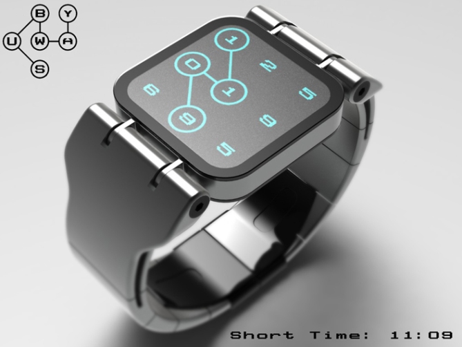
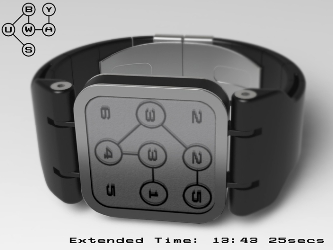
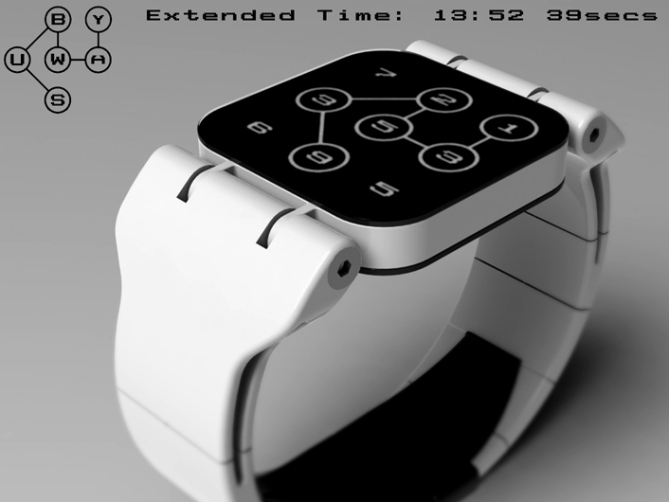
Peter says: This is “Subway”. I had an idea of a always on LCD display that showed continuously changing apparently random numbers. Some of the numbers tell the time but without knowing the order are completely meaningless.

To tell the time the watch would be activated either by a button or touchsensitive screen controls. Once activated an animated chain links the appropiate numbers together showing the time, the order the numbers are linked in shows the order in which they should be read. This means of displaying a sequence of numbers would work equally well for the date too. This animated chain looks like the graphics used on some underground train maps hence the name subway.

The watch is very simple in both its styling and operation and therfore should appeal to the main stream. The display style would lend it self to different colour combinations and different animations, hopefully appealing to a wider audience.
This design stands out due to its simple, intuative time telling method and use of existing technologies and production methods.


Thanks for adding this design to the blog TF! 😀
LikeLike
Nice one Pete!h
LikeLike
Thanks a lot Gordon!h 😀
LikeLike
This presses all the right buttons for me. 5/y
LikeLike
Yay! thats great news! Im glad it pleases sir! Cheers for the vote! 😀
LikeLike
Only thing…I want this always on. Not interested in pressing screen or button to tell the time. Obviously, you need something to indicate which digit is first. You could put a small “tail” on the circle of the leading digit.
Pre-reqs: Always on, date, alarm.
LikeLike
The numbers would be always on and change appropiately with the time. The animation could come on at set intervals or perhaps using an accelorometer in the same way as online so when you move your wrist it would be activated. The circles could have little arrows on them like the “male symbol” which would show the direction and order for extra clarity. Im sure that it would be no trouble to include the other features you mention as the display is not limited in anyway. Cheers for the extra feedback DZ! 😀
LikeLike
So how do you get 13:44 or 13:53 or 13:47 or 48 ???
LikeLike
Hi George, the numbers will change with the time, they appear randomly on the screen. If the animation that reveals the time is still on the screen the appropiate number will update while highlighted. If the animation has finished the new numbers would appear randomly anywhere on the screen and the next animation would be different to highlight them. Hope this explains it 😀
LikeLike
Another neat design Pete! 5Y. 🙂
LikeLike
Thanks a lot Mushy, cheers for the vote! 😀
LikeLike
^ George, I think then the numbers would just repeat.
GMTA Pete 😀 Love this and wanna have this. Every city boy and girl should own this watch. Cool theme, easy to read exectution (compared to what I planned) and good looking! 5*/TICKET PLEASE
LikeLike
Thanks Sam, yeah this just seemed an easy way to highlight the time. Was paranoid someone will have done something similar as it seemed obvious for some reason. Would love to see your version!
Cheers for the positive words and vote! 😀
LikeLike
Very beautiful watch, Pete!
Quick question: the seconds ravel or are fixed in short time of activation of the hour? (even without the seconds, it works well)
It is a watch which I would buy readily.
5 * and yes, of course.
LikeLike
I got my answer a little higher, it’s OK.
LikeLike
Yeah the seconds would keep updating, when the animation has finished they could constantly move around the face as they change.
I should have done this in the animation for clarity! doh!
Cheers for the comment and the vote! 😀
LikeLike
Good and really nice job Pete
Five-Y
LikeLike
Thanks a lot Jose! Cheers for the vote! 😀
LikeLike
Very interesting watch! I like the way it draws the path onto the screen as opposed to just having the circles and lines appear 🙂 Clever. The place where the face connects to the strap is a bit bulky but nonetheless awesome and I very much enjoy the butterfly clasp. 5* as always my good sir from the UK. And as it was once said, “May the odds be ever in your favor”
Just one question: What is the logo mode? Why the specific numbers and lines to connect them?
LikeLike
Thanks a lot Jordon!
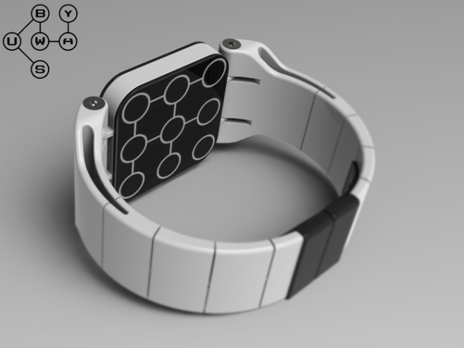
The logo mode is just a bit of meaninless fun. The layout of the circles is the same as the Kisai logo, so I just joined them up in that style. I imagine with a little more thought it could be made more meaningfull etc but at the moment its just for fun (could be a screen saver or something)
Cheers for the feedback and the vote! Good luck with your next submission sir! 😀
LikeLike
Ah, I see 😛
Thanks for the luck! I sent in a design 6 days ago, got impatient and just re-submitted (I don’t think you’re supposed to do that lol) Hopefully it gets added! 😛
LikeLike
Hehe patients is a virtue! I think the average time between submitting and posting is about 4 weeks depending on how many submissions they recieve around the same time. As you havent submitted any recently it may be quicker. Either way dont lose hope if it takes a few weeks! 🙂
LikeLike
Like this to molecular level, awesome Pete, well done! 5* wanted!
LikeLike
I like you comment to a molecular level too! thanks a lot for the awesome comment! 😀
LikeLike
http://fr.ubergizmo.com/2012/08/concept-montre-subway-affiche-heure-carte-metro/
LikeLike
Top! J’adore…….et je la veux!!!! 🙂
LikeLike
Merci Jeremy beaucoup! Im heureux que vous l’aimez! Vive dire! 😀
LikeLike
Finally! A watch that displays the time in a quick and readable way (i.e. not binary, etc.) and that is very cool-looking. If it is not too expensive, I would definitely buy it.
LikeLike
Hehe I couldn’t have said it better myself (are you available for PR? lol)
I struugle with the code based designs too! Thanks for the compliment the comment and the vote! 😀
LikeLike
I “struugle” with spelling too! lol
LikeLike
Another top piece of work Pete, this is a goodie 🙂 5/Y
LikeLike
Thanks a lot KV! cheers for the comment and the high 5! 😀
LikeLike
I think I understand the inspiration behind this watch design. A watch display that uses the diagram style maps like those used on the The London Underground train line & other underground trains: Subway like those in New York Or Paris.
This design also has a air of the Artistic Underground Map by Simon Patterson: The Great Bear.
http://georgesjournal.wordpress.com/2011/03/27/mapping-the-stars-the-great-bear-1992-simon-patterson/
LikeLike
If Im honest most of my designs start with a mental image which seems to occur randomly and usually not in any context, Im not really a brainstormer. These things tend to be quite organic in the waythey come to mind. It only tends to be at the sketching or modelling stage that I rationalise it and then usually it becomes associated with any inspirational images. In this case I just had the image of the circles around the numbers linked by the lines which in turn reminded me of the iconic image of the london underground map like your linked image. Any association to this iconic image is needless to say very welcome. Cheers for the interest Andrew! 😀
LikeLike
http://techcracks.com/2012/08/subway-lcd-watch-concept-by-peter-fletcher/
LikeLike
Connect the numbs : ) 5*
Signed: Taco
LikeLike
Short and Sweet! Thanks Mr Taco! 😀
Signed: Pete
LikeLike
All your examples are of times with all different numbers. How would it display a time such as 11:22?
LikeLike
Hi Tokio Pierre (cool name btw),
The time would be displayed in exactly the same manner as the other examples, only the display would have two or more 1s and two or more 2s prior to the animation. The display will always show the correct numbers to tell the time at any moment, but without the animation linking them together these numbers are meaningless.
I hope this answers your question, cheers for the interest! 😀
LikeLike
love this – simple, easy to read, sleek design. beautiful. 5*
LikeLike
Cant argue with any of your points there! hehe
Thanks a lot Heather! 😀
LikeLike
http://technabob.com/blog/2012/08/03/tokyoflash-subway-watch-concept/
LikeLike
http://rivalanimus.com/2012/08/03/tokyoflash-subway-watch-concept-underground-map-easily-tells-time/
LikeLike
http://www.new-digital-gadgets.com/subway-the-concept-of-hours-in-the-style-of-the-metro/
LikeLike
http://technology.automated.it/2012/08/03/tokyoflash-subway-watch-concept-underground-map-easily-tells-time/
LikeLike
http://pichaus.com/+subway/
LikeLike
http://www.damnthatshot.com/2012/08/03/tokyoflash-subway-watch-concept-underground-map-easily-tells-time/
LikeLike
http://www.beautifullife.info/fashion-design/subway-lcd-watch-concept/
LikeLike
http://boofos.com/tag/lcd-watch/
LikeLike
http://luxuryon.tumblr.com/post/29049189298
LikeLike
http://thinkgeeks4u.com/news-feeds-mainmenu-7/52-future-technology/21-beatiful-life.html
LikeLike
http://ru-clocks.livejournal.com/143007.html
LikeLike
http://feedgrids.com/source/BeautifulLife/
LikeLike
http://bluepantsdesign.wordpress.com/2012/08/09/subway-lcd-watch-concept/
LikeLike
http://pichaus.com/subway-tokyoflash-user-submitted-watch-@30cd88c345430a50e040e90e2d12c428/
LikeLike
http://technology.automated.it/category/design/page/2/
LikeLike
Crikey, I nearly had a heart attack. The likes which were on 94 said 10 when I looked a min ago, and the tweets that were on 5 went down to 1, I refreshed the page and they returned to the correct figures, don’t do that too me bloggy I’m going grey as it is!
LikeLike
When I said likes I ment pins, the likes stayed the same. Shows I was panic’d lol
LikeLike
http://montre24.com/news/2012-08-08/1862/
LikeLike
http://popkorn.pl/181425
LikeLike
http://www.paramodernism.com/subway-lcd-watch-concept/
LikeLike
Time is short for this post so I want to say a quick thanks to every one who supported this design! Especially the likers and the pinners! I haven’t seen so many pins on one design since TF introduced pinterest to the blog! So cheers to you guys, cheers to TF as ever for adding this design to the blog! : D
Thanks everyone
Pete from England 😀
LikeLike
This one is nice. I like the overall look, the idea and the name. A small dash on the starting circle would help to read the time correctly. A note on the rendering, of the first pic, : I would preffer if it was showing 10:19 ( the first and 3rd lines would be vertical ) 5* and I would buy.
LikeLike
Im glad this one appeals on various levels, yeah a couple of people have suggested some kind of marker to highligh the first number to help with reading should you miss the animation. Hehe you have a prefered orientation of numbers, you clearly like a sense of order 😉 cheers for the thoughtful feedback Makko! 😀
LikeLike
http://aabid77.blogspot.co.uk/2012/08/subway-lcd-watch-concept.html
LikeLike
http://bloggers.com/post/ldquosubwayrdquo-lcd-watch-concept-8100101
LikeLike
http://www.artifakt.pl/index.php/subway-zegarek-z-ktorym-zawsze-dojedziesz-na-czas/
LikeLike
http://designno.com/3423/subway-lcd-watch-concept/
LikeLike