Design submitted by Andy from The Ukraine.
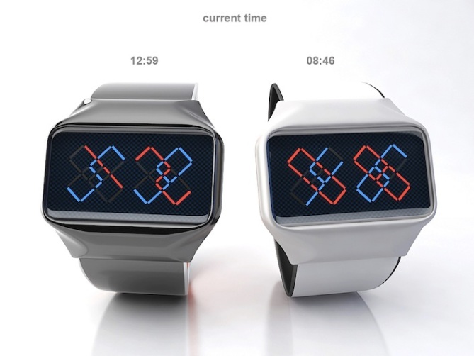
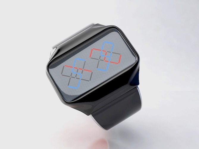
Andy writes: “I decided to create intersection figures, to create an ornamental effect based on digits and colors. After understanding the system, it’s very easy to read the time.
This concept uses the following method to display the time: 1 digit and 2 digit in hours group, and 1 digit and 2 digit in minutes group intersect at an angle of 45 degrees. For easy reading 1 digit is red, 2 -blue. For example a 1 red digit intersect 5 blue digit in the group of hours and 3 red digit intersect 8 blue digit in minutes group. As the result, the current time is 15:38.
Here I use different colors metallic case and leather / silicon strap. I think this model is able to be interesting for peoples who love differents ornaments, unusual wrist watches and simply beautiful, fashionable devices. A nonstandard method for displaying the time using the intersection digits.”


Beautiful watch original, well done Andy.
5 * / Yes.
LikeLike
Thanks, Patrick! Good luck
LikeLike
This is an easy 5 stars and YES!! design. Easy to read and nice to look at, best of luck to you 🙂
LikeLike
Thanks for you comment, Krautesh Vakir! Good luck
LikeLike
Greeting!
Nice design, I like the concept, but believe it can be made more interesting and cryptic like the Online Watch. There could be more intersecting lines on the display and continue to the leather strap. I can imagine the outcome. I can imagine consider myself buying the product in the future. Well done 5*.
LikeLike
Hi, Firdaus! thank for you comment. Maybe you are right, but I thought about using more line and decided that my way is more easy to tell the time. According strap- it depends of personal taste and it could be made in 2 kinds- one color minimalistic strap and second – ornament lines strap
LikeLike
Simple but very effective! Looks great and works well! 5/Y best of luck Andy! 😀
LikeLike
Thank for you comment, Pete! Good luck
LikeLike
hey, andy! this is a really neat idea, and the effect is really cool. very easy to read – the colors make a big difference. i i like firdaus’ idea of including more interesting lines on the display.
i see one possible problem, though. at times like x2:x2 or x5:x5, you will have what appears to be very similar to a swastika on the display, which could be offensive to some. and forget about 22:22. i’m not sure how this could be fixed – maybe try a new font? good luck!
LikeLike
Hi, Heather! Thanks for you deep comment. According to swastika- the first of all it’s ancient symbol of the sun, and the second- the evil symbol and nacism. But on the other hand, differents color do not join 2 and 2 in one symbol and also in swastic cross start in one middle point, but here it’s only intersected lines.
LikeLike
Nice of you Heather to think about it. I think it won’t be a problem and if it will be, it’s because people look for trouble. 55 on a normal LCD watch looks like SS and noone ever complained 😉
LikeLike
I agree with you, Sam!
LikeLike
This is too simple! You can try something different! How about different length or width on the either hours or minutes? It can be more interesting that this one. Try it. 5 stars!
LikeLike
Leonard Lee Kah Khiong!
Thanks for you comment. I think too simple it’s enough good for many peoples especially for peoples who likes to wearing easy reading and minimalistic watches. According using different length or width of lines, it could looks bad and conflict to the principle of the golden section. Good luck
LikeLike
Good point. Simple is good. Firdaus or my suggestion may be bad or… good. There is a good potential with you design. You should try more to learn more about you design’s potential. About the principle of the golden section, it just a guide and no everything is good to go with it. Don’t feel bad about us. We just try to help each other. Good luck!
LikeLike
In a dispute born truth. Thank you, Leonard for deep and nice analyze. Yes, you are right-we need help each other for the best result
LikeLike
Rating on this should be much higher. This is a really crypto-simplistic design, uber Tokyoflashy.
This one sparks my interest like flint on steel. 5.y.awesome
LikeLike
Lol, Cory! Flint on still…. he-he.cool . Thanks and take care
LikeLike
Nice one Andy! As a puzzle writer, I can appreciate this one. 🙂 5Y. It’s a really creative idea! I expect a lot of voters just don’t take enough time to see what it’s all about. Good luck with it.
LikeLike
Thanks, Mushy. Good luck and wish you design never ever seeing puzzle!
LikeLike
First time, Andy? Fantastic job! Give me one or five, please 🙂
5 stars from me! One for each of those watches!!
Thanks!
LikeLike
Hi, Dzign! No first time 🙂 you can take one or five after production watch 🙂 Thanks and good luck
LikeLike
This is a really really good example for a watch that is super easy to read but looking cryptic at first. The crossing of the digits and the necessary smaller segmentation of the junction creates such a nice effect! I would be happy to own this watch. 5*/¥€$
LikeLike
Thank you, Sam! good luck
LikeLike
The overall look is interesting. + the color of the lights could be changed. + the left side could be use for the hour and the right side for the minute ( red for 10th – blue for single digit )
LikeLike