Design submitted by Lloyd from Australia.
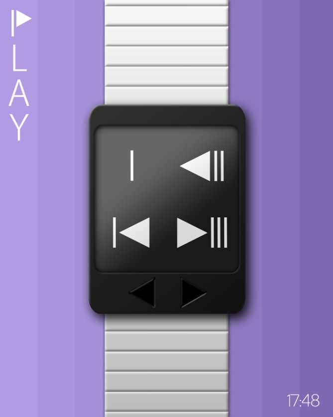
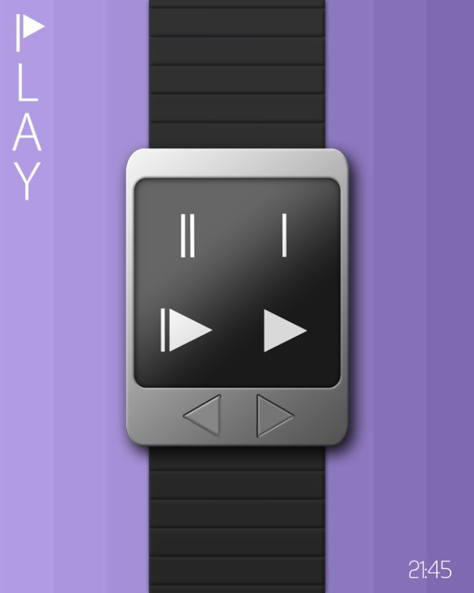
Lloyd says: “Play” is an LCD concept watch that displays the time and date using symbols resembling those found on DVD players and other modern gadgets.

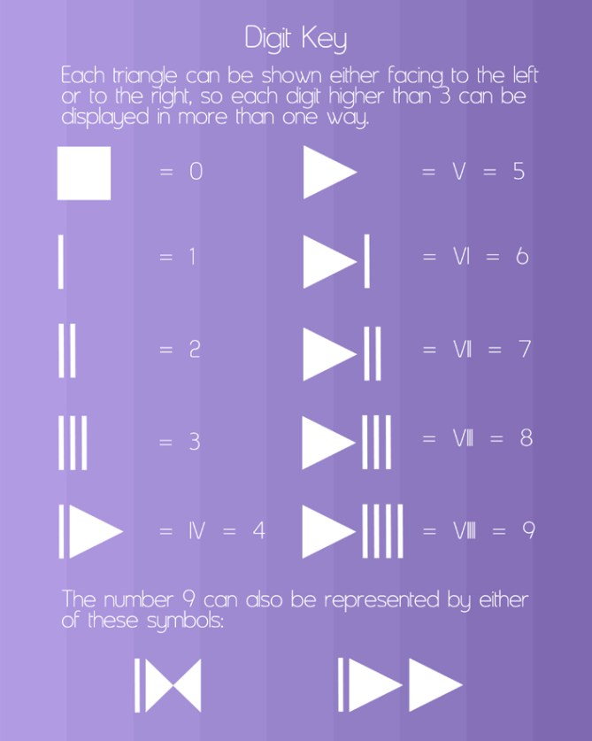
In actual fact, the symbols are just Roman numerals, except that the V’s have been filled in to make triangles and rotated 90 degrees clockwise or counterclockwise. There is no Roman numeral for zero so it is represented by a square, the symbol for “stop”.
Play is USB rechargeable via a computer, and has an alarm. In the images below it is shown in various combinations of black, white and silver, but could be made in other colours too. Its 2 triangular buttons are located on the front of the watch just below the screen. The display is “always on”.
This design would appeal to anyone who likes cool modern gadgets, puzzles, creativity, thinking “outside the box” and having fun.
It stands out because of its unique and easy to read cryptic display.


Thanx for posting this design TF! 🙂
LikeLike
Very cool twist on Roman numbers, making an old number system looking modern 🙂 5/Y
LikeLike
Thanx Krautesh. 🙂
LikeLike
Very neat design and a fantastic way of making roman numerals look modern! As the numerals look like mp3 player controls maybe this should be touch screen and various modes can be accessed by pressing the appropriate symbol (where ever it may be on the display) very nice work Lloyd 5/Y best of luck! 😀
LikeLike
Yeah that would be cool Pete. Good idea. 😉 Thanx!
LikeLike
A simple project, easily read, a obviousness disconcerting!
5 * and Yes, obviously!
LikeLike
Hey Patrick. Thanx a lot. 🙂
LikeLike
Nice work Lloyd, I like it!
►*/Y
Ps.
4= ▌► or ▌◄ ?
6=◄▌ or ►▌ ?
LikeLike
Thanx Lazlo. 🙂 Yes, 4 = ▌► or ▌◄ and 6=◄▌ or ►▌.
LikeLike
Thank you Lloyd!
LikeLike
No worries Lazlo. 😉 I hope you have found a new home and are no longer living inside a box! 😀
LikeLike
I think I’d prefer to see a simple V instead of a sideways triangle. I suspect this design would grow on me, so 5*!
LikeLike
Nevermind DZ. Thanx for taking the time to vote.
LikeLike
This design might be more up your street DZ. 😉
https://www.facebook.com/#!/photo.php?fbid=10150987243028889&set=a.10150683938843889.403881.523388888&type=1&theater
LikeLike
V7 watch design
LikeLike
Yeah, the other one hits the spot for me! Don’t get me wrong…I still like the above design…love Roman numerals!
LikeLike
I actually like the idea of this one … if the strap/case are retro style it’d be even more awesome … just please no usb rechargable … normal batteries are way better for this.
LikeLike
Thanx \///. 🙂
LikeLike
Can this watc incorporate with other function? Padometer, MP4 player, … 5 stars!
LikeLike
Maybe Leonard. I did a watch design before with an MP3 player. Thanx for your interest and vote.
LikeLike
I like the “Play Watch”,the concept of how to read it is very easy and if anyone can read it like me should buy it. I would buy a couple or a few of these to give to friends of mine. By the way the illusion and online watches that have blue numbers are not very visible at nite even with the backlite on .
LikeLike
Thanx Arthur! 🙂
LikeLike
This is great, Lloyd! Very clever! Love the look, the style, and the overall concept. 5*/yes. 🙂
LikeLike
Wow! Thanx Heather! 🙂
LikeLike
Definitely like this “PLAY-TIME” concept…hmm…perhaps you should call it that, or even “PUSH PLAY” or “DIS-PLAY”…okay, I guess “PLAY” is simple enough…great design, Lloyd! 5*
LikeLike
Thanx BB. 🙂 I thought about PLAY TIME, but opted for just PLAY cos it’s the name of one of Moby’s albums. 🙂
LikeLike
I’ve always appreciated the creative twist in Lloyd’s watches, and this one is no different. On this occasion however, I find the concept and aesthetic presentation working in tandem a winning combination.
I dig the bold, black symbols centered in an all-white frame and strap. It’s an accessory that’s chic and sleek. I imagine this would be a cool must-have for martini-sipping guys and guys at a cosmopolitan New York lounge where all the decor is monochrome and geometric and every piece of furniture is post-modernist and functional.
Anyway, the design is serious in a cheeky, quirky way and for that, it’s a go for me. 5 and yes.
LikeLike
Cheers a lot Ai! 🙂
LikeLike
Really a geeky watch, but not my cup of tea. Bang no! 4* 😉
LikeLike
No worries Firdaus. 🙂 Thanx for bothering to have a look etc.
LikeLike
Awesome Lloyd, just awesome. Not only, that we thought alike this time, I like how you combined the roman numerals with a contemporary set of symbols that are future-fit.
I’m not sure about the big flat display because the 4 symbols look a little lost and not presented in a way they deserve it. Hard to explain… I also have to rethink some of my concepts too 😉 Maybe each number needs an own frame (be it a drawn frame, making the symbols look like flat screen buttons, or be it a hole in the case that carries the number) or each pair should be framed. The result could be a bit more techy. But I take this as an idea for numbers, that I totaly like to see on my wrist. 5*/YES
LikeLike
Thanx a lot Sam. 🙂 Good to know you like the numbers and thanx for the feedback.
LikeLike
This one is nice. I prefer the 3rd option for the 9, because it look like the fast-forward button. ( |>> ) I like the buttons position/style.
LikeLike
Thanx Makko! Yeah I like that option best too. 😉
LikeLike