Design submitted by Christian from the USA.
Christian says: I liked the idea of surrounding, closing-in on the hour–like a mouth. The name DevHour then wrote itself.

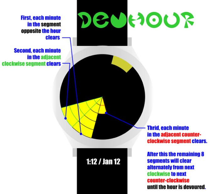
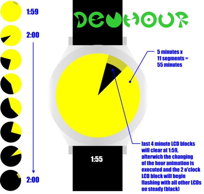
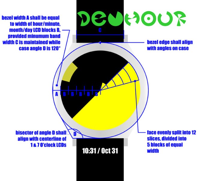
The hours are represented by 12 equal pie slices of the watch face, and each slice holds 5 bars representing minutes. One bar represents the current hour, which flashes on and off once per second. Minute bars clear from the center out, firstly opposite the hour position, secondly bars clear in the adjacent clockwise slice and thirdly from the adjacent counter-clockwise slice; after this slices clear alternately from clockwise to counter-clockwise until hour is devoured.

High tech geek or IT types will find it appealing, although I’ve included the option of an icon to display on the watch face which will potentially appeal to children and possibly women.
Simplicity, readability and an attractive dynamic display.


Cool. I like the fun pictures on the watch’s face. 5 stars and Yes!
LikeLike
Thank you, mushy.
Since I’m using a two-color scheme I’ve played with the option of always showing one of the pictures/ icons all the time and showing the time/ date in inverse color, though that might be hard to read. I am open to suggestions.
LikeLike
Not really my cup of tea this one, it looks interesting but the time telling seems complicated. The icon mode is fun and I can imagine that appealing to kids. I support the design buts it’s not for me.
LikeLike
Hi Christian!
I like the the pictograms you can make with it and the time telling idea with the minutes starting at the opposite position from the hour marker. And I like the distance effect of the display. It has quite an expression when you look at it from far away – not many designs have this.
But a it’s bit too hard to read. It’s a matter of estimation. Maybe a segmentation (that LED can’t go without) would help counting the the segments.
LikeLike
Hi, Samukun!
When you say segmentation are you saying that you would prefer seeing separation between the individual segments/cells? I think that would be easy enough to implement without compromising the design intention, provided it was subtle (think hair line thickness).
Thank you for the feedback!
LikeLike
GREAT design, but there are many things missing and need to be fixed here. I hope you can improve and improve and improve…. and prove it… till the time, 3*
LikeLike
Such as?
LikeLike
It’s not my style. And the time telling method seem hard.
LikeLike