Design submitted by Sam from Germany.
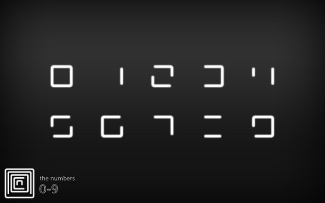
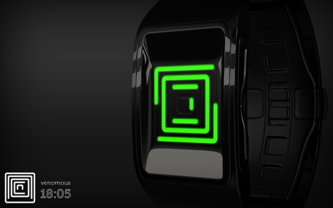
Sam says: NEON IO is a display concept, that came to being while working on the NEON concept. Instead of the classical 2×2 array, I’m using an inside-out display. Since the numbers are hollow, there is enough space in them to contain another number.

The most numbers are recognized intuitively – they look like the well known 7-segment digits without the center segment. For the 8 another encryption had to be found, to distinguish it from the 0. The = symbol it is. The display of the NEON IO looks way more cryptic than the one from NEON. It takes a bit longer to understand it, but the dense mazy style looks cool.

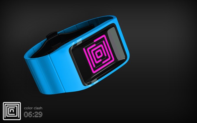
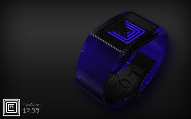
As for the watch, I chose the same simple and smooth geometry with a recess for the display to achieve a stylish sci-fi look. And because everything is held minimalistic, there can be quite some color play. Watch and display can have the same color, or clashing ones. The watch can look serious or playful. There are many options available and I think everyone could find a favorite.


make it, I’ll buy it.
LikeLike
It’s wonderful! I want the silver / red version!
5/Y
LikeLike
More badass work Sam 5/Y 🙂
LikeLike
Thanks alot Toky for posting this variant of the NEON concept!
If this really could be done with e-paper, then both layouts and even more could be made in one watch….
Thank you Shideh, Laszlo and Krauty for your support! Cool you found a version for yourself 😀
LikeLike
Same punishment as the first “NEON”, 5 * and YES!
LikeLike
Oh merci pour ca Patrick! Punishment hehehe.
LikeLike
Weird, wonderful and walloping!
A very good development from Neon mk I.
I would buy one this very minut if it has an “always-on” mode.
I prefer to check time with a quick glance (when I have learned the riddle) instead of being forced to press a button.
LikeLike
This speaks for Tokyoflash’s e-paper idea, mentioned at the mk I. Always on and always impressive 🙂 Thank you Jens for your comment!
LikeLike
I WANT IT!
LikeLike
Thanks for yelling 😀
LikeLike
Both NEON are wonderful! 5 stars! But, I prefer the previous NEON! And … I recently join a design contest. If you guys like my work, please vote it. Thanks! http://www.talenthouse.com/creativeinvites/show/submission/detail/7JQHAX
LikeLike
Oh that’s fine if you have a favorite, Leo 🙂
LikeLike
Hey guys would anyone know of a good software to make designs that look so realistic,likee these ?
LikeLike
I never used Blender, but it’s a strong program and it’s free. I own 3ds max which I use for my watches. Plus Photoshop to finish the images. The free alternative would be GIMP. But the watches don’t automatically look realistic. It takes quite some practice.
Although the blog speaks another language mostly, you don’t necessarily need to make realistic looking watch concepts here. If you have an idea, and if it’s really good and if you can sketch or describe it in a detailed way, then Tokyoflash will try to visualize it. So simply telling what kind of watch you’d like to have would be a little lame. I always like to mention the Kaidoku, that has been made real based upon a sketch from a now teenager 😀 Tokyoflash translated it into a 3D model and the final product developed even further.
LikeLike
Thanks for all the info! 🙂 Now I can start working on some new ideas I had in mind without using such bad pictures like last time xD
LikeLike
interesting idea – reading the digits inside-out like that 😉 friggin awesome execution, sam! i’d buy several. if i could give more than 5*, i would. YES, YES, YES.
LikeLike
Epic stencil lady likes it, yoohoo Heather!!! Thanks so much for the words!
LikeLike
Epitomization of TALENT 🙂
LikeLike
A great take on the concentric numbers layout, cryptic and pretty 5/Y best of luck Sam! 😀
LikeLike
love love love it!!!
5/yes.
one of your best designs…..my favorite version is the one that has the time at 07:48.
on a side note, congratz on “online” 🙂
LikeLike
YES YES YES! I love the design of this watch, easy to read people would notice and i would have to explain how actualy it is to read!
Signed & Typed by¦
Mr. Taco
LikeLike
PS¦
I love the sour watch
LikeLike
Ranjan: Oh what a compliment :3 Thank you!
Pete: Thanks alot sir!
diclonius: Great comment! Thank you d! And thanks for the congratz!
Taco: Yeah hehe, quite a conversation starter. Sour times for Taco then 😉
LikeLike
Please, make it make it make it.
We want to buy it, we are already three people and counting.
Sent from Costa Rica!
LikeLike
Greetings to Costa Rica! Thank you for coming by and telling!
LikeLike
Just love the design! there is only one thing: i would prefer the outerline showing the hours! anyway gr8 concept!
LikeLike
Hi Jag, thank you for the comment and the suggestion. I think it could be done, that one chooses a number order so eferyone could be pleased. That would be cool 🙂
LikeLike
The watch is cute just like you! I’ll buy them in various colors for my girls ( I can imagine Aphosno guy would say so). 5*
LikeLike
(Where is he anyway?)
Aahahaha 😳 Do you have girls or is that just your excuse to buy the pink one (that I would ask Tokyoflash to make). Thanks for the nice comment Fir!
LikeLike
I prefer the other version. ( except that this one could be a not always on watch, if it had a regular wristband look, and have an animation mode, because of the concentric effect )
a horizontal dual-square inside-out, or outside-in, would be nicer ( easier to read )
LikeLike
Hm, also interesting 🙂
LikeLike
Missed the original Neon bye bye comment. Not this time! This was an intersting time with the Neon concepts. The numbers didn’t seem to be a big problem. That’s so cool cause I love how they look. There are maybe other layouts possible, but the classic 2×2 and this inside-out one are my favorites. Thank you everybody for your support and for sharing your thoughts!
Stay tuned!
Sam from Germany
LikeLike
Best of luck Sam! 😀
LikeLike