Design submitted by Sam from Germany.
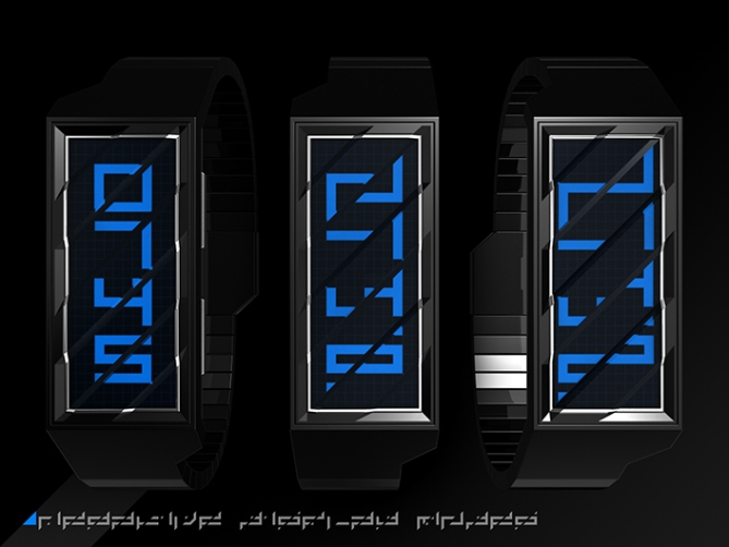
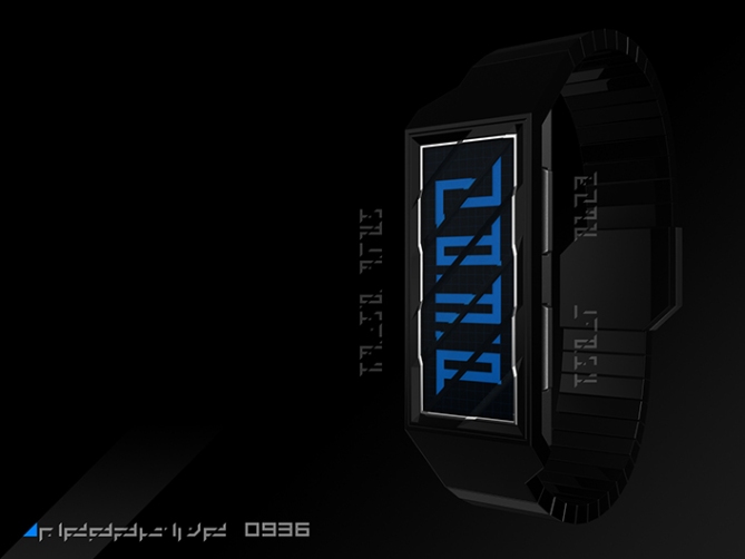
The basic idea for this watch is “changing the classic numbers with a simple operation to let it look cryptic but easy to decypher”. The simple operation this time is slicing the numbers diagonally and moving the resulting parts along the slice. As reaction, different parts of the numbers create new alignments letting the new numbers look like alien symbols.


Sam says: I chose a vertical alignment of the four time telling numbers. There are three display modes: a) showing the sliced numbers b) moving the parts a bit and c) moving the parts more extreme. Once the wearer got used to one mode, he/she can move on to the next. The covering glass is diagonally embossed, always reminding the wearer of the way the symbols have to be decrypted. My favorite mode is the second one, with halfway shifted parts. The “numbers” still look compact and are easy to reconstruct mentally. With a button, the modes can be changed easily. Another button is for the backlight.
If you like it cryptical, alien looking but simple to solve, and if you love 45∞ angles, this is a watch for you.


Thank you Toky for posting VEER!
Btw, don’t bother reading the alien texts. They HAVE a meaning, but the images speak for themselves if you worked through the terrestrial summary 😉
LikeLike
Dam i wish i had as many ideas as you do 🙂 very cool idea 5 stars and yes
LikeLike
Thank you Kraut!
Don’t worry. Some have ONE idea and succeed already. I hope I move from idea collector to something bigger in the future. Step by step 🙂
LikeLike
I hear you, Sam…=)
As I tend to tell people who ask me where I get my ideas; “Getting ideas isn’t the problem…” =)
LikeLike
It’s a bit messy looking. Sorry don’t like it.
LikeLike
NP Lloyd 😉
LikeLike
Sorry that was probably a bit unfair Sam. It’s just not for me. Good luck with it. 🙂
LikeLike
Thank you for ironing the creases, Lloyd.
It’s normal that a watch isn’t liked by everyone. That’s why it was no problem. And you gave a reason, which makes the comment useful in the end 🙂 It IS messy and that’s where the separate tastes start to collide.
Thanks for the luck too!
LikeLike
You know what, the slashed letters and numbers really looking like specific type of Arabic Kufis calligraphy. Syekh from Dubai would certainly love these….. أحب ذلك أيضاخمسة درجات ونتمنى لك التوفيق لك!
LikeLike
شكرا لك!!!
I had the same thought when I made the Veer half shift font! The little “towers” and dots reminded me of arabic fonts too. Oh a big donor from Dubai is highly welcome 😉
LikeLike
Hi Sam,
Hasn’t TF manufactured any of your designs yet? Geeesh…what does it take! Like Firdy, I was thinking Arabic writing. This is a fantastic design – needs different colours, though. 5 * from me!
DZ
LikeLike
Thanks alot DZ! Other colors are no problem 😉 Sometimes I just don’t like a rainbow in the presentation to focus on the encryption. What color would be your favorite, you think?
No design of mine out there… yet! I made so much concepts so the ideas don’t collect dust in the sketchbook. The next step is definitely freeing some of them, getting them offline. But hobby and profession are different things. Anyway, it’s fun and if it becomes more, oh yes please 😀 It doeas take quite a bit to make a watch. Watch industry is shrinking but TF try to break new horizons. The have to do alot of research and spend money for prototypes cause they can’t let the factory produce a watch right away. Tough job hehe.
LikeLike
It’s pretty amazing what TF does. The watches are really good quality and not very expensive. (When you consider the boring brand name watches around which are often x times as expensive.) If I pass a watch shop these days, most of the watches are pretty bland. I’m sure that’s partly because I’ve been influenced by TF’s fantastic watches…not just the watches that go to production, but the ones on this blog.
Cheers,
DZ
LikeLike
The watches could be cheaper, but they could be much more expensive. And one has to keep in mind, they are unique and some of them are based upon fan designs! Thats so awesome actually.
LikeLike
Too cool for school! I like it, simple but cryptic. The numbers look like some kinda alien language! 5/Y
Best of luck Sir! 😀
LikeLike
Yeah I was so fascinated by how strange the numbers look after this little transformation, so I made the whole alphabet. It was fun, making the images look like alien advertising. Thank you for your support Peter!!
LikeLike
should make a font and post it somewhere so i can download it hehe
LikeLike
Maybe I do that Kraut. I have the sliced, the half shift and the full shift as font. Oh I have the mood to type something now… 😀
LikeLike
love it. i’m not sure whether i like the positive or negative display better. they’re both pretty awesome. 🙂 i like both of the first two modes – my favorite is probably the half shift, like yours, but even the one without any shifting is also cool looking because of the way you have the diagonals on the glass. 😉 5*/yes – best of luck!
LikeLike
The cool thing is, positive and negative can be done with one watch. So if you feel blue, you take the blue one and if you feel you’re close to blacking out, then you can quickly switch to black 😉 I’m glad I left the gaps in the unshifted numbers. Yeah, they can stand alone. Thanks alot for your perspective and the rating and the luck!!
LikeLike
I have some “tilt” to the bizarre watches.
5 * / Yes.
LikeLike
Hehehe, nicely said. Merci bien Patrick!
LikeLike
Very good! I like the most is the glass! The diagonally sliced embossed glass, a very nice bold approach! Innovative 5 stars!
LikeLike
Mhh nice how you emphasize your favorite aspect. Thank you Leonard for the comment and the support!
LikeLike
Your insane5*. This is becoming Pete and Sam Flash. But seriously you are a very prolific artist.
LikeLike
Don’t forget Laszlo. He’s been pumping out some beautiful designs recently
LikeLike
white version would be cool as well!
LikeLike
Thanks for the hint!
LikeLike
Hi everybody, check new images here!
LikeLike
since the 3 options, and the positive/negative display, are in 1 watch, it’s a 6*. I prefer the 1st option ( just slice ) I love the red one ( on fb ), but would take it on a black case/band, not white. I would buy it.
LikeLike
Coolio, you puzzled together your own favorite! Oh yes, different display modes in one watch are pure fun. And when you have enough of the one you chose, you can still take another one after a year 🙂 Thank you for the comment Makk!!
LikeLike
and it’s better on the pocket ( to buy 1 watch )
LikeLike