Design submitted by Dietrich from Australia.
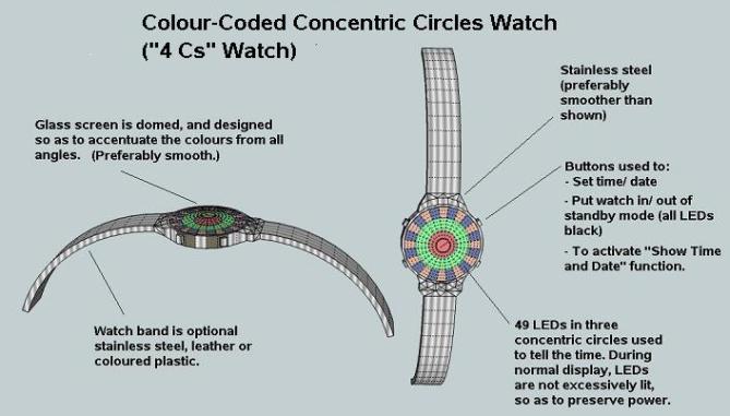
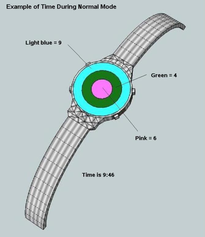
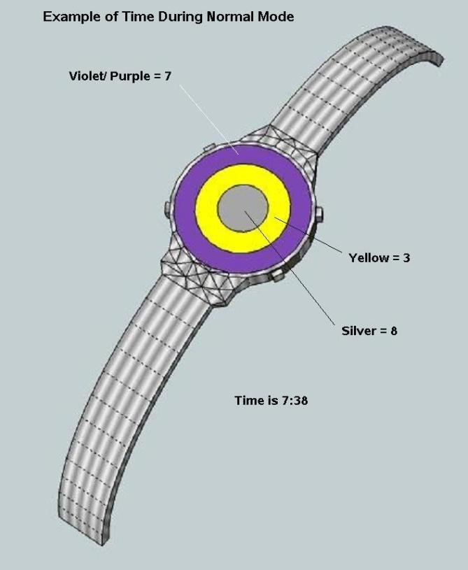
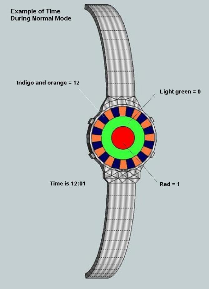
Dietrich says: I was looking at designs on Tokyoflash website and thinking that many of them are based on “codes” of some sort. Then I hit upon the idea of colour codes.Three concentric circles show hours/ month and minutes/ day. The three circles are colour-coded to represent the numbers from 1 – 12. After looking at the colour-code chart and a few example watch faces, it’s easy to see how to tell the time. The watch is also colour-blind friendly.
This design has sophistication and practicality, as well as beauty. The colourful design makes it stand apart. The code is partially derived from “ROYGBIV” to make learning easy. The show time/ date function is a useful “cheat” feature, and makes it accessible to colour blind people and learners.


Thanks for posting this design, TF. If anyone is wondering…this was designed about three months ago when I was still learning Sketchup…so the presentation isn’t the best. I thought it wasn’t going to be published!
Cheers,
Dietrich
LikeLike
This would get peoples attention in the fireworks mode, would definitly need the option of showing the numbers to help learn the number value of each colour tho. Dont worry about the presentation so much, sure its not like some of the other submisions but its the idea that is important 🙂 Im in the same boat, have sent a submission during the process of learning how to use blender, sooooo much to learn hehe.
LikeLike
Yeah, it takes a while to get up to speed…in this one I didn’t even use a render program. Good luck with your submission, Krautesh.
Cheers,
DZ
LikeLike
Thanks :), heres hoping
LikeLike
Im not big into the colourful stuff but that wouldnt put me off. I think with all coded watches its useful to have a reveal mode for when the user hasnt got the time or patients to work out the time or for training purposes until they are profecient. I also think that maybe some kind of colour key that attaches to the strap would be useful, again for training purposes. When your used to it you can take the key off etc. I presume this one was drawn before your triangle watch? the triangle watch graphics were much improved compared to this so you must be learning fast. You will soon be the go to guy for graphics! Best of luck! 😀
LikeLike
Hi Pete. Thanks for your feedback. The above contains a reveal mode – I did this deliberately in both my colour-coded watches so that it would be simple to learn. Yeah…after designing this one I got really serious and then made the triangle design, which is so much better. I thought they weren’t going to publish this design…
Cheers,
DZ
LikeLike
The ideas is wonderful. Simple and clean, to read the time/date.
But, Big problems was the colors codes, again. Without colors codes in hand, with poor memory of my who cannot remember all the colors code: what colors represent what numbers, this will be extremely difficult to read.
5 Stars from me, Good Luck !
LikeLike
Thanks for the stars, Leonard. I think if you wore this watch for a few weeks, it would be easy to learn the code. I know the code off the top of my head…but I wonder if that’s because I have a good memory for such things…could also be because I designed the watch!!
Cheers,
DZ
LikeLike
Nice and colourful DZ. 🙂
LikeLike
Thanks, Lloyd.
LikeLike
Hey Dietrich … nice one … new creativity n’ jolly touch … best of luck for your design …
LikeLike
Thanks, Ranjan. With a bit of TF finesse, I’m sure it would look sensational! 🙂
LikeLike
I LOVE it and am disappointed that it has a low approval rating. I’d buy it. Good luck with your submission.
LikeLike
Thanks, John. Who knows…maybe TF will manufacture it? I’ve checked other winning submissions, and they normally get 4 and above.
Cheers.
LikeLike
Hey, Dietrich! This is a really neat idea – color coding is a particularly difficult concept to tackle, both as designer and reader! Great that you have a reveal mode – I don’t think it would take too long to learn..and the Fireworks mode is a neat and fun idea! Good luck! 🙂
LikeLike
Thanks, Heather. It’s a pity I don’t have the design skills of Sam or Pete…then I’m sure it would get stratospheric ratings, hehe. 😉
LikeLike
I really like the circular time displays. The ones with 10,11 or 12 are not that super stylish but the others are very. The 3:33 is cool. “What? I see a yellow circle, where do you see a 3?” Hahaha. The fireworks would be like a party on your wrist! I totally support the color coding idea. It’s not for everyone, that’s clear, but it’s a fun way to tell time. Good luck DZ. And congrats to further experiences with SketchUP.
LikeLike
Thanks, Samukun. I think you and I are on the same wavelength – to me the time 3:33 is like a joke…it’s yellow, and that’s it??! 😉 Perhaps with 10,11 and 12 you could have black instead of ivory.
Cheers,
D.
LikeLike
Errr…indigo, I mean…
LikeLike
That made me smile too when I saw it. 😀
LikeLike
I agree with you for the 3:33 pic. totally weird. and the effect repeat itself 18 times per day. ( probably the best feature )
LikeLike
The moment I hit button like at the rainbow puke blog, I have a watch based on colors the next day. But I feel like don’t have to rush it now, I’m hoping to see more watch design with time telling based on colors here.
Dsign555, I think your watch is already ok and interesting, but the actual fans of it might not be here, but else where in the web, may be someone should share this at the rainbowpuke website hehehe
Consider simpler but more user friendly display, use less color (you can utilize the analog position instead of using 100% color-telling) and apply some art to the overall design and you are all good to go!
Goodluck on this though, 5* for fresh and different concept!
LikeLike
Good words from Firdaus. Let me share what Dieter Rams say about good design:http://www.vitsoe.com/en/gb/about/dieterrams/gooddesign/. I hope this website will guide you well.
LikeLike
HAHAHA…rainbow puke…LOL. Maybe they’ll be vomiting up my watch.
Sorry Firdy and Leonard, but I like my watch! I’m sticking with the overall idea, plus or minus a few things. If this became a reality I think it would rock!! I have a sense that my idea has come before its time…
Cheers,
DZ
LikeLike
Like the cyclop watch : There is to much colors to remember. But the positive factor is that the display part is better, a lot ( 3 circles instead of 36 squares ) It’s better for the time telling speed, less confusing. and when the time is 11:– it’s looking like a “dart board”.
LikeLike