Design submitted by Sam from Germany.
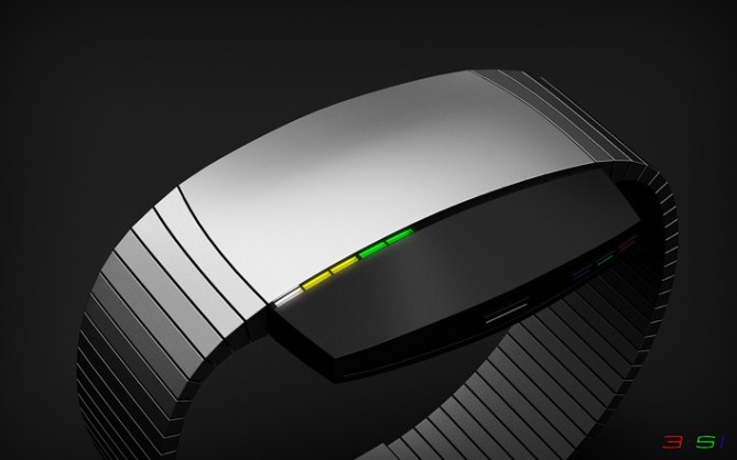
Sam says: First there has been the sun dial. That has been mechanized and so it became independent from the sun. Then only the relevant numbers have been taken and time telling became digital. Later, these numbers have been represented by shapes and colors and so time telling became artistic. It’s time for another step, a watch that fuses all information into a compact display.This concept watch consists of three elements. The carrier: It’s a stainless steel case with the battery, a USB charge plug-in and the straps. The button array: It’s a gunmetal block with the four buttons. Between these first elements is the gap: It tells the time with 12 LEDs.


The 12 hours are told by red LEDs. Five 10-minute-steps are told by green LEDs. Single minutes are told by blue LEDs. Simple rule: 12-5-9 -> R-G-B. Each color can be activated by a representing button. But the professional time telling occurs by another button that lets all colors light up at the same time. Whenever different colors overlay, the LED(s) light up in their mix color (red+green=yellow, red+blue=magenta, green+blue=cyan, all together=white). The LEDs are separated by small indicators of which each third one is a little thicker to ease up reading.


This time telling method requires training. Really. You can learn relaxingly if you press the colored buttons separately one after the other. Later you learn to interpret the mix colors by pressing one button and adding another one step by step. Once you are used to it, you are ready for the white button, that displays all required colors at once.
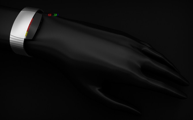
Sam chose an asymmetric design with a simple but elegant shape and emphasize the time telling gap by letting it cut through the watch. That can be flipped by 180 degrees so you can wear it how you prefer. If worn on the left wrist and having the button block right, the buttons can be comfortably pressed by the right forefinger. If the button block is left, they can be perfectly reached by the right thumb.


The time telling method is undisputably tough. If you are willing to learn because you like colors and a minimalistic style, LED Evolution takes you one step further into the history of time telling. Can you evolve?


Hi Sam,
Nice one! I wonder why people are giving such low scores these days…maybe they are just getting picky.
I’m guessing this is the colour-coded one you were talking about. Actually, I think your design is quite different to mine. I like the colour-blend idea…nice touch. 5 * from me.
Cheers,
DZ
LikeLike
Maybe some people think, downrating would help other designs, as if this is a limited competition and in the end the best rating wins. Let me tell to those people: Downrating does not put our favorite watch in a better position. The rating is just a small indicator and since we know it can be cheated, it lost it’s credibility. But it’s a good way to show some disrespect.
Anyway, DZ 😀 This is not the color coded one I meant. The one I meant will… you know what, I’ll publish it on my facebook page (click my yellow name).
Cool that the color-blend idea isn’t too much. I’m expecting some tears here the next days. Although it’s a simple time telling method, the blending makes it hard. It’s like imagining 4D hehe. But that’s the deal, one has to evolve to comprehend the compact display.
Thanks for the support DZ!
LikeLike
Definitly requires a bit of thinking to get the time right, but no doubt one would get used to it after some practice. I like the colour mixing idea as well. 5 stars and Yes from me 🙂
LikeLike
Yessss, thanks for this Kraut 🙂 If one is willing to learn, he/she gets rewarded: fun with the people around them.
LikeLike
5*/Yes!
LikeLike
Merci bien mon Patrick fidèle. Tu peut me dire toujours, s’il ya quelque chose déplaisant ok 😉
LikeLike
Ah ah ah,Thank you Sam, for this affectionate message in French language., now it is impossible to be critical. Let’s just say that this work is very good (5 * / Yes), as usual, but it’s not my favorite, sorry?
LikeLike
Hehe that’s fine!
LikeLike
Cool idea Sam, the fused time telling method takes a little getting used too, but it works well when you get your eye in. I like the A-symetry but feel it needs a liitle more detail. Maybe as simple as a more textured material just so it isnt quite so plain. Definaly got potential (as per usual! lol) 5/Y Best of luck Sir! 😀
LikeLike
Yeah I know what you mean about the plain-ness. I thought about making the bright part a tad more slim so the emptiness is not so strong. I also thought about letting the segmentation run over the case, but I’m actually happy with the smoothness – like an Apple product hehe. Cool that you see potential 😀 Thank you for your support Pete!
LikeLike
I like it, even if I can’t figure it out, still looks cool
LikeLike
Nice! I Im speechless really no lie nice job!
LikeLike
Thank you Gordon and Taco! So cool that you like the look.
It’s basically pretty easy the 12 are hours red, the 5 10-min-increments are green, and the 9 single minutes are blue (RGB = 12-5-9). You can activate each separately by certain buttons (with the according color) or all at once (with the white button). Then the colors overlap and mix. These mix colors make the reading difficult, true true, but you can always “extract” the single time elements when you know a bit about colors. You “just” have to find the colors that contain red, green, blue. You can train color mixing comprehension by pressing two buttons an seeing what comes up 🙂
LikeLike
i like the easy modes, but for me the mix is just baffling – i think i’ll do better with your other color themed watch idea! the minimalist look is pretty neat – you changed it up a bit with the asymmetry, and i like that the display can go on either side – clever! good luck!
LikeLike
Baffling waffling hehehe. Yes, comprehensible. I work with colors all the time and it’s like when a cook tastes the separate ingredients of a soup – piece of cake (when I keep the analogy).
Oh you like the look, that’s good! Maybe we can get you purchasing this piece and you learn how to read it step by step. But yeah, the other one is more fun, I can see that 😀 Thank you for the visit Heather!!
LikeLike
I love the time telling method, here. I would absolutely love to own a watch with that method, and I think you’re the man to design that watch!
This isn’t the one, though. I like so much of it, but find the chunky black piece to be off-putting. It’s asymmetrical and off-weight. It’s not always a bad thing to be asymmetrical, but I don’t think it works well here.
I think the design could grow on me, but one of the things I look for in a watch is a great first impression. I didn’t get a good first impression on this one.
LikeLike
Gahh, there’s always one first first impression >.< That you like the time telling method is a good sign. This watch surely polarizes 🙂 Thank you JP!
LikeLike
Love the time-telling method. Do you have any plans to use it in another design? I could really get behind that.
You have so many great designs with stylized numbers, like Suuji Maru and your recent Veer. It’s nice to see one from you that uses a completely different method.
LikeLike
The watch looks beautiful Sam. Just a bit too minimalistic for me. Good that it can be worn on either hand. The colour merging works well too. 🙂
LikeLike
hand = wrist. 🙂
LikeLike
Okidoki, thanks Lloyd 🙂
LikeLike
Simply lovely, like it allot! The best design is a minimalist one! 5*/yes rainbow puke sirr!
LikeLike
Hmmm tasting the rainbow gets a whole new meaning now hahaha. Thank you for the comment and the support Fir!
LikeLike
SHUT THE FUCK UP! AND TAKE MY MONEY!!
i want this… TF!
anyone can tell me where can i buy these kind of watch in the Philippines?
nice design!
LikeLike
shut up and TAKE MY MONEY
LikeLike
I first read TAKE MY MONKEY, not sure why hahaha.
Wow nice 🙂 Thank you Ray and Anon!
Ray, there are no kind of watches like this yet as far as I know. If this blog entry continues to get along well and if Tokyoflash can imagine this for their catalog, and with some luck you can maybe order it in the future. Big maybe 😉
LikeLike
Simple au point de rien pouvoir lui enlever; élégant au point de rien pouvoir lui ajouter.
Je dirais il est parfait ton concept Sam ! (Ce doit être ouf d’attendre une confirmation de TF)
Je suis tout aussi bien émerveillé par tes (LEDs) designs (je suis un nostalgique de la Fire T_T) que par tes prouesses linguistiques: chapeau !
きをつけて
LikeLike
Mes quoi linguquoi? Hehehe 😉 Oh je comprend bien. Peut-etre tu as la chance d’acheter la Fire à Ebay… Ma montre nostalgique the Toky, c’est la 12-5-9 L. Je veut la noir!
Merci pour ton feedback! Les couleurs superposées ne sont pas du probleme? Tres bien 😀
ありがとう^^
LikeLike
I like it, a lot. 1st : the 180 degree meaning you can’t wear it upside down.
2nd : the 3 color 12-5-9, instead of an automatic 3 phases. ( which could be a nice addition )
3rd : the asymmetrical, rounded side, design ( a full size band with 2 colors, divided at the same place as the one on the case could be less good. and 1 color full band would be very bad, on a 2 color case )
4th : you can either choose to check only the hour or the minute.
The fused time is tricky and need some practice ( which is ok since it’s an important, if not the most, aspect of TF )
Bottom line : 6****** and I would buy.
LikeLike
Wow, thank you so much for this review!
You mean “can” I hope 😉 An automated 3 phases display would be a nice addition. There could happen alot on this small display. Oh yes practice makes perfect. The learning phase is way longer here, and you can always choose another mode.
LikeLike
at least you can use the other mode to practice.
LikeLike
3rd : a vertical rectangle case wouldn’t work.
LikeLike
Yes, practicing is the key.
Cool how you analyse the gemoetry. It’s not easy to find one for just a line of LEDs and I’m glad that it pleases.
LikeLike