Design submitted by Peter from the UK.
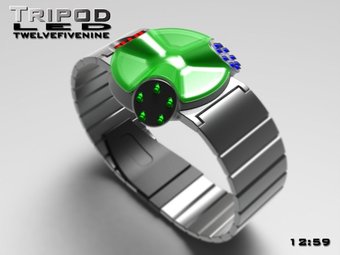
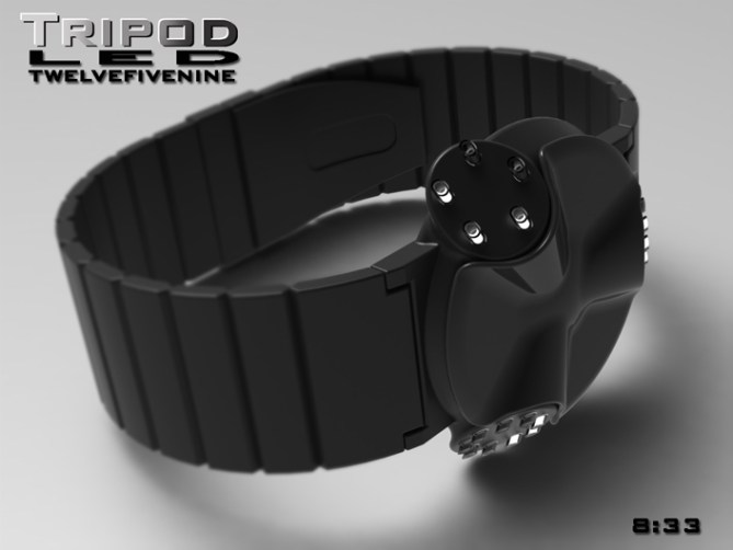
Peter says: I have allways been interested in sci-fi films and wanted to design an unusual alien looking watch. I didn’t have a specific image in mind but the watch evolved into something that resembles a cross between the “Tripods” of “the war of the world” films, the little spacecraft/aliens from “batteries not included” and a mechanised turret.The watch consists of three separate display “Pods”. This layout would lend itself to either LED, LCD or Analogue or a combination of these types of displays. These “Pods” could be interchangable allowing the consumer to choose the combination of display types.
The time is told in the classic twelve-five-nine format, hours (x 12) are displayed by the top “Pod”, groups of 10mins (x 5) are displayed by the left “Pod” and single minutes (x 9) in the right “Pod” .
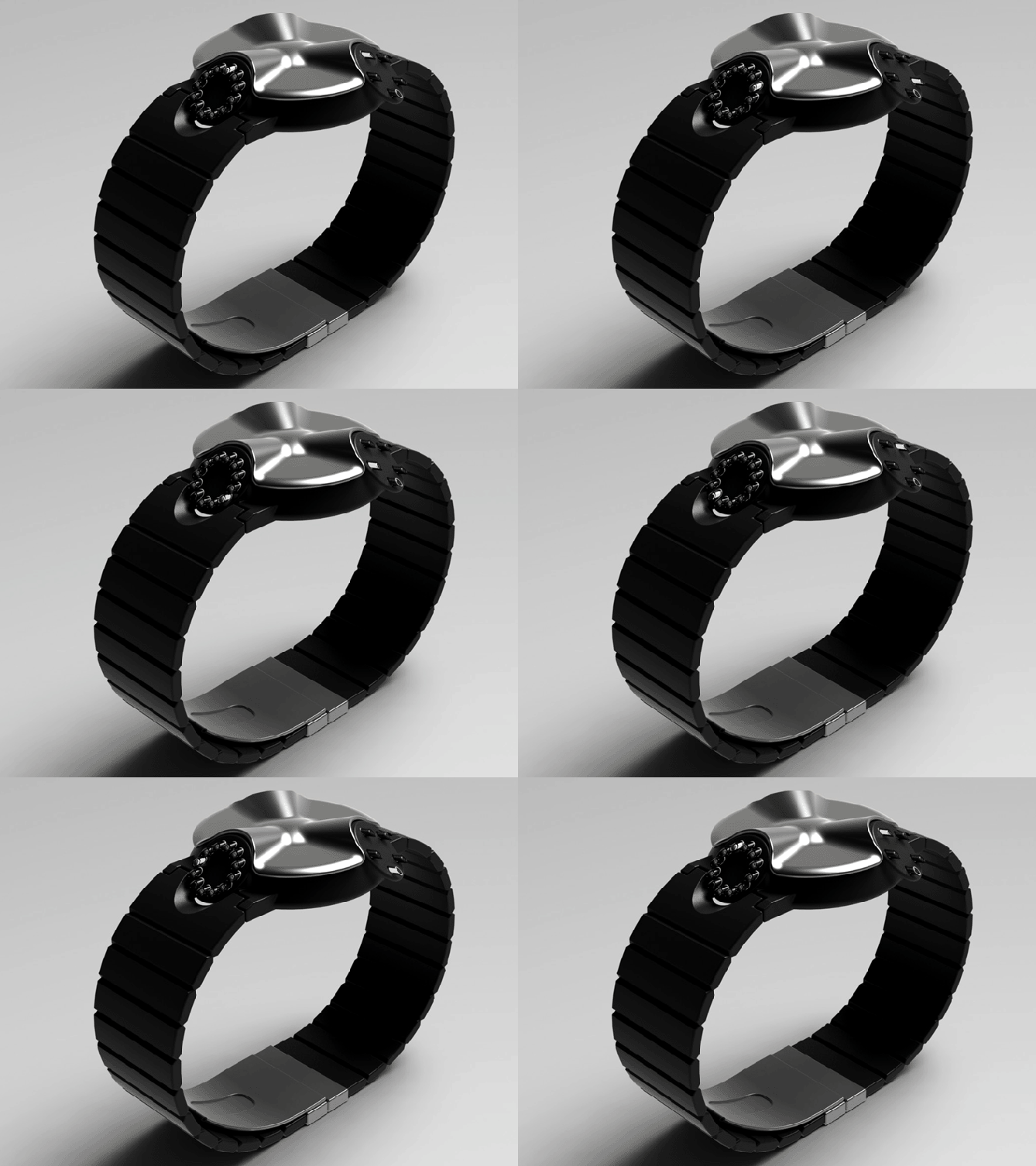
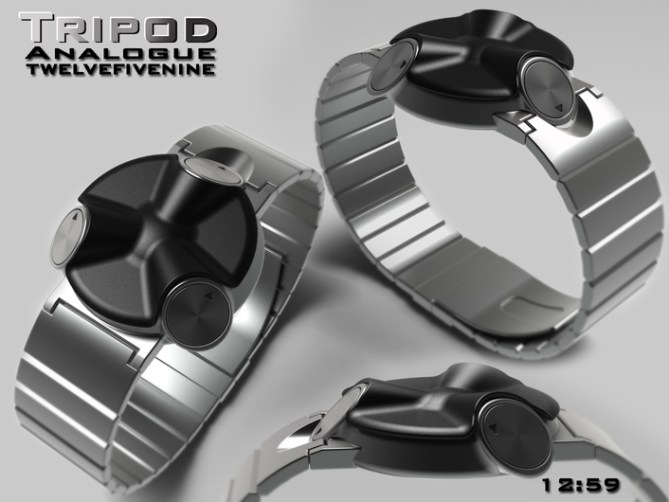
The unusual form of the watch lends itself to different colours and finishes including the removable “Cowl” on the top of the watch. This would be available in contrasting colours to collect and swap. These choice of colours and finishes would hopefully give the watch a wide appeal. The sci-fi theme and form would hopefully appeal for other sci-fi fans and the classic twelve-five-nine format will hopefully keep existing Tokyoflash customers interested.
This design stands out due to its unusual form and modular “Pods” available in LED, LCD, and Analogue. This would give the consumer plenty of choice and customisation. This combined with the interchangeable cowls would allow the wearer to have a unique watch thats suits their personality.
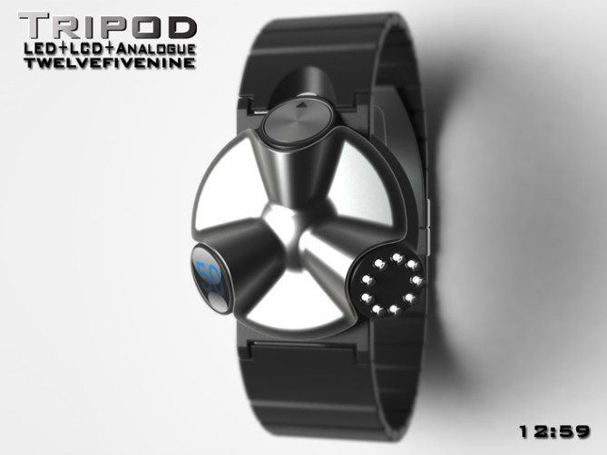
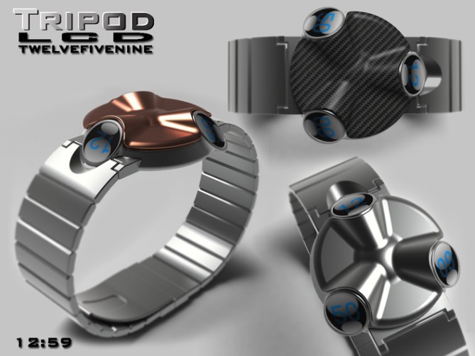


Do I hope that this watch with also mode “teleporting”?
5 * / Yes, it’s good to dream!
LikeLike
hahaha Teleporting is yet to come! keep your eyes peeled for that one! Cheers for the comment and the vote! 😀
LikeLike
Thanks for adding this design to the blog TF! 😀
LikeLike
LOVE IT!
It’s bold and looks eye-catching without being cheesy. I like the different time telling methods. My favorite is the LED then comes the analog and the LCD is my third purchase. Is it a mixed version up there of do you just show the three systems in one pic for the overview? Mixed version would be pretty cool too. The geometry of the case is just great. 5*/WANNA!
Freakin’ forkin’ underrated!
LikeLike
There is a mixed version up there, I liked the idea of it being “podular” allowing the user the choice of what display they choose, all of one or a mixture etc etc. The analogue version is my favorite followed by the LED and LCD. I was worried some would find it cheesy or too different, so thats reassuring! Cheers for the feedback Sam! 😀
LikeLike
Hehe This is fun! I like the interchangeable pod idea. The time might be a bit hard to read with the pods at their current angle, but that’s an easy fix I’m sure. Or could the top be rotated by hand or motor so that you can read the pods one after the other? 5 * and yes. 😉
LikeLike
Rotating pods? That sounds rather cool, like an LED gattleing gun! lol peeaw peeaw!
I think when the watch is looked straight on (the view I neglected to show lol) they are all visible to the wearer. The analogue is probably the most difficult to read as I havent added any markers. Just wanted to show as many options as possible. Thanks for the feedback and the vote Mushy! 😀
LikeLike
😀
LikeLike
Really great ! could be used by blind people too 😉
and i really love the way it looks !
LikeLike
I hadnt thought about it like that. Its great how different people see different things in designs (no puns intended) Thanks for the great comment! 😀
LikeLike
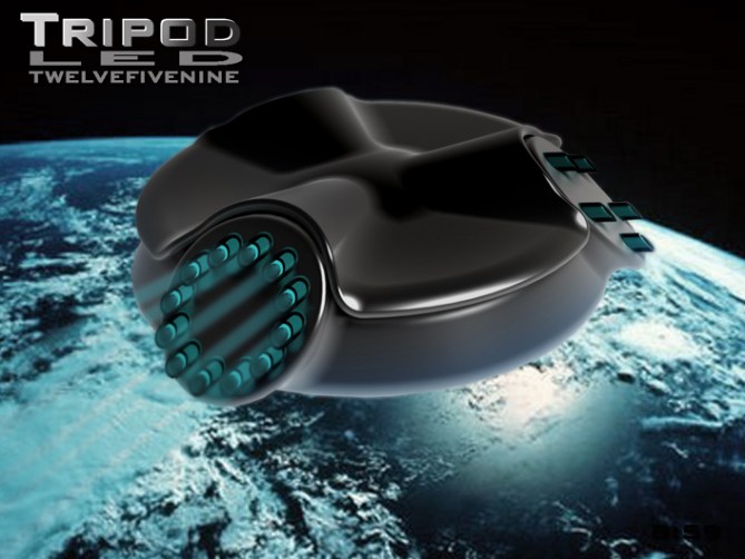
hey, pete! first, i have to tell you that the last image up there, of the one in space, is really awesome!
the way i see it, this would make a really cool pocket watch, but this design does not work for me as a wrist watch – i guess it’s too masculine…good luck! 🙂
LikeLike
awww its started so well! hehe, Yeah it might work nice as a pocket watch.
It does have a bit of an industrial look (just for a change lol)
Thanks for the luck (I seem to need it at the min) I recently did a more femine design which hopefully might appeal, only time will tell if and when it hits the blog. Cheers for the comment! 😀
LikeLike
Shes a beauty Pete, remineds me of my syfy days…….. Anywho looks great, good job!!
LikeLike
Thanks a lot Mr.Taco, Im glad it makes you reminisce! Cheers for the great comment! 😀
LikeLike
Pete, this is a watch-design blog, not a UFO design blog! Looks like I’ll be buying a UFO. Does it take off? HAHA 5* from me.
LikeLike
Sorry, I keep forgetting! lol The little men from Mars gotta keep track of time too! So far it hasnt really taken off but you positive comment sure helps! Cheers DZ 😀
LikeLike
Totally love this design, best of luck. 5/Y
LikeLike
Yay thats great, Im glad you likey, Thanks a lot Krautesh! 😀
LikeLike
I’m not sure about the replaceable cover, but I do think there is a LOT of promise in this design. Great looking piece.
LikeLike
Thanks JP, Do you think the cover should be the same colour as the strap? or just lose the cover?
Cheers for the comment! 😀
LikeLike
I think that I like it best when the cover is the same colour – or nearly the same – as the strap. I was drawn in by the thumbnail concept image, before I found out that the cover was removable.
LikeLike
The advantage of the cover being removeable is that the customer could choose if they wanted a contrasting or matching cover. The choice would be yours sir! 😀
LikeLike
I can’t deny couldn’t tell the time at certain degree of angle but the basic idea is cool and the design is unique. I have idea to make this design better, but the result would be the 3 circle 😉
5*
LikeLike
Yeah I considered having three circles not unlike sattalite, would look pretty cool! Cheers for the feedback and the vote! 😀
LikeLike
It’s a very nice idea but the angle of the pods make it to hard to read. ( the wearer will have to rotate his arm 3 time ) Re-work the angle & I would buy.
LikeLike
I think you could read the time without moving your arm around like a crazy person at the current angle of the displays, but there is no reason the angle couldn’t be reduced to make it clearer. Maybe this is something TF would tweak if they chose to develop this idea further. Cheers for the feedback and the comment! 😀
LikeLike
Thanks to everyone who voted, commented and shared/liked constructively.
Cheers to TF for adding this concept to the blog! 😉
Thanks everyone,
Pete from team GB 😀
LikeLike