Design submitted by Sam from Germany.
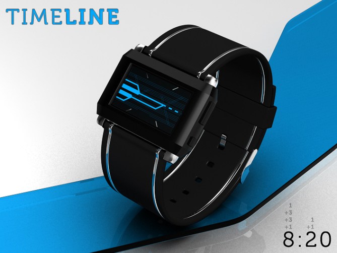
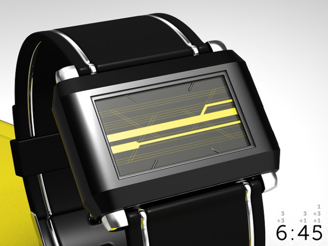
Sam says: The inspiration for this watch comes from the multiverse hypothesis. It says, that there are parallel universes that represent alternative timelines. So everytime a decision has to be made, there are many options, many possibilities of how your path continues. One decision can lead to many ways as well as many ways can conclude into one decision. This relationship can be shown with parallel graphs that sometimes have connections.The time is told by a varying number of connected lines with different thickness. The lines are passing three stages, hours (1-12) on the left side of the display, ten minute increments (0-5) in the middle of the display and single minutes (0-9) on the right side of the display. The lines themselves can have three states: thick standing for 3, thin standing for 1 and interrupted standing for 0. When a stage has many lines, you have to add the representing numbers. 4:32 would be a thick and a thin line left (3+1), a thick line in the middle (3) and two thin lines right (1+1). Since each stage can have different amounts of lines, they have to split up or melt together regularily. The result is a cryptic looking display that just requires some little math to be decrypted.

Timeline is a watch for time lords and those who like to see time as a graphic.


Darn cool!
LikeLike
The time telling takes a little getting used to but once you do it works really well. I had a similar idea a while back but tried to make digits out of the lines rather than just using the lines themselves. This looks more cryptic and cleaner. The case also looks a little like Kaidoku, which maight add to the viability if they could re-use the case. 5/Y Best of luck! 😀
LikeLike
Great design!
Thos os my favourite form factor for a watch, good for people with not giant wrists and IMO the most futuristic looking.
Keeping the everything black puts the focus on the display which is good.
The method of reading the time producing a very appealing and again futuristic appearance…
I would buy more than one of these…
Really hope his gets made soon!!!
LikeLike
Not easy to read the first time (with the google translation), but now it’s OK, great idea Sam!
5 * / Yes.
LikeLike
The last image looking very earthy and yummy. Me want the caramel flavor! 5/y Sir!!
LikeLike
Cool design! I would buy it, if they decide to make it! 🙂
LikeLike
Wow lunch break and bam, good news for me. Thank you so much for your comments everybody!
Kangpi, 😉
Pete, thanks alot! Yeah the wide screen reminded my of the Kaidoku too. That one has a super case! I tried to do it a little retro. Cool you say, the time telling works well after a while. Maybe you develop your idea? But I think you are busy with a couple of other ones right now 😀
Tokyohunter, cool name btw. Very interesting and nice comment! Thanks for highlighting the features 😀
Patrick, thanks for taking the time to read it. And for the Voting
Fir, thank you, you sweet tooth! *gives paper tissue for your screen* 😆
Kro, nice of you 🙂
Tokyoflash, thank you for posting this concept!
LikeLike
best 12-5-9 concept i’ve seen!!! so easy to count – only 2 different thicknesses of lines to remember – the 0 interrupt is easy to recognize and intuitive – just great. i also really like the accents along the edges of the strap. black with blue is my favorite… i would buy this! 5*
LikeLike
Waaaaah thank youuuuuu! I’m glad you like this one Heather. Nice to see how you perceive the watch 🙂
LikeLike
Great! 5 stars! About the rendering, it is quite realistic! What kind of software you used? Can recommend to me?
LikeLike
Hello Leonard, thank you for your comment and the vote!
I use 3ds Max and Photoshop for my watch concepts. I use them because I work with these programs a while now and got used to them. I would recommend Blender and GIMP now. Those are free programs with the same potential. Well GIMP is a little less comfortable but that’s it.
LikeLike
nice and cryptic, definitly would buy this 🙂 5/Y
LikeLike
OMG that’s sexy 😀
I WANT ONE NOW!
LikeLike
I can’t believe how easy it is to read the time!
I love the story relating it to the multiverse too (in fact i would probably change the name to multiverse). Very cool indeed. 5/Y + extra geek points! 😀
LikeLike
Thank you Krautesh and Toby 🙂 Thank you too Scott! Cool, that it’s easy for you. Multiverse would be a less mainstreamy name = supercool 😀
LikeLike
Another design so nice that I had to come out of hiding to praise it! Fantastic work, Sam!
Tokyoflash, take my money and make me one of these already!
LikeLike
I certainly would buy one, a very good combination of cryptic looks and easy readability. Could it be an option to switch off the thin “helperlines”? I hope Tokyoflash will look into this one, as they hopefully still do with your junction-watch…..
LikeLike
It’s Peter Bishop’s watch (in the TV series Fringe). Excellent work! I like the 12-5-9 method and it’s very easy to understand! All of my honor and respect to you Sam.
LikeLike
Wow sorry Sam but I think you owe me a new drink because when I saw this watch I droped my glass nice job!
LikeLike
Well done, but I can’t understand at all:) But looking good:)
LikeLike
Oh nicey 😀
Squisqui, thanks for coming and praising! Always nice 🙂
Jan, thank you for your comment! Hm, there are metallic indicators that remind us of the three sections and there are the LCD gaps. I imagined the display to be LCD and that has to have thin gaps between each segment as far as I know. I actually like them, they make the display look more sci-fi and less empty. But taste shmaste hehe. Awww, no news for the Junction watch, but thanks for mentioning it!! See, that one was idealistic. I left the LCD gaps away, that cheeky I was 😉
Laszlo, thank you very much for your nice words! Although I saw Fringe, I can’t remember Peter’s watch. But the new season comes to Germany soon 😀
Tacoman, I just emptied a soda on my head, now we’re even xD Thanks alot for the comment!!
Kairat, thats cool 😉 The look is at least 50% of the purchase decision. If you like, work through the red image, then I hope it’s easier.
LikeLike
Sorry! I meant: it could be …
LikeLike
Hehehe, what about Marty Mcfly, could be his watch too 😀
LikeLike
My jaw literally dropped when i saw this…I have tried to make watches similar to this but i dont have the skill or imagination…this is just so immense!! Its like Halo mixed with Tron and predator! Who can dislike this!!
Words cannot describe how awesome this watch is It is the best looking futuristic watch i have ever seen and i damn mean it I want it now.
Let me tell you…TF will make this 100%..because this is the best watch ever!!
LikeLike
Wow Jun! Thanks so much for this nice comment! I appreciate your optimistic view and hope with you.
LikeLike
Very nice looking watch, as usual from Sam.
I would consider purchasing this. I haven’t had a leather-strap watch in a long time, and this is one of my favourite designs for the face. The number system is simple and effective, even if it would perplex onlookers.
I’m always looking forward to the designs you submit, Sam. TokyoFlash should consider hiring you on, full-time.
LikeLike
JP thanks so much for your comment. I somehow missed it but it’s great for sunday evening. All the points you mention sound so good when you write them. Also thanks for your confidence 🙂
LikeLike
Nice! The usual quality from Sam. 5/y
LikeLike
Thank you Tom.
LikeLike
Very nice watch Sam. I really like the idea behind it and how it looks.
If they would make this watch there is no timeline where i wouldn’t buy it.
The only things i feel is a bit wierd is the markers in the middle of the watch. Maybe it’s the thickness or something, it distracts a bit from the line design you have. Maybe put a slopey bump in between the markers, it would make the face have sort of a sideways hourglass shape making other timelines look like they flow towards the middle. Or you could put the markers in the corners of the watch since the lines diagonaly fall to the center.
LikeLike
Heeey, nice timeline theory!
I appreciate your thoughts about the markers. Both ideas are interesting and don’t stand against my vision of the timelines. Thank you very much for your perspective!
LikeLike
I love this concept. As I said on fb, some time combination give very cool graphics. I like the metal line on the wristband. ( if tf where selling them, I would buy a few to replace the wristband on a few watches that I have )
I would buy one. And since there is nothing to change, TF should start making it ASAP.
LikeLike
Thank you so much for leaving your comment here! Yeah, that’s the fun part: the layout looks different throughout the day so it’s takes longer to get boring. Interesting wristband policy hehehe 😉
LikeLike
This was fun! Thank you everyody for the comments! Now as I look at it again, I realize, it doesn’t look like a time telling device at all :O I think that’s pretty tokyoflashy 😉 Well, the timeline for this concept ends. If it’s a blurry interruption… we’ll see.
Cheerio,
Sam
LikeLike