Design submitted by Andrew from the UK.
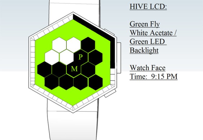
This LCD watch design concept is based on the interlocking hexagonal cells inside a honey bee’s hive. The time display is split into several time sections and divisions.
The three central interlocking hexagons have letters within them – A, P, and M, to indicate AM/PM. Hour is shown by each plain black hexagon and the 59 section around the edge of the wtach displays minutes.
This watch design should appeal to anyone interested in nature espectially insects and bugs.


Me likey hexy. I like the simple time telling and the look of the face. Im not so sure about the model names.
Nice work Andrew 5/Y best of luck! 😀
LikeLike
This is the forth design that I have had added to the Tokyo Flash Design Blog. I am will to accept suggestions for alternate names for the models / versions I have created. If like this Design why not check out my other design by typing in: Andrew UK or by clicking on the following Links:
http://www.tokyoflash.com/blog/?s=andrew+uk
Safe Cracker http://www.tokyoflash.com/blog/2012/05/safe-cracker-watch-ideal-for-bank-robbers/#more-13623
The Zodiacs: http://www.tokyoflash.com/blog/2012/02/zodiac-analogue-watch-does-not-require-mystical-powers-to-read/#more-11871
Triple Yin Yang: http://www.tokyoflash.com/blog/2012/01/triple-yin-yang-watch-contemplates-the-time/#more-11173
LikeLike
Here my advice for those who are thinking of submitting a design to this blog to do the following?
1) Draw your design on paper first then re draw using a Paint program or 3D design application: Sketch Up.Your design is more likely to be published if it is something that no one else has though or had posted on this Blog yet so do your research first.
2) Make sure your fully understand how your Time Works. Because if you don’t no one else will.
3) When adding text to your design or submission spell check it first.
4) Patience’s is a virtue: No matter how many designs you submit not all will be published. So take a second look at your design & think how you could improve it or try & come up with something Better.
5) Copy & paste a link of your Design to your & Friends: Social Network Page/s: Facebook Etc.
LikeLike
Yepp, good summary.
to 1) Everyone has his/her own approach. I like to sketch until I need to see it 3D mostly. Sometimes I start 3D and let the design develop.
to 2) Oh yes, you have to defend your design so it’s good to have thought about how it works. You have to be open to suggestions but if you have a clear vision, then other people can tell you anything and you’re still happy.
to 3) Hehe, yes. But hey, we are all humans and little mistakes aren’t bad. Besides the pronounciation of words, the displayed time is different from what is told by text outside next to the watch. When users come and correct you, it’s cool cause it shows, they’ve understood the display 😀
to 4) Oh yes. Don’t rush it and look at the design after a night or some days. But don’t force it. If you have the feeling, you wouldn’t wanna add or remove something, it’s good. Not all designs might be published and definitely not all designs will be produced.
to 5) Sharing is cool! Getting some new commenters to the blog is welcome.
When you (all) go to submit a design, you might check the helping questions, Tokyoflash ask before you do here:
http://www.tokyoflash.com/blog/got-an-idea/
LikeLike
Great to see you having a go at the graphics, Andrew! Good luck with your design.
LikeLike
Gongrats to your first steps in SketchUP (I think).
A recommendation for a strap: Make a cylinder, 3cm radius (1.2 inches) and 2cm – 2.5cm high (0.8-1 inch). Then scale one dimension (not the height) to 0.75, making it 4.5cm in diameter (about 1.8 inches). Now you have an ellipse that comes close to the cross section of a medium sized wrist. You can inset the elliptic faces by 2mm (for a soft silicone strap) till 4mm (for a thick metal strap) now (0.08-0.16 inches). You can change the width of the strap (by pulling the vertices outside) in the area, where you wanna place the case, making the strap look more dynamic. It’s just a suggestion for a basic strap, maybe it helps 🙂
Now to the display idea. I do like hexagons but this display could use some more diversion. A more loose placement of the cells and size variation would be more playful for the eye. I would suggest to let a hexagon grid segment the dispay completely and then fill the cells according to what time it is. Right now, the little hexagons look a little lost in the big one.
Anyway, you seem to have some ideas in your head and it’s cool you share them with us! Big rule: it has to be fun. You will develop if you keep doing, that’s a nice side effect. Good luck Andrew!
LikeLike
I’ll have to try that technique.
LikeLike
I totally like this design but I am not sure how to read the time, maybe because the graphic is boring make me less interested to read further, but I can imagine the watch in live action, must be totally awesome! Google “smart brain” logo, my favorite. 5* yes. (the red version is dam hot!
LikeLike
It’s the smashing article.Was that executable to find great freelance writing? Suppose so, and everyone could find it rather helpful.
LikeLike
I like it, but it would be better if the A-M-P letter where on the 1st row. or add a 5th hexagon at the right side of the 3rd row, and use the last row for am-pm.
LikeLike