Design submitted by Sam from Germany.
Sam says: The inspiration for this watch came from the number sign (hash, pound sign, rarely octothorp in different variations). This symbol divides an area into nine squares.
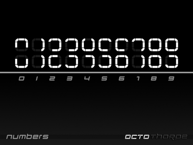
I sketched around for a digital display and quickly came to the double square numbers, you can see in the images. I took the name Octothorpe due to it’s emphasis on the number 8. There are 8 squares forming the time display and each of them is made of 8 segments.

The eight squares are aligned along the edges of a rhombic plane. They have a varying amount of lit and unlit segments and look confusing to the untrained eye. A pair of squares forms a number and each number has been framed to ease up reading. You read the time up-down-left-right – the same order as if you would write a +. Once you’re used to the numbers, it’s a piece of cake to read it while others might look at you like a car.


I let the rhombic display straightly morph into the straps and kept the case pure and simple. In the center of the case are four buttons, the upper, lower, left and right one activate the time, the date, an animation and the setting mode.
Octothorpe is a simple and stylish LED watch for everyone who likes it cryptic but easy to decipher. It’s an artistic but not too playful way to tell time.


Thank you Tokyoflash for posting this concept!
#♥
LikeLike
Beautiful design, Sam.
Not easy to read on the first try, but with a little learning, it should.
5 * / Yes.
LikeLike
Thank you Patrick!
LikeLike
Whats not to like about this design, funky form, funky and unique method of displaying digits, in fact the only thing I dont like is the fact I didnt come up with it! 5/Y Best of luck Sam! 😀
LikeLike
God save the Queen!
LikeLike
hehe thanks Patrick! (I presume you mean the Queen of England rather than suggesting I like to wear ladies clothing :p)
LikeLike
Ah ah ah ah, of course, are going? 60-year reign, it can only be for the Queen of England. I love British humor and I also like the “Queen”, the group musqiue, of course, ha ha ha
LikeLike
The “Queen”, Pop music group
ah ah ah
LikeLike
Yeah I knew what you meant, its a kinda magic, bohemian rapsody etc etc 😀
LikeLike
I suspected that you knew what I meant, ehee
Good weekend of joy, Pete.
LikeLike
Thanks alot Pete 🙂
LikeLike
Why so few votes for this great concept?
LikeLike
yeah the voting has been a bit hit and miss lately, I can seem to score above 3.6 at the minute irrespective of the design. Im sure it will pick up
LikeLike
Don’t worry Patrick, I can’t please everyone everytime and it’s good that way 😉
LikeLike
Sleek. But isn’t this one the collaboration between Sam-chin and Heather-chin? I’ll checkit out again later but sleek is sleek. Congrat Pablo! Me gusta
LikeLike
I did is all by myself hehehe. Sleek for the geek!
LikeLike
Ok I must be confused with this http://www.tokyoflash.com/blog/2012/02/modulo-3-led-watch-looks-complex-has-simple-solution/
Thats my dejavu 😀 I wonder too much recently. A flower, rafflesia for you. Yes the design is so yours!
LikeLike
Wo.of interesting flower!
LikeLike
Sam, it looks really spectacular (that goes without saying) but I’m not so keen on the numbers. I guess I could get used to them though. 🙂 5Y
LikeLike
Thank you Lloyd for the comment and the vote! It’s cool you’re willing to take the numbers 😉
LikeLike
I didn’t understand it, then a realized that for each number you look at both sets
5*y
LikeLike
Yep 🙂 Thanks Smokey!
LikeLike
ty for your comment, now I can understand and appreciate it. And after looking at the pictures a 3rd time, I realize that there is a small outline around two blocks.
LikeLike
black with white LEDs – beautiful! 😀 5*
LikeLike
Good choice 🙂 Thank you Heather!
LikeLike
nice concept. It would be easy to tell the time. I love that the control buttons are in the middle. It seem like there is an error with the 1. On the 2nd picture timed “12:34” and the last one, timed “12:59”. The 1 is on the left side when it should be on the right side. ( base on the 3rd picture, the one that show all the numbers, and common sense )
LikeLike
Hehe, cool that you realized it, but that’s not an error. I let the 1 be left-aligned when it’s on the 1st and 3rd position to give the whole amount of illuminated LEDs a groupy, less broken look 🙂 The fact, that you recognized it as a 1, makes me happy hehehe. Thanks for looking at the pictures again and again Makko and for sharing your thoughts. So cool, that all possible concerns are recorded here!
LikeLike
I also love that the middle part is divided instead of only appearing on the top square.
And : “all possible concerns are recorded”. lol. like there was many, when it’s one.
LikeLike
Hehe 😉
Yeah I use this method for my split numbers to give the both halfs a more solitary appearance. You’ll like my FRAME concept I guess. Comes laaater.
LikeLike
This was nice 🙂 Thank you all for the comments and the support!
Best regards,
Sam
LikeLike
good luck Sam! 😀
LikeLike